Why you shouldn’t skip ‘Skip navigation’
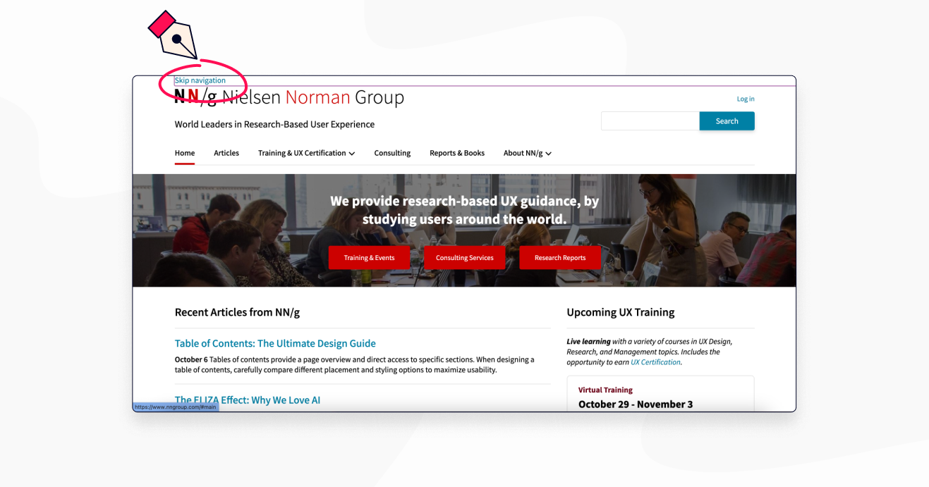
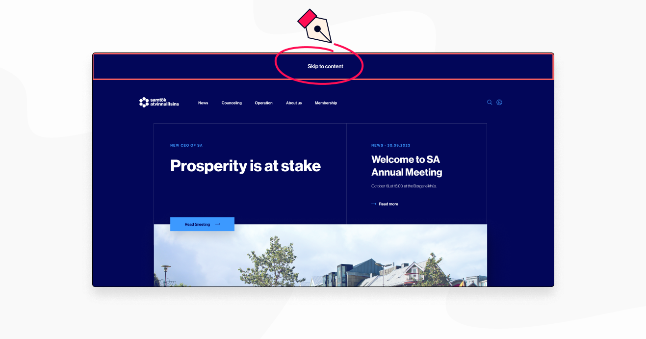
The link is typically hidden by default, but when a user presses the 'Tab' key on their keyboard, it becomes visible and in focus state. This allows users to either skip the navigation entirely or tab through it.
Why it matters
When designing a website, there's a lot to keep in mind. You want to make it look good, work well, and be easy to use. But there's one crucial aspect that you absolutely can't ignore: accessibility.
Around one in four people in the United States, and over one billion people worldwide (16% of the world’s population), have some type of disability. Everyone should be able to use the web, regardless of any disabilities they may have. Designing with accessibility in mind is not only the right thing to do, but also the smart thing to do. Making your website accessible opens it up to a much larger audience, demonstrates care for all of your users, and ensures compliance with laws that require website accessibility for people with disabilities.
Since most assistive technologies are based on keyboard functionality, keyboard accessibility is crucial. It can be overwhelming to ensure full accessibility compliance, but implementing one feature at a time is a good start. In this article, we'll focus on a seemingly small but impactful feature: the 'skip navigation' link.
Why are these 'skip navigation' links so helpful?
Usually, there is a lot of content at the top of a webpage before you get to the main content. While sighted users can easily skim through the navigation using a mouse and get to the content they want, keyboard-only users and screen reader users are left with no choice but to go through the entire navigation menu before they reach the main content.
When using a screen reader, content is read out in the same order as it appears in the HTML file. This can be frustrating for users as the navigation and other content at the top of the page is read out first, delaying access to the main content. For users who are only interested in the main content, this can be a time-consuming experience. To improve the user experience, a 'skip navigation' link can be included, allowing users to bypass the navigation and go straight to the main content.

Ok, I'm sold - Now, what are some best practices to keep in mind when designing 'skip navigation' links?
Good question! Here are a few key considerations to keep in mind:
1. Make sure the link is the very first item the screen reader reads out to the user, and that the keyboard focuses on it. This way, users can easily find it and skip past the navigation quickly.
2. Keep the link text simple and descriptive. Something like "Skip navigation" or "Skip to main content" will do the trick.
3. Ensure the link text has enough contrast against the background so that users with low vision can easily spot it and read it.
4. Since you got this far, I'll give you a Bonus tip! If you're feeling extra fancy, consider adding a 'skip to footer' link too. This lets users quickly jump to the end of the page if they wish.

Hopefully 'skip navigation' links will become a simple, predictable and essential feature in every website’s design. And the best part? They're easy to implement and can make a big difference. So go ahead, give it a try on your next website design project!
At Jökulá, we're all about making the web more accessible for everyone. If you need any help with your website design, don't hesitate to reach out to us. Let's make the internet a more inclusive place, one 'skip navigation' link at a time!


