Rebranding an Icelandic Hockey Legacy
Our Roles
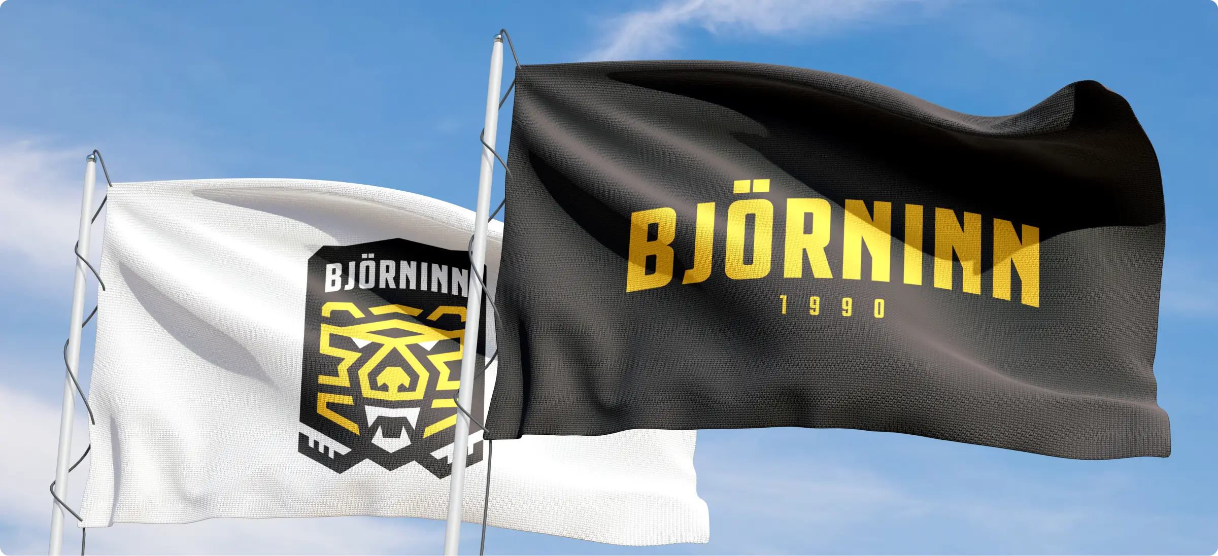
Branding
Merchandise
Client
Description
The mission
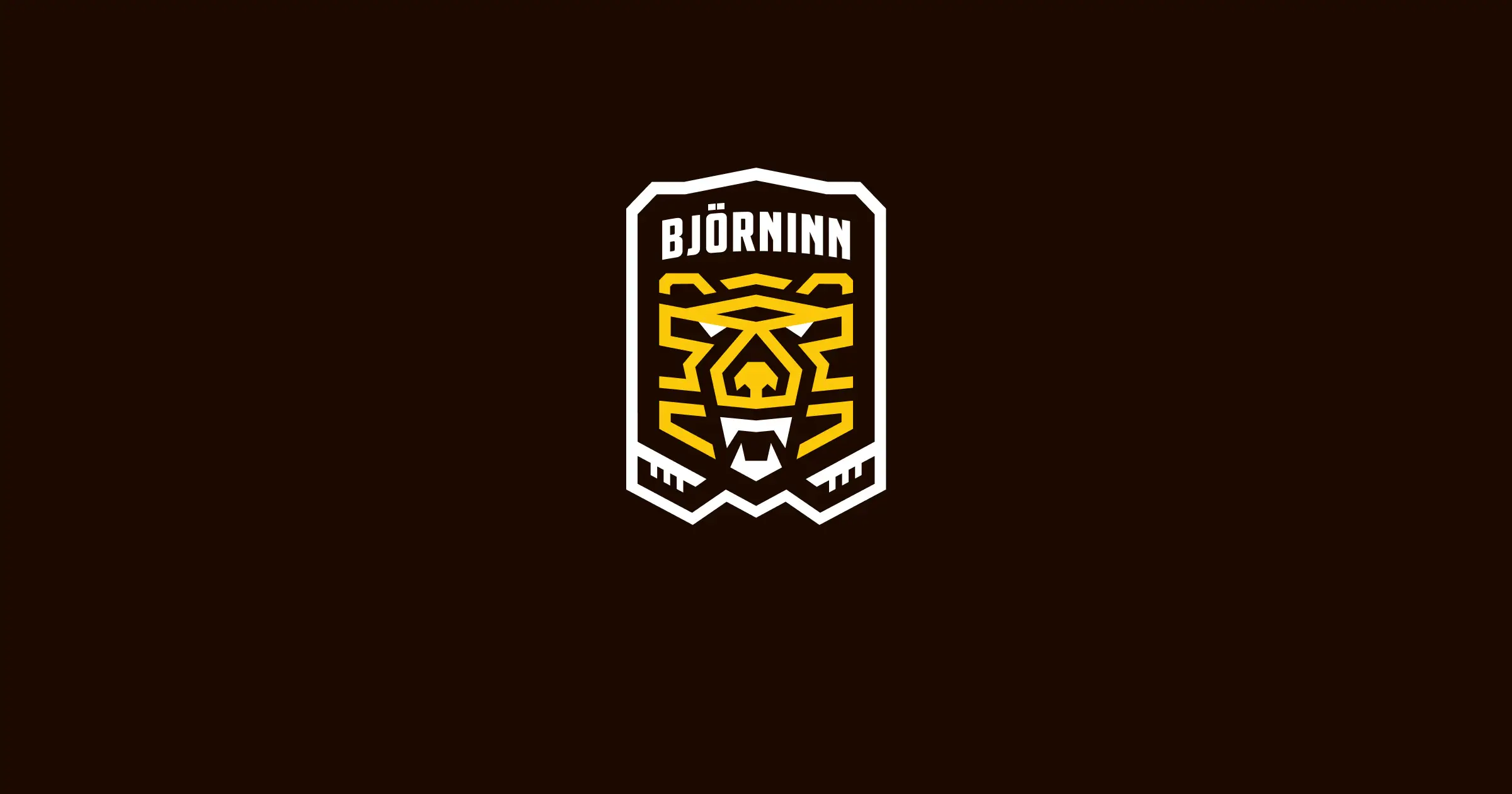
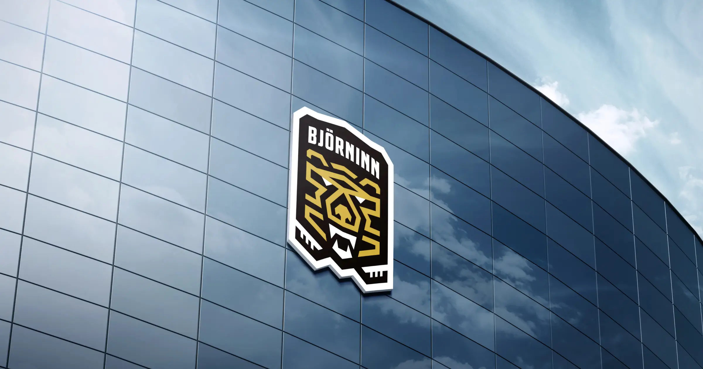
IDENTITY
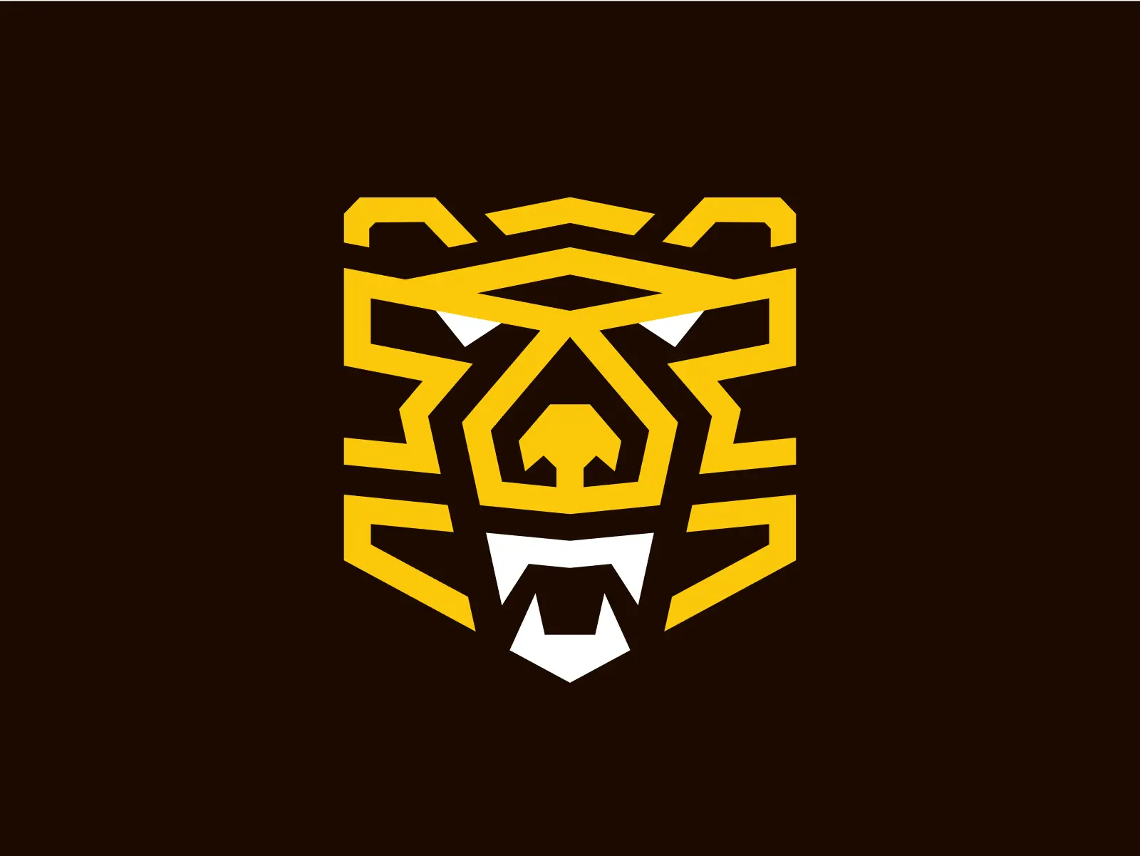
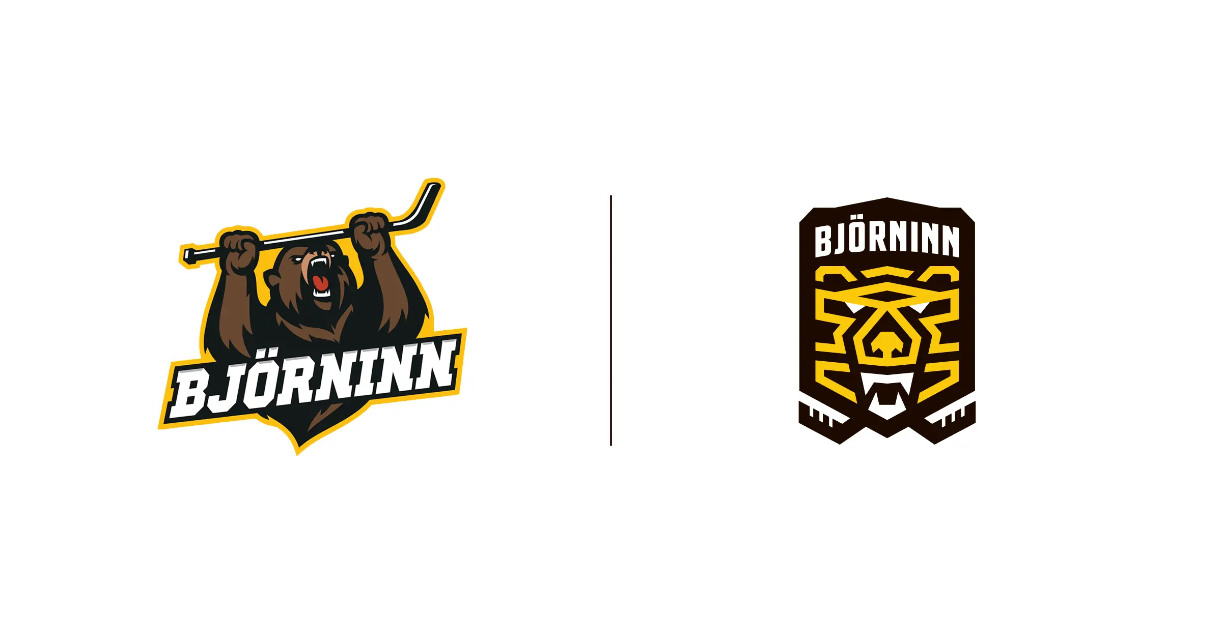
Modernizing the Bear
Our process began with sketching and refining countless iterations of the bear, ensuring the final logo honored tradition while embracing modern design. The result was a bold, streamlined emblem that symbolizes strength, resilience, and confidence — perfectly embodying the team’s spirit.


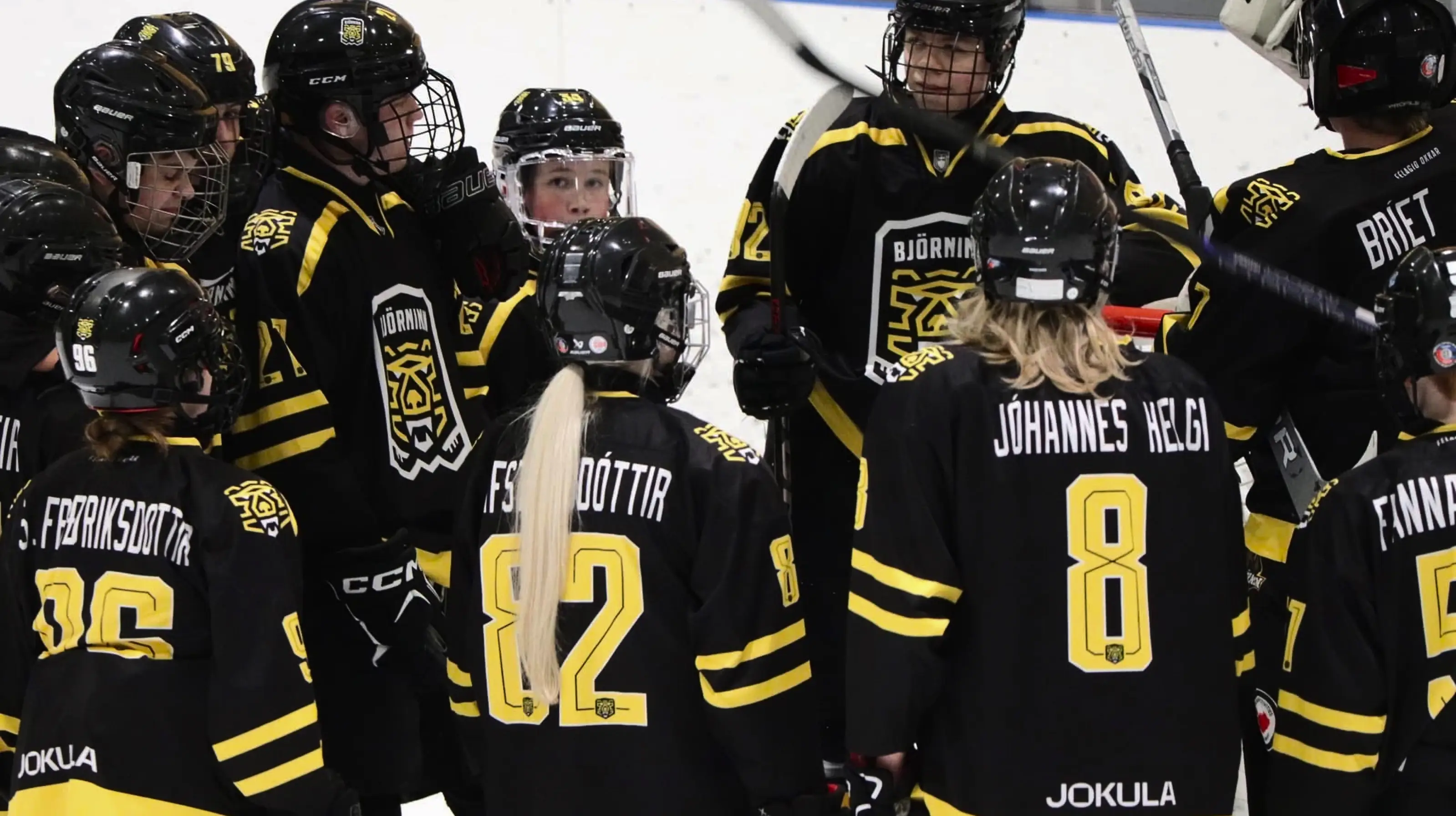
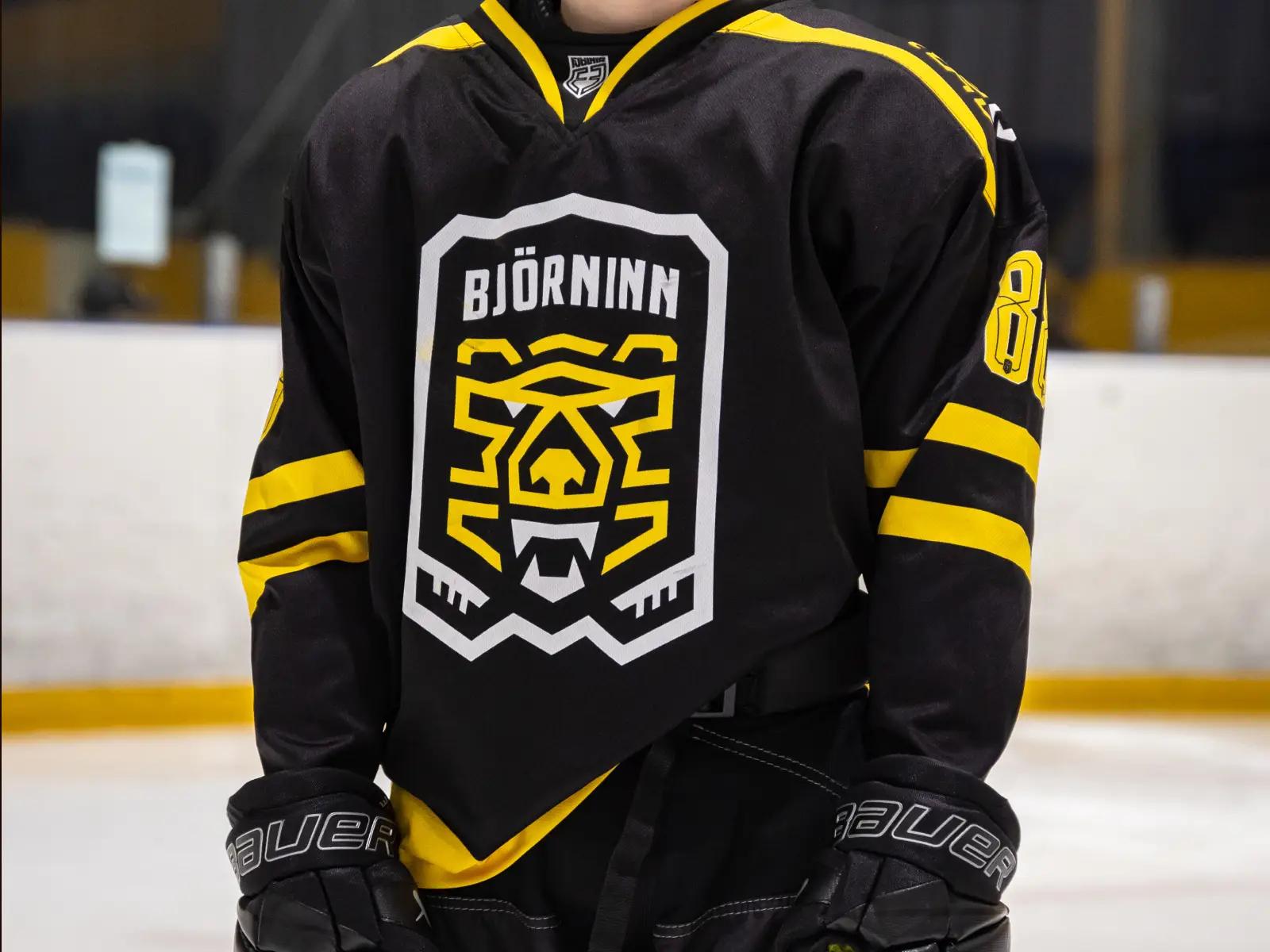
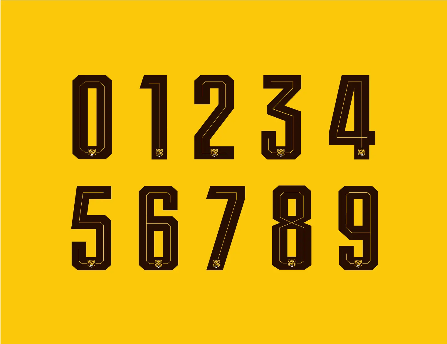
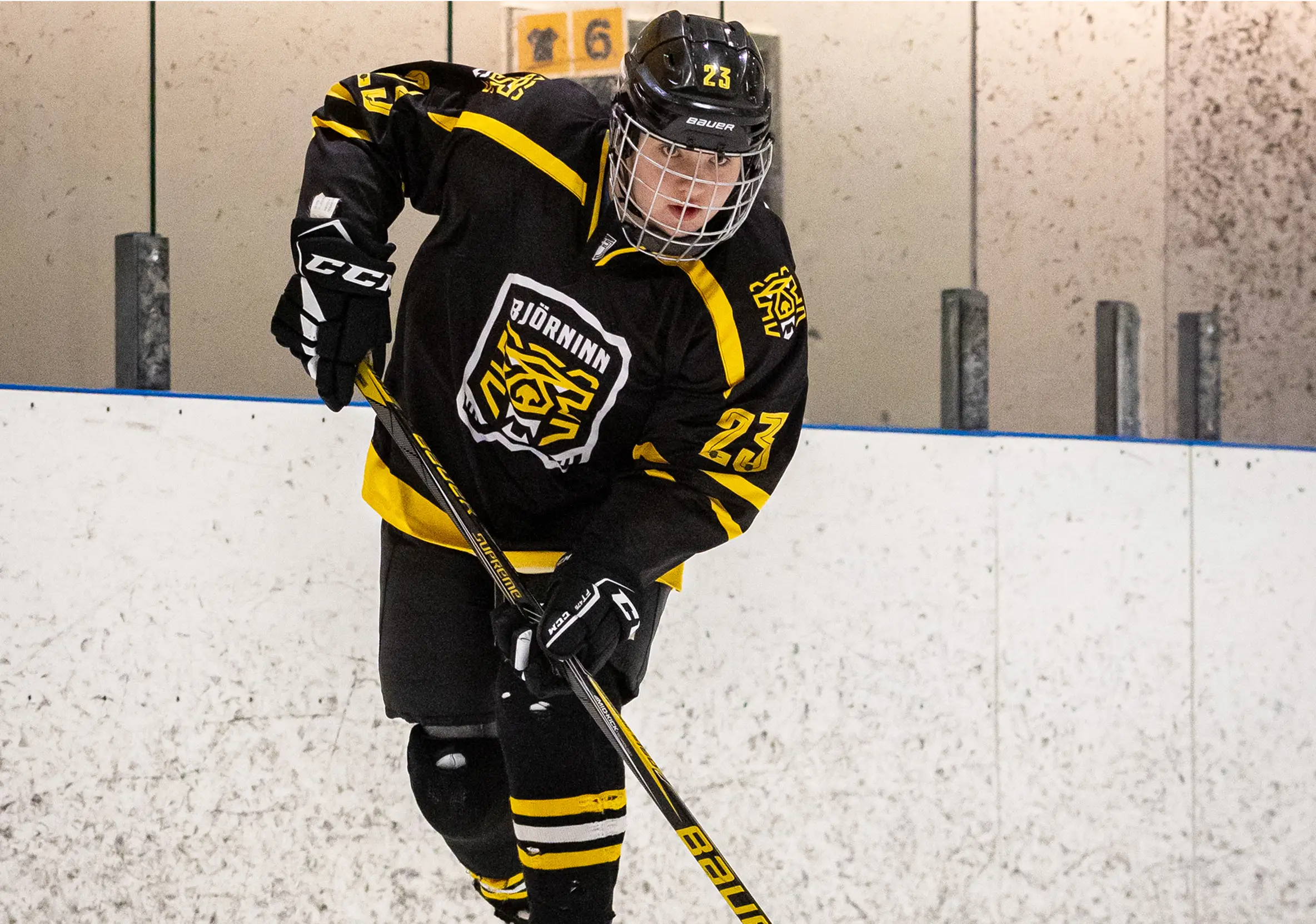
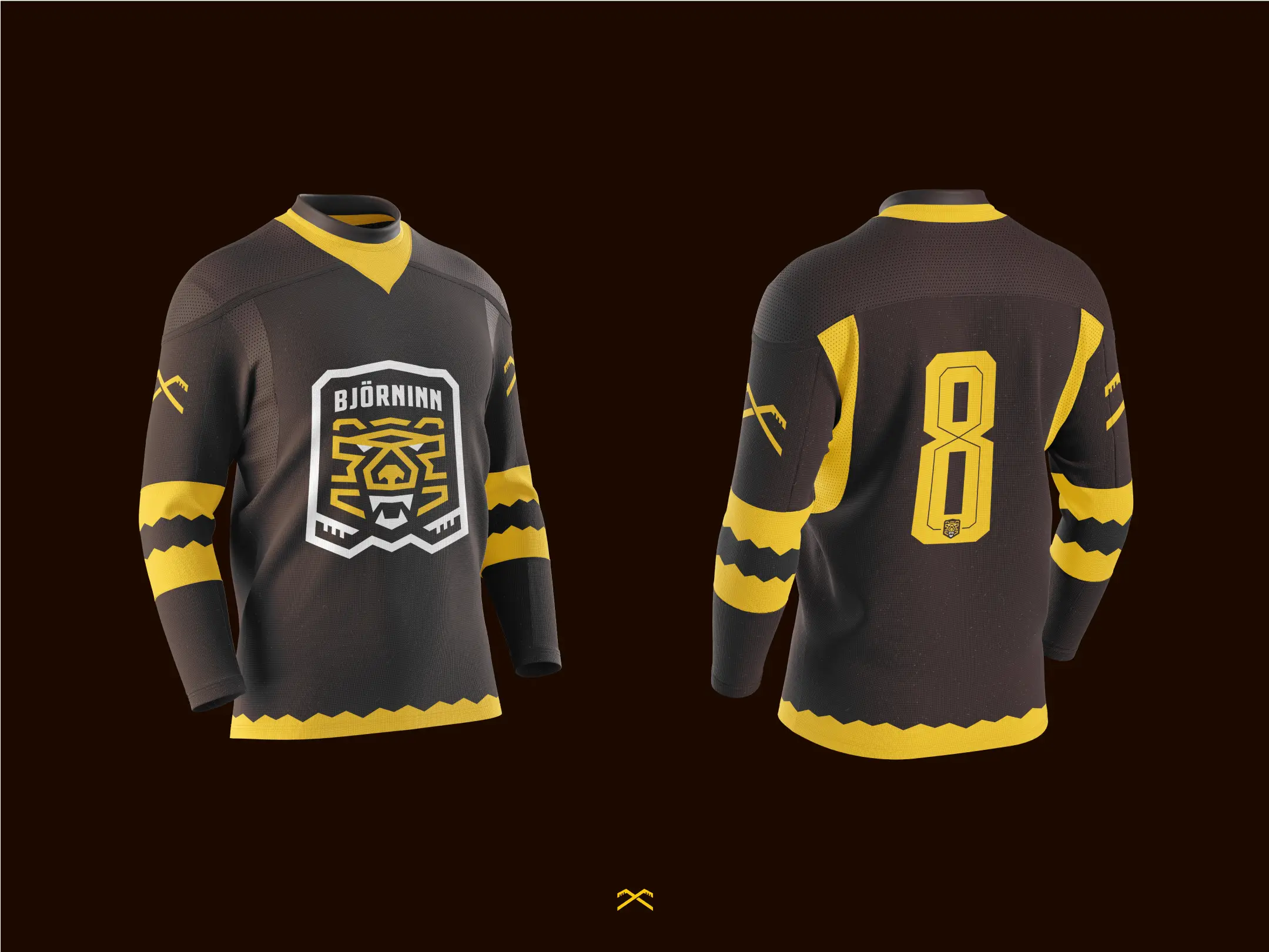
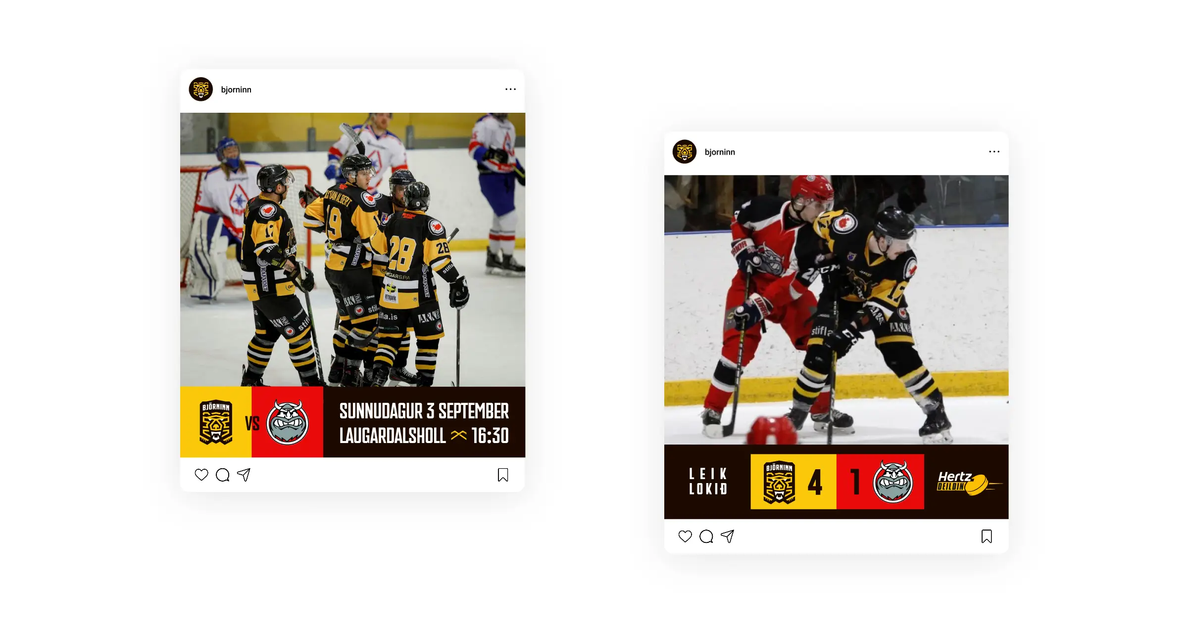
JERSEYS
Minimal Change, Maximum Impact
We redesigned Björninn’s jerseys with a subtle yet striking update that helps them stand out in Iceland’s small but passionate hockey community. Custom-designed numbers gave each jersey a personal, player-first touch and deepened the connection between the team and its supporters.

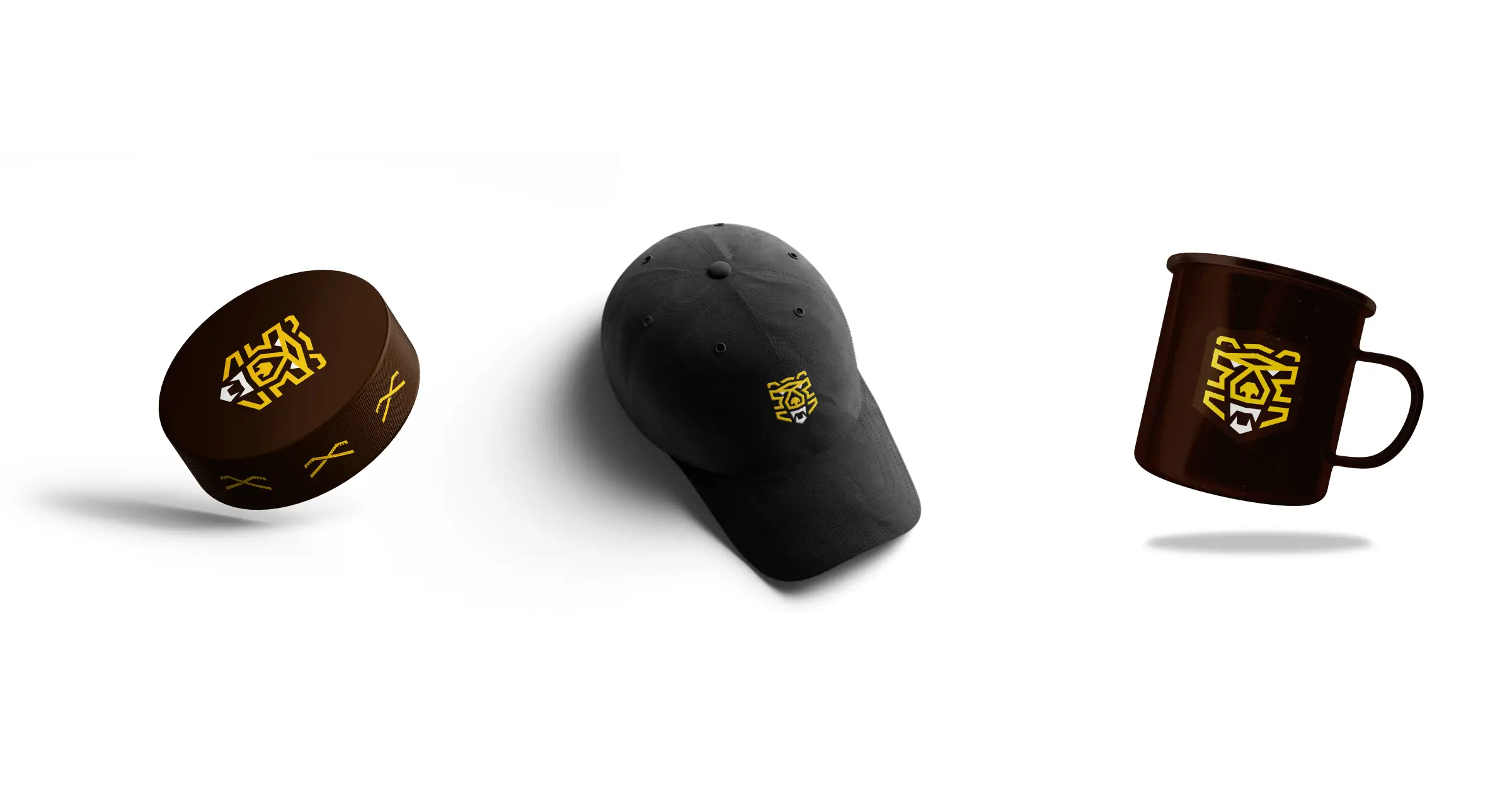
MERCH
Gear for Every Fan
To grow the club’s presence off the ice, we developed a merchandise line ranging from cups to hats, appealing to fans of all ages. Each item was crafted to reflect the new brand identity, turning supporters into walking ambassadors for the team.
Next project

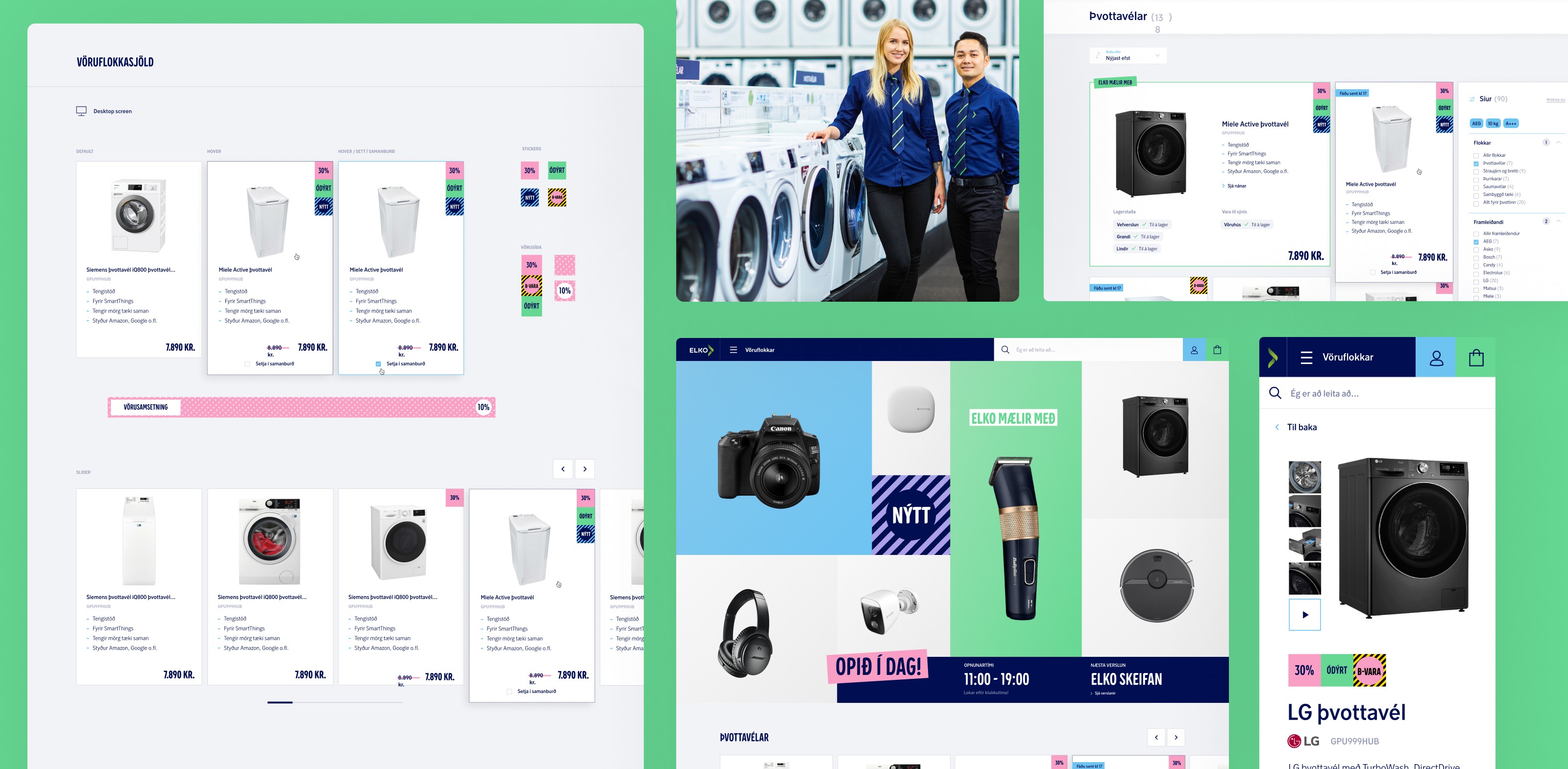
Web Store Redesign
UI Design


