We like to move it
Our Roles
Branding refresh
Visual language
Logo design
Motion design
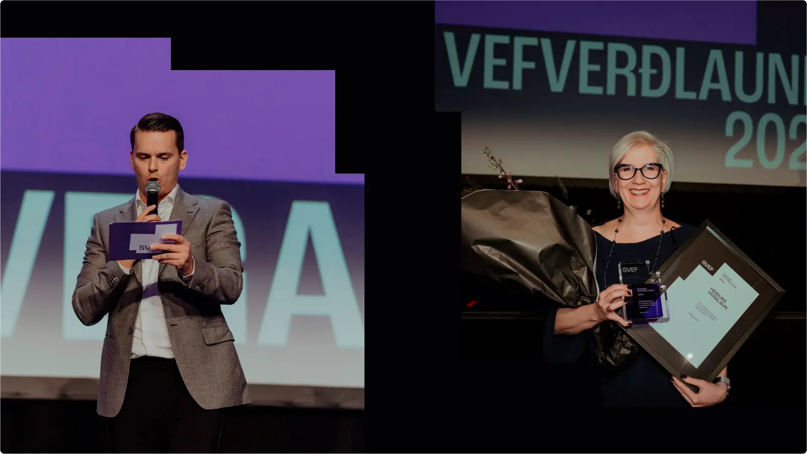
Client
Description
The mission
CONCEPT
The light bulb idea
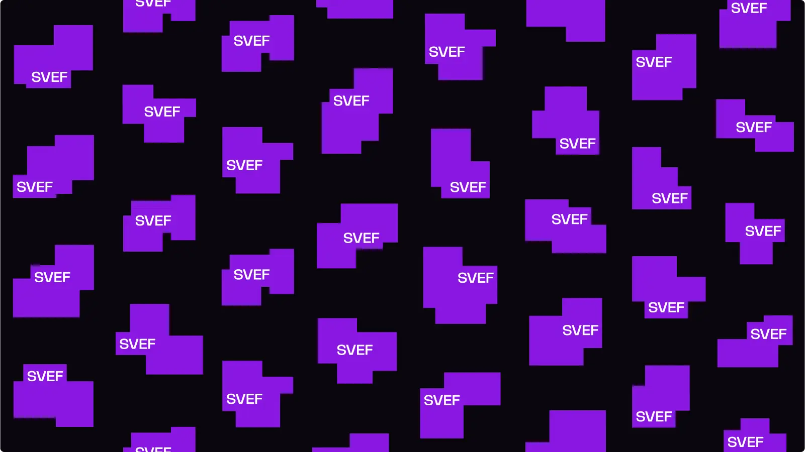
What is a website if not a bunch of pixels? And what does SVEF do? Where does SVEF live? Where does SVEF do its SVEF-y things?! In the pixel! That’s why their main visual identity is a pixelated shape, a symbol of how SVEF thrives in the digital world. It takes over the screen, moves around it, owns it. And it always moves forward.
IDENTITY
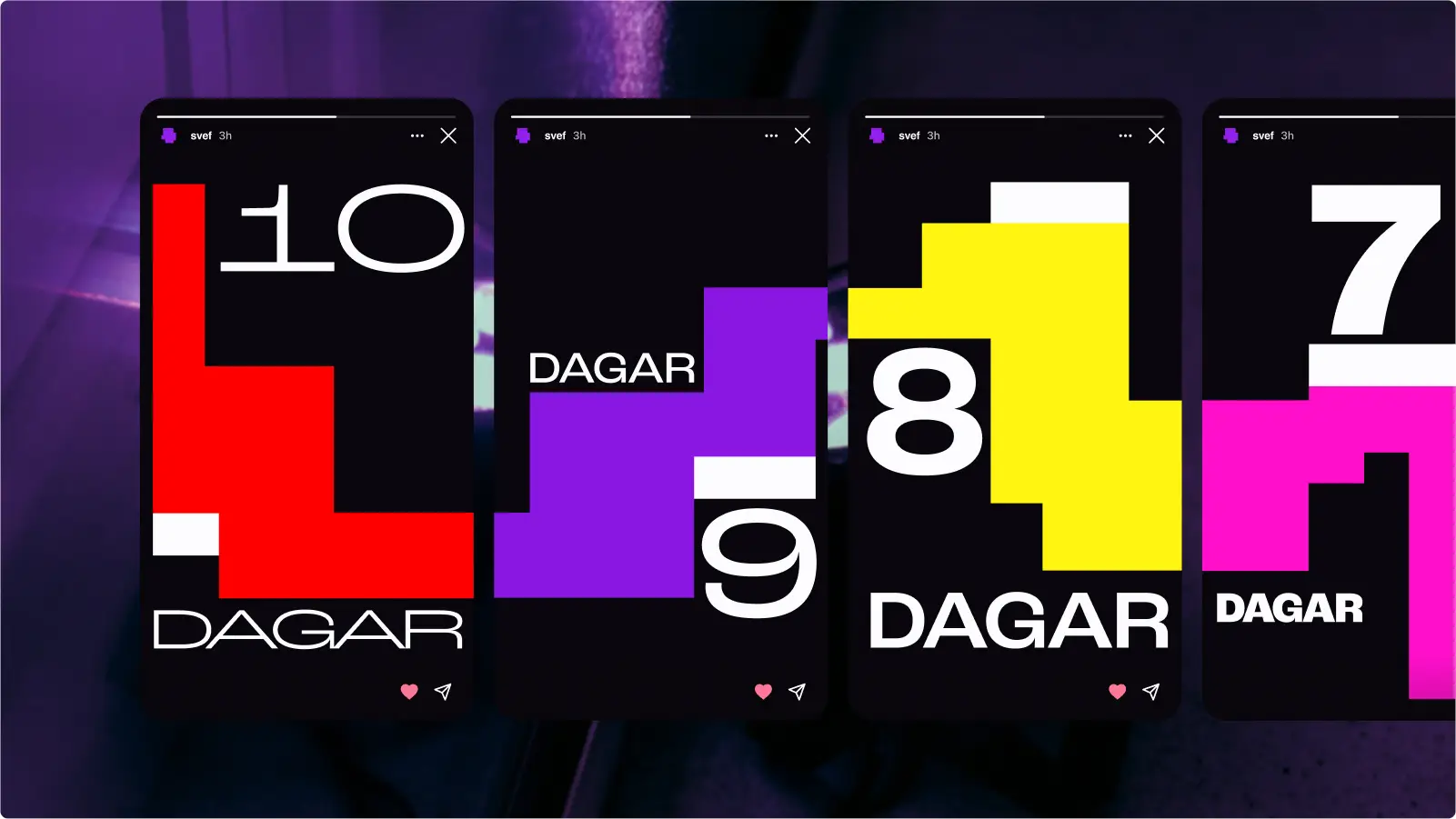
An almost infinite logo library
And the logo couldn’t be less (because of its ego, like designers). With SVEF’s flexible, dynamic and restless attitude, we created a logo that is never the same... but it’s the same... all at the same time. Changing it’s shape, SVEF’s logo has almost infinite possibilities.And we set a very strict rule on how to chose the logo: the have to close their eyes and pick one logo shape from the file list.
THE DRIVE
How this madness started
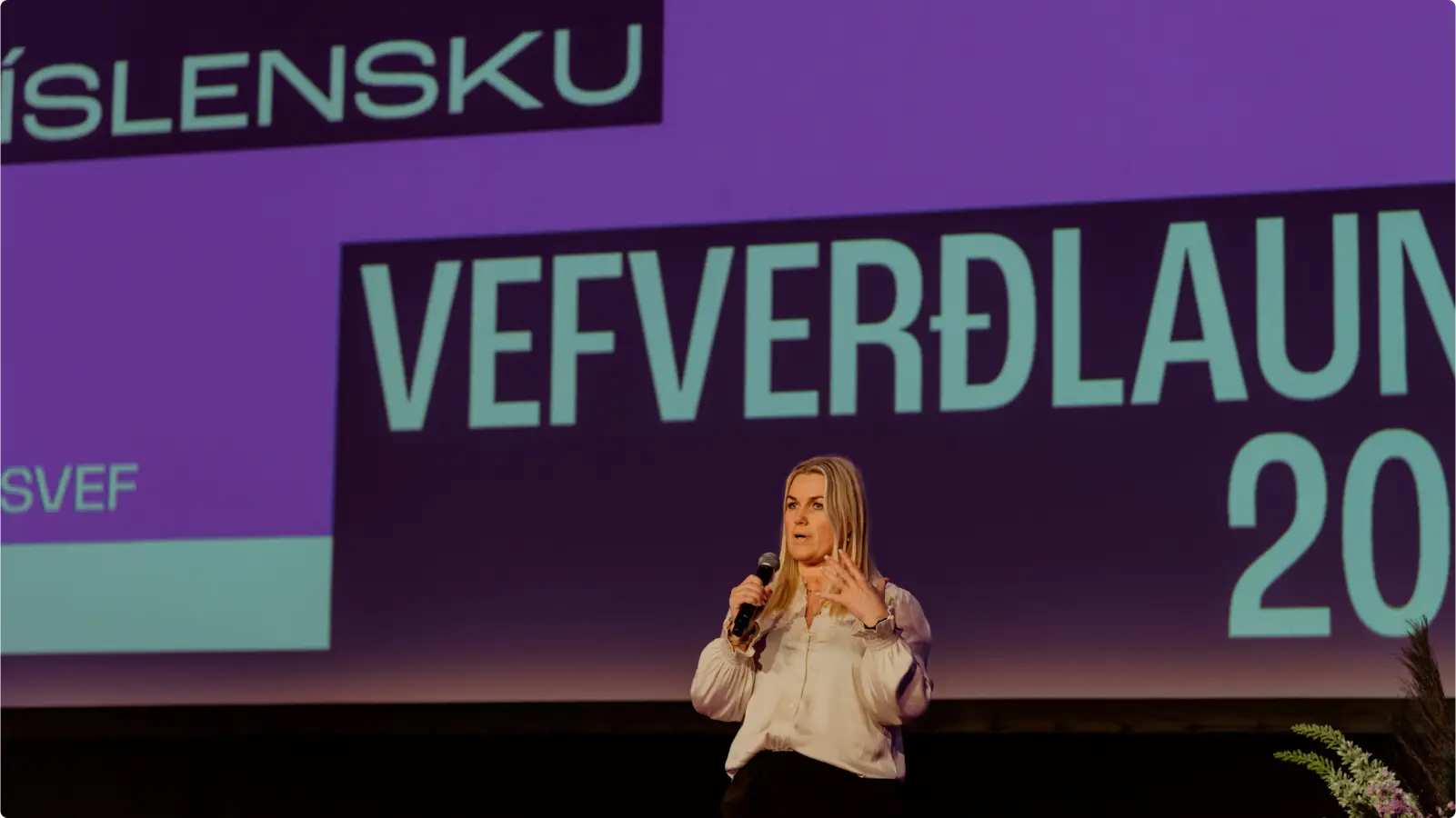
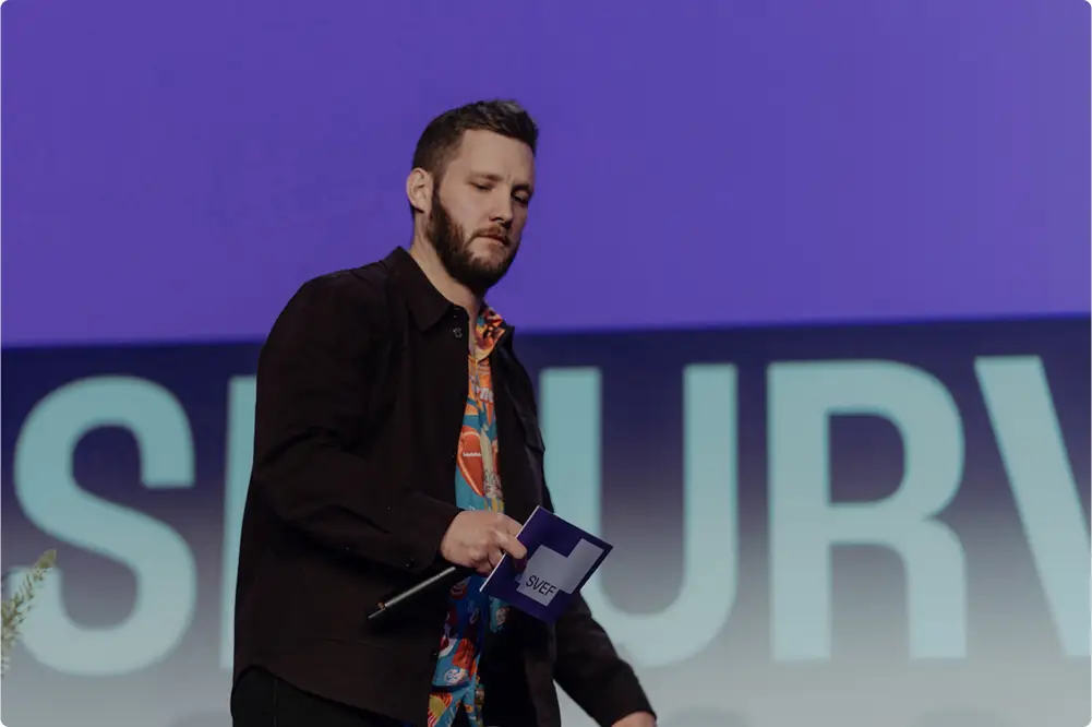
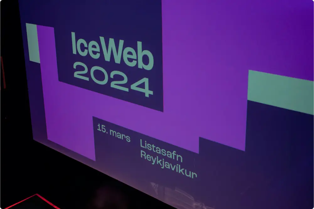
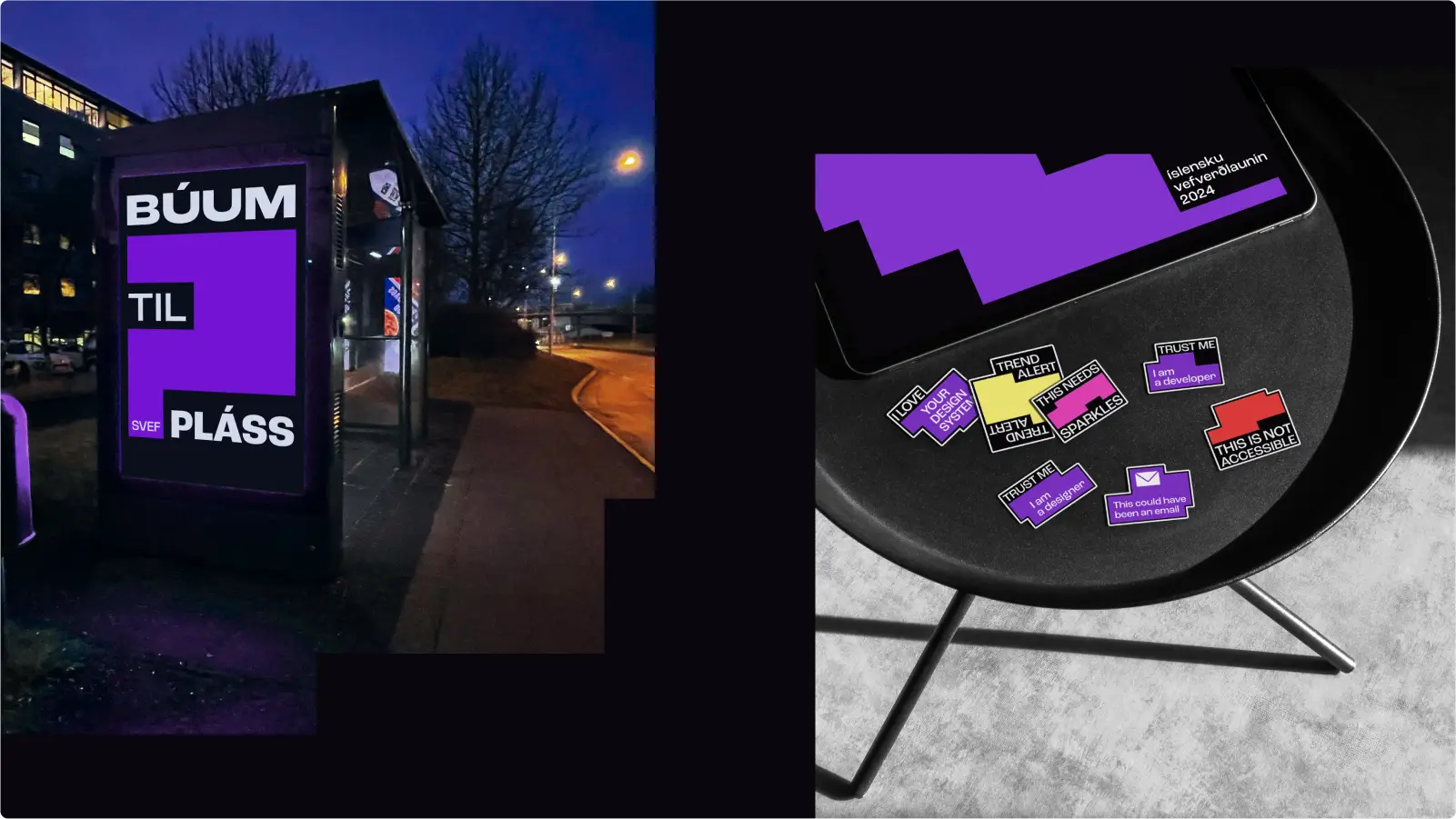
But SVEF isn’t just a logo. Did you know it all started with a bunch of people gathering over drinks to chat about design? Well, now you do. They’ve always been informal, spirited. That’s why their tone is playful, bold, and sometimes, just a little cheeky.

CHARACTER
Serious but not serious
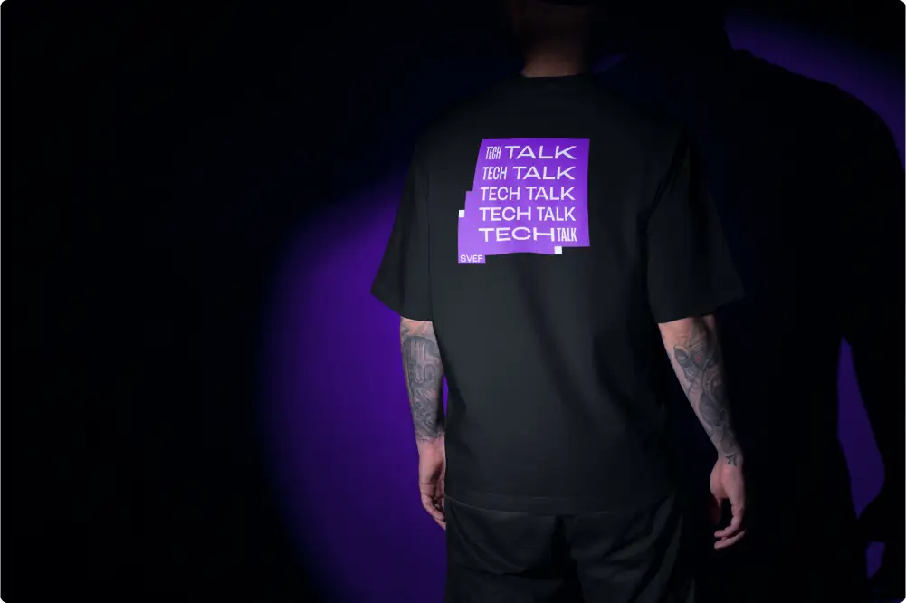
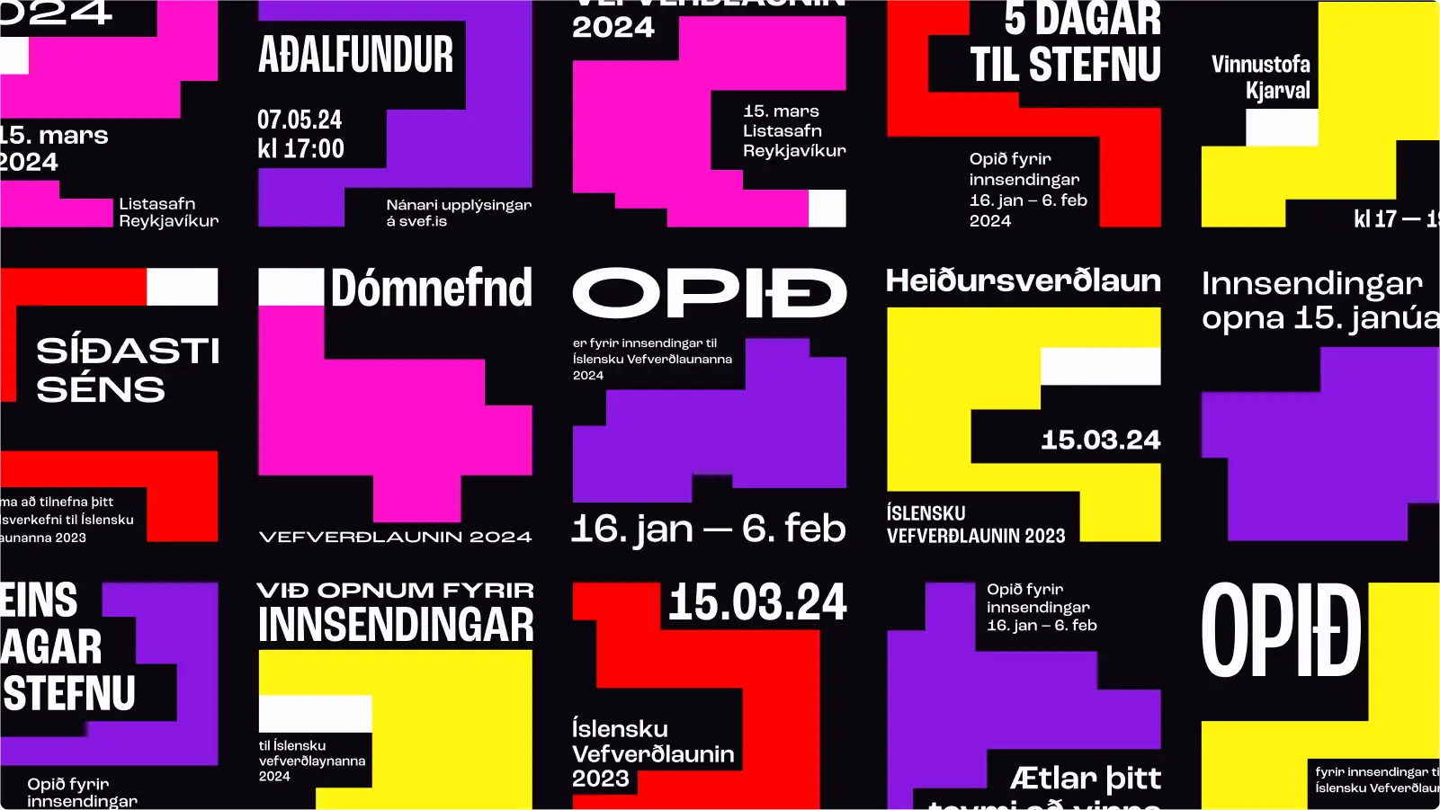
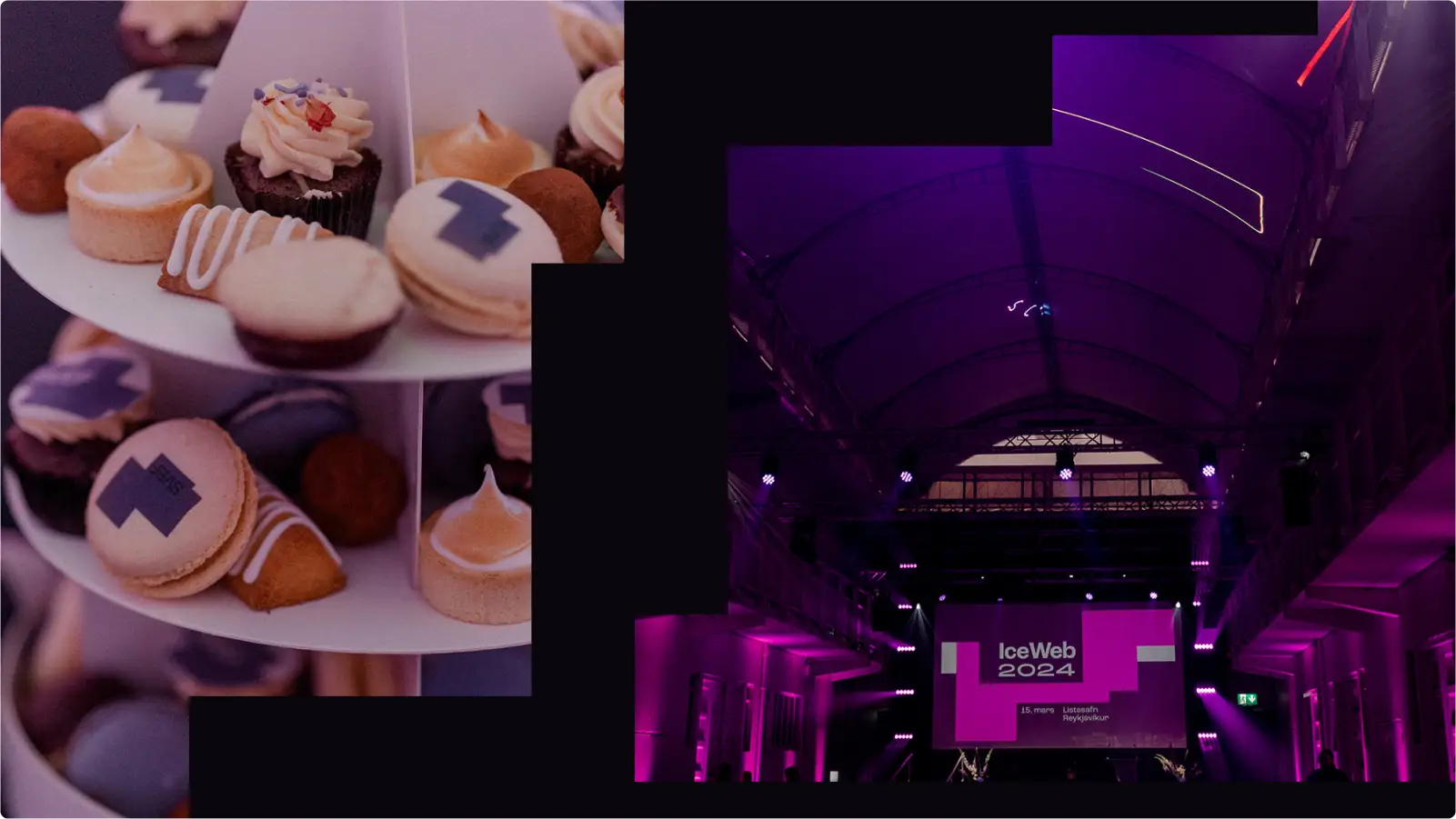
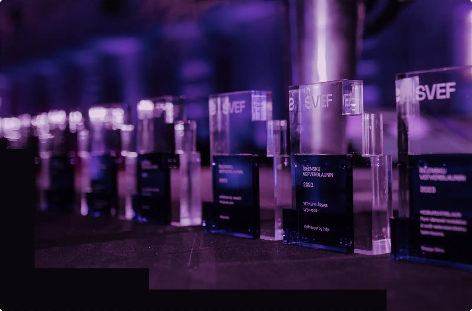
The branding reflects just that: restless, vibrant colors boldly contrasting, making your eyes flutter. Unapologetically ever-changing variable typography. And, of course, some seriously cool swag.
Next project
.webp)
.webp)
Simple Sports Tracking App
UX Design
App Design


