
From Vision to Viska
Our Roles
Design System
Web design
Client
Description
The mission
.webp)
.webp)
.webp)
Branding
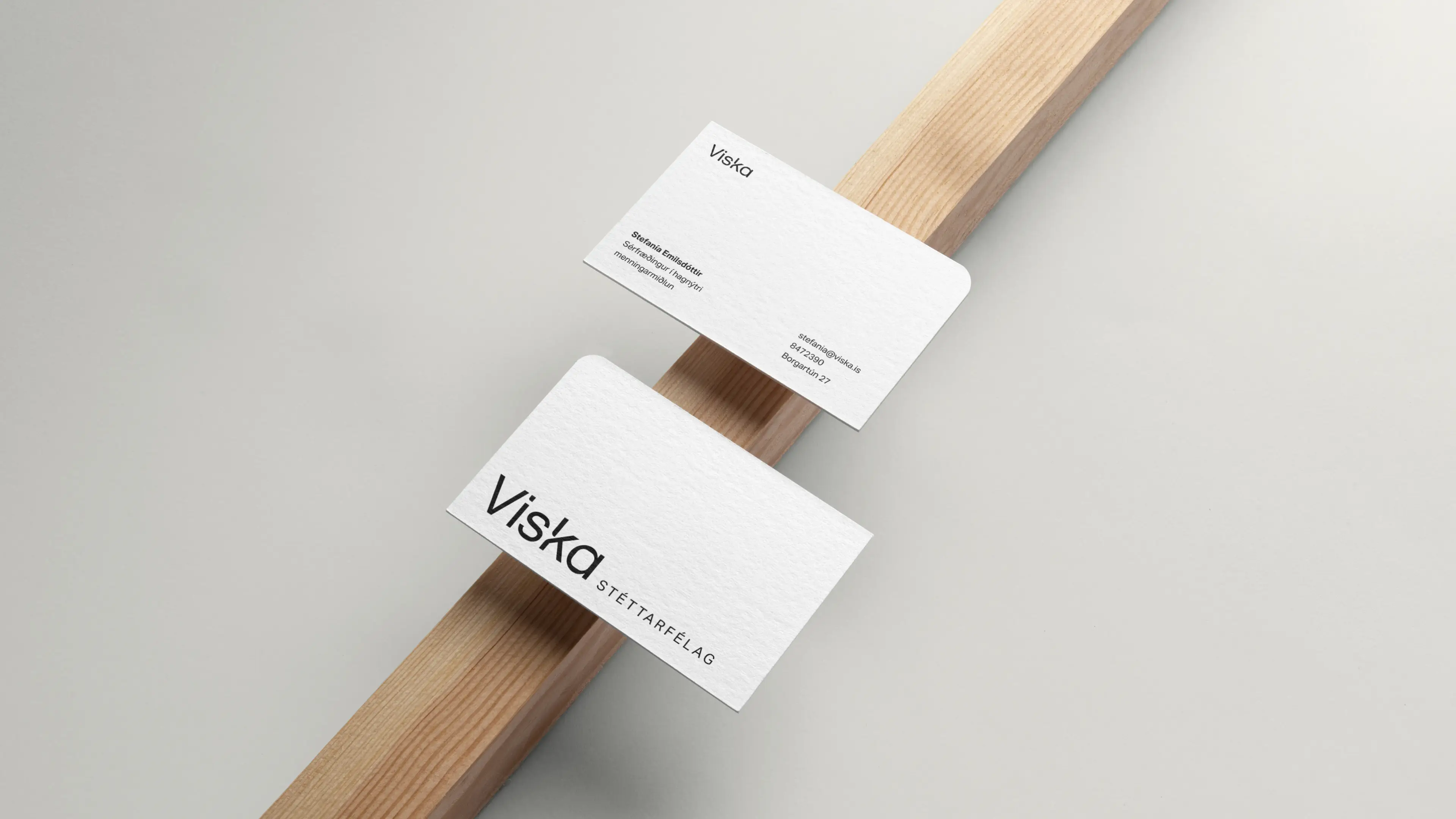
A minimal identy
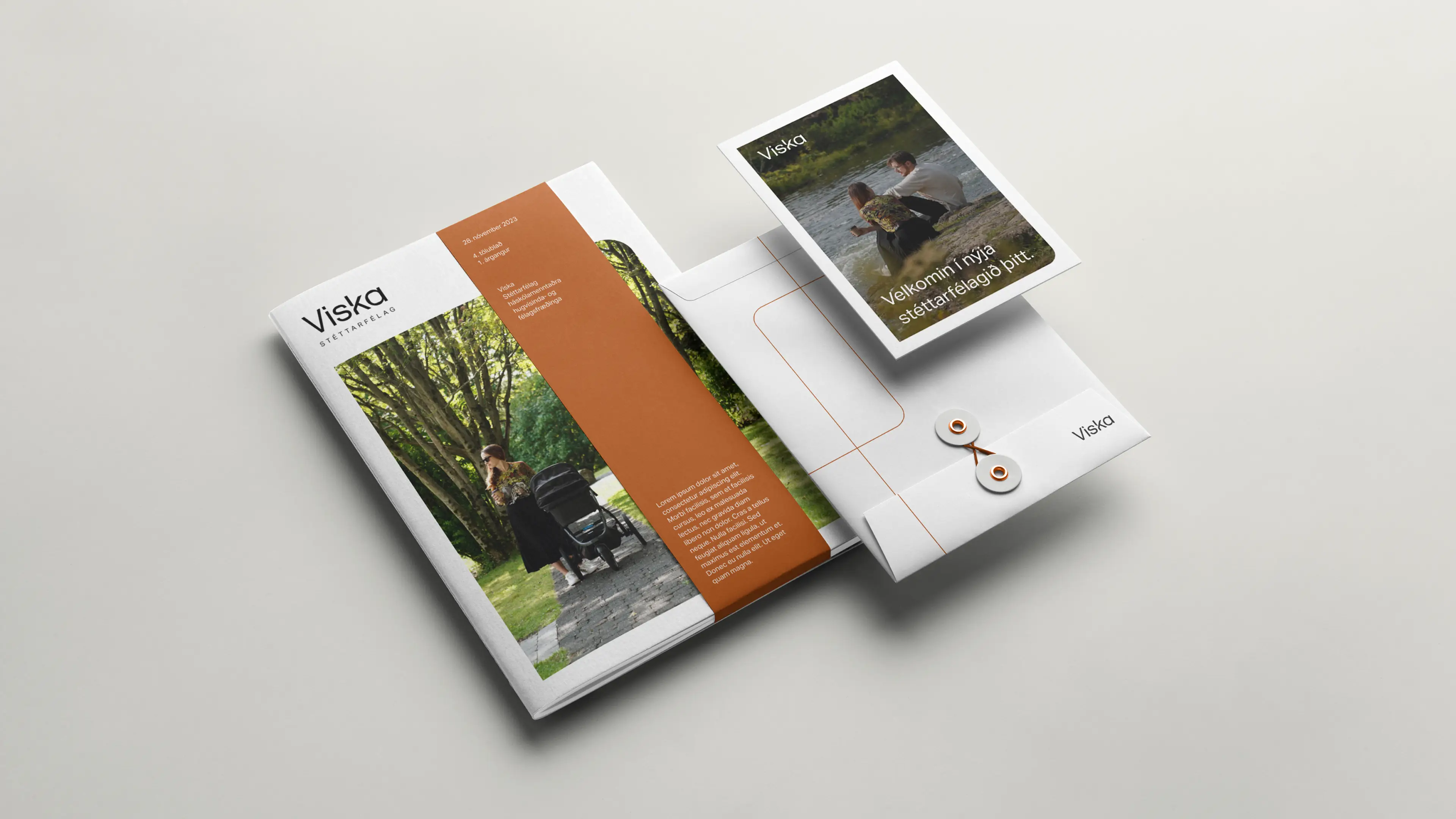
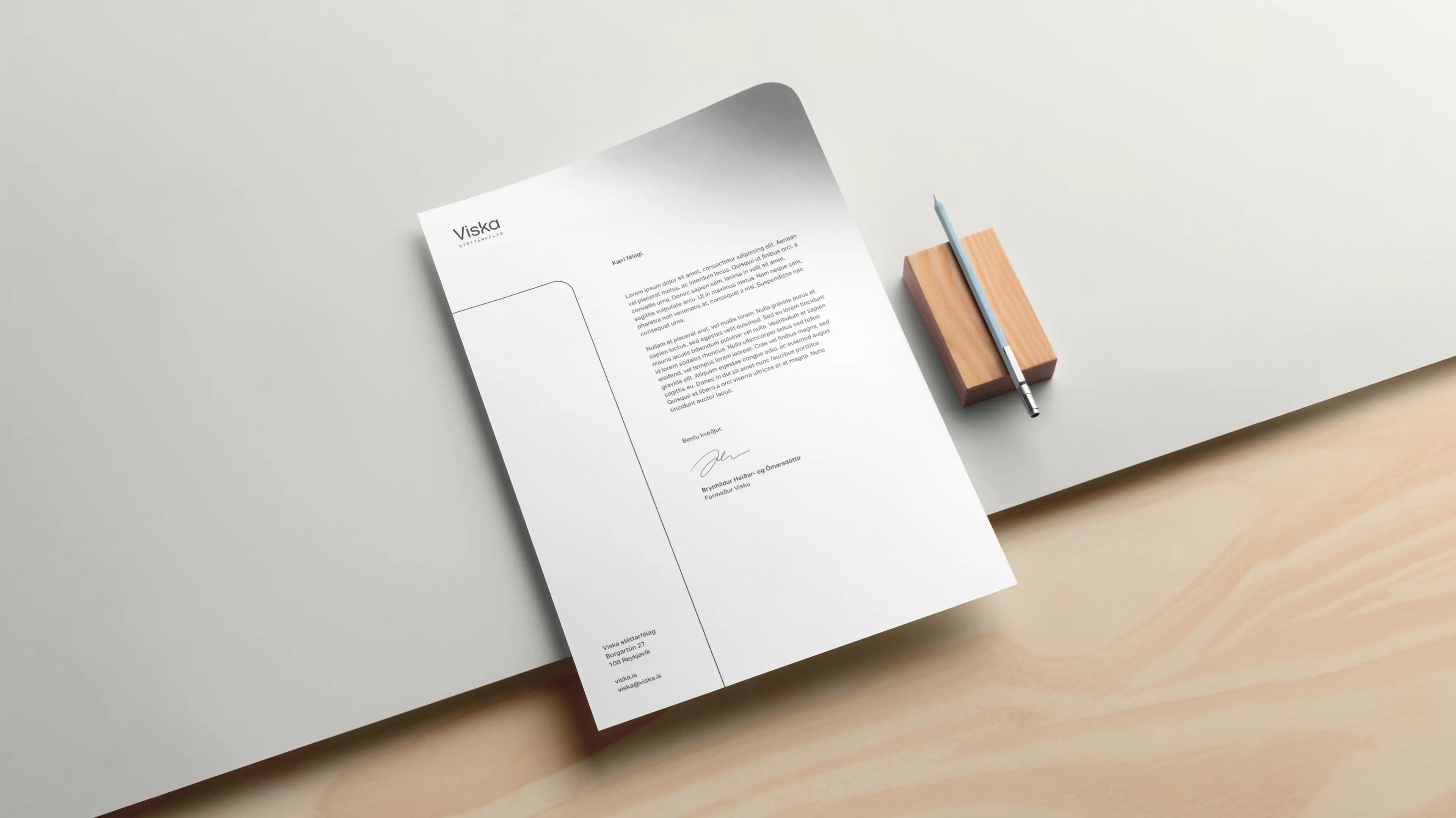
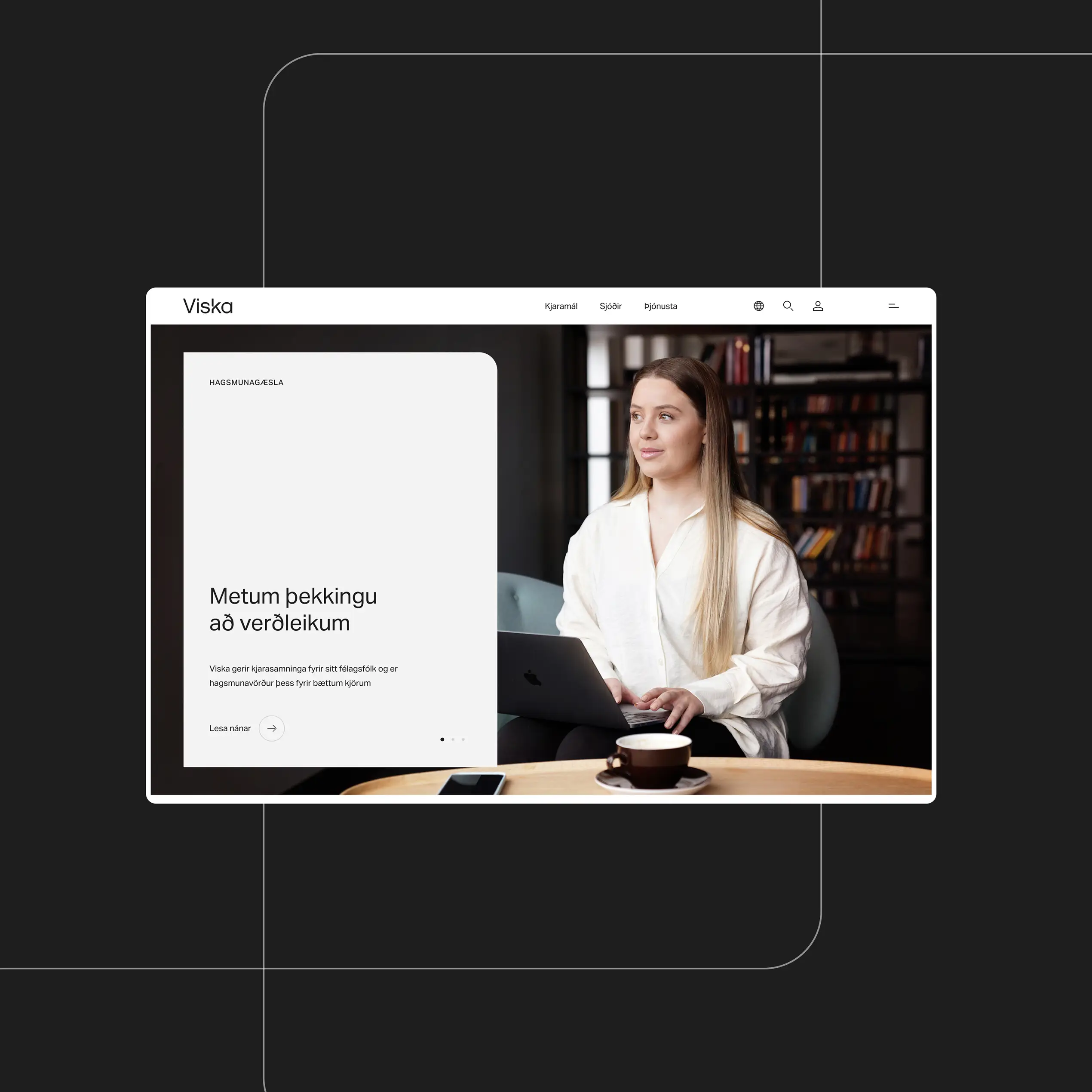
We began with a stylescape workshop, presenting three tailored proposals to define Viska’s visual direction. The final identity centers on a clean wordmark with signature rounded corners, supported by a minimal color palette of warm black, pure white, and earthy tones. This balance of simplicity and warmth makes the brand both professional and approachable.
Layout
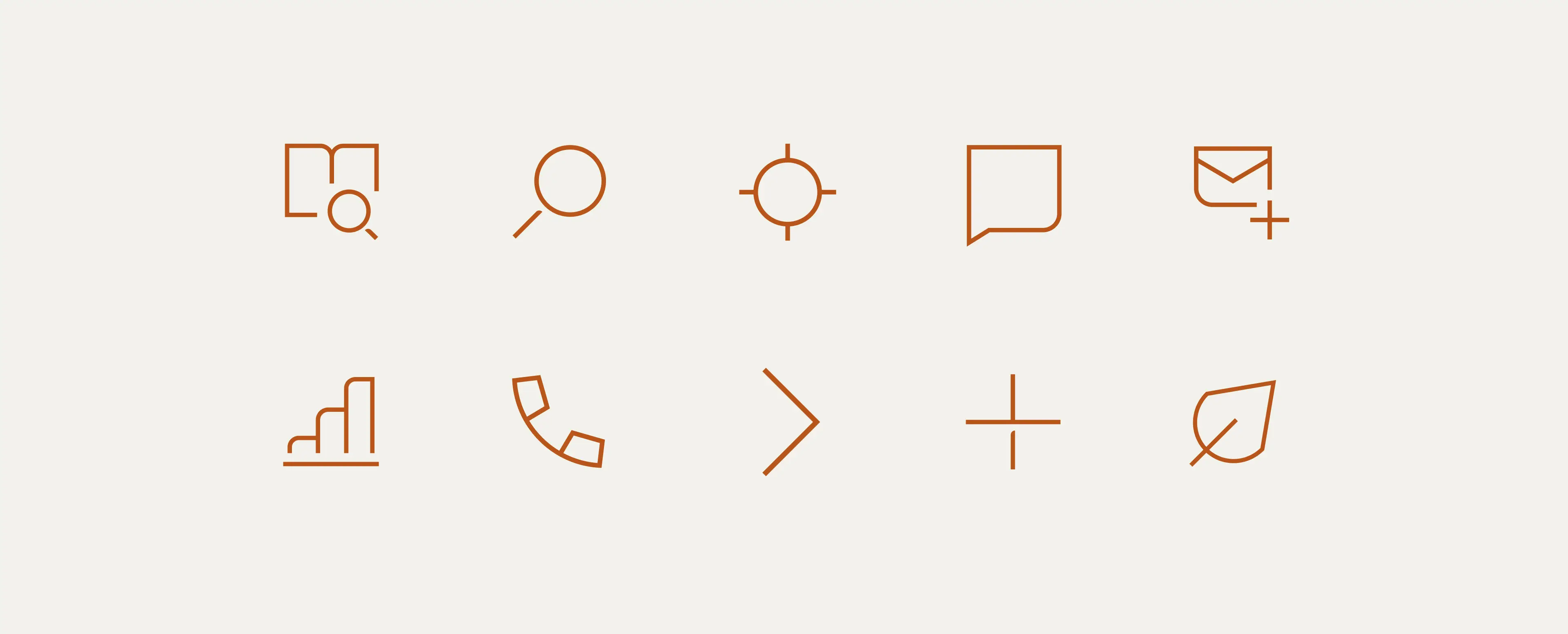
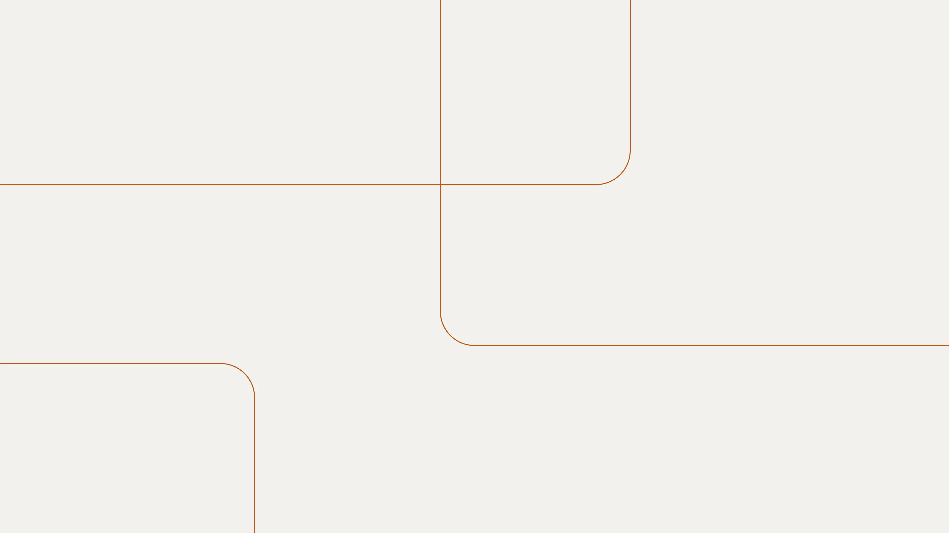
Recognizable design language
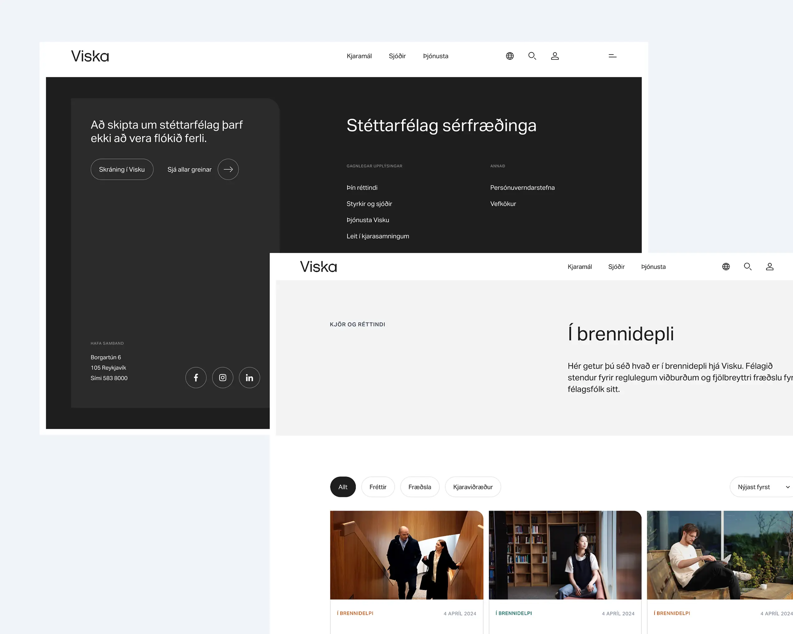
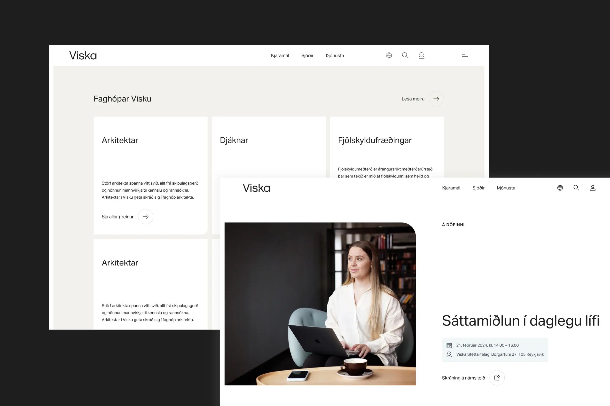
Viska’s graphic style is minimalistic, yet distinct. A single rounded corner is used consistently in photography, frames, and business cards, giving all visuals a recognizable signature. In some cases, curved lines are introduced as graphic elements, adding variety while maintaining a cohesive look.
What we do
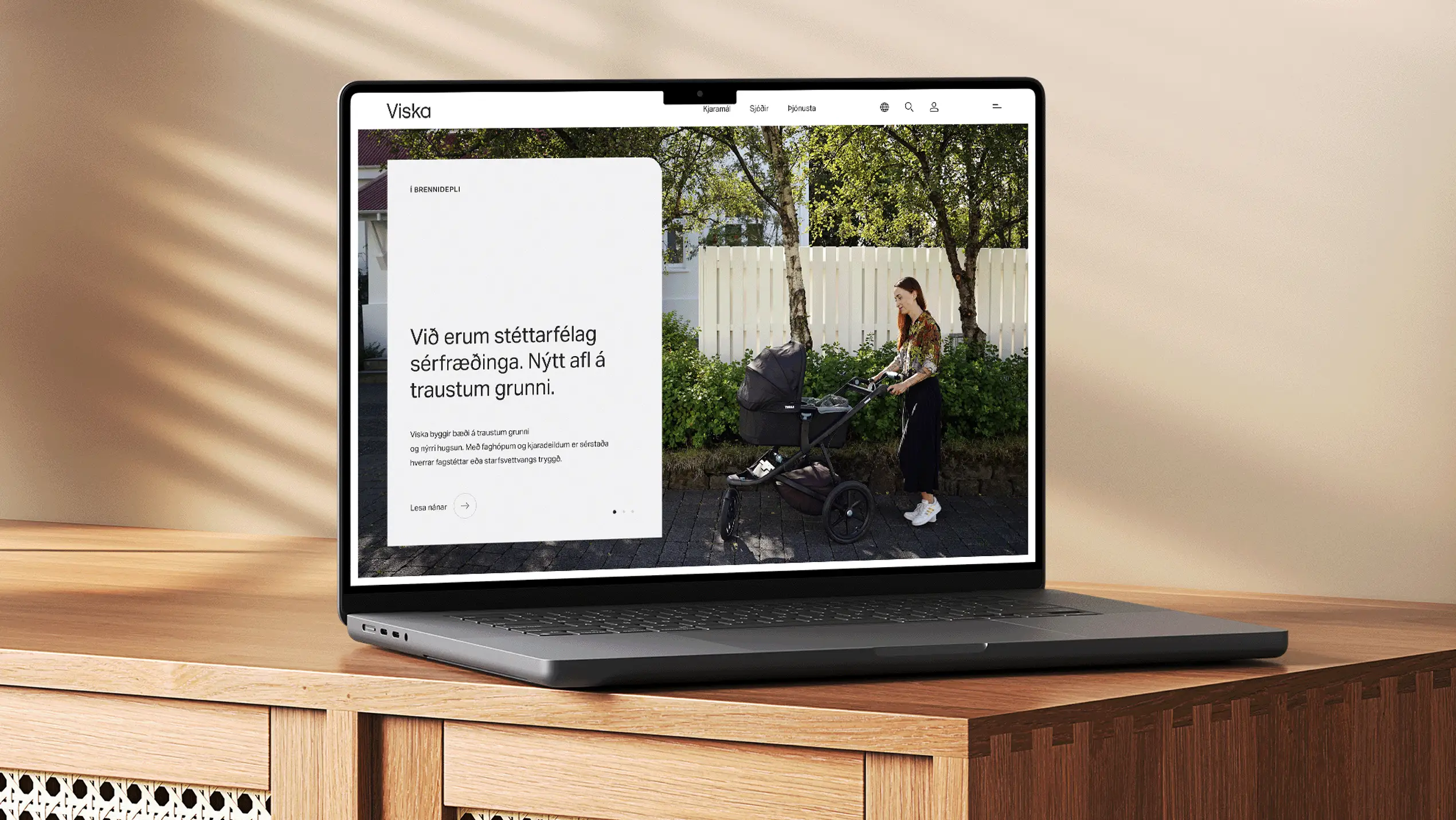
A platform for lifelong learning
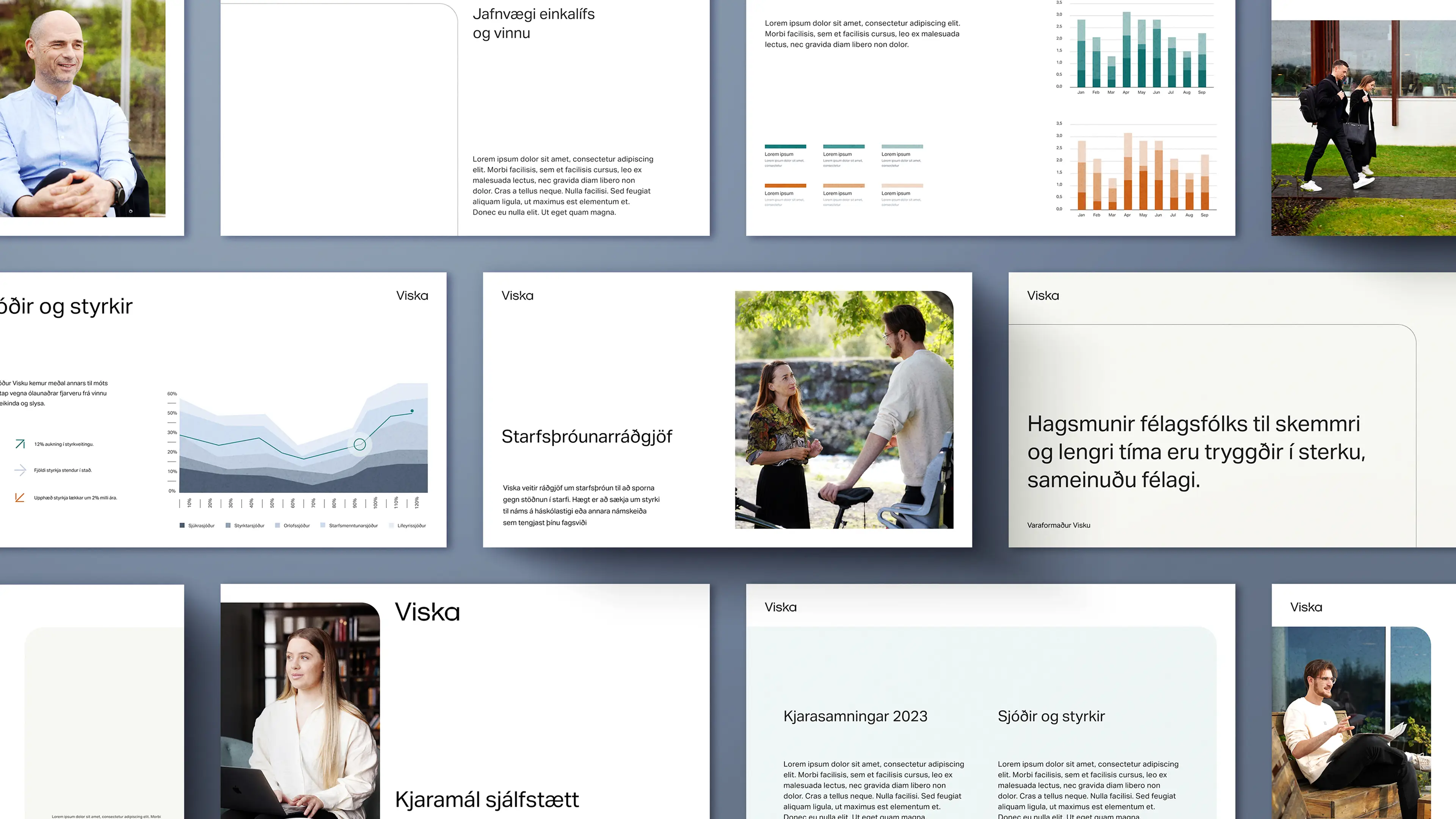
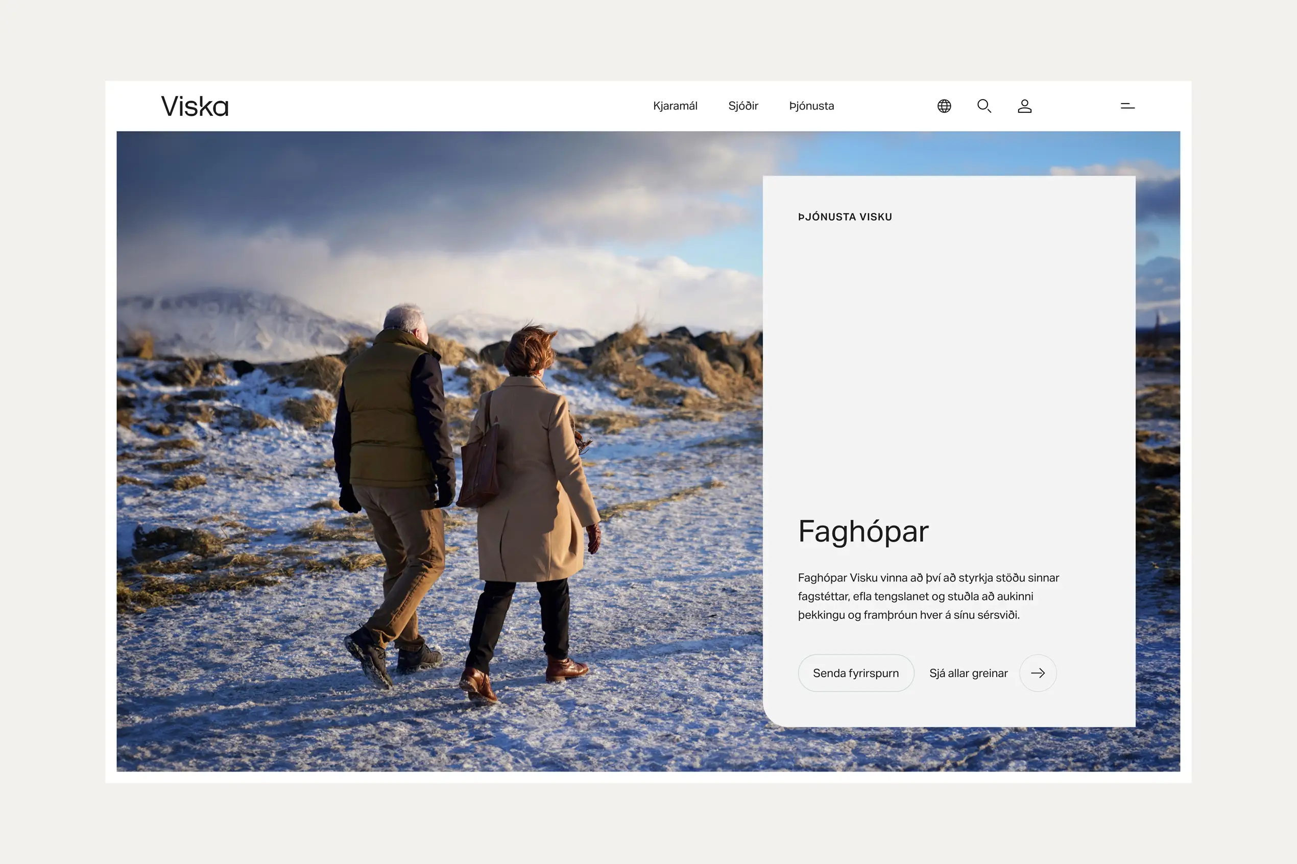
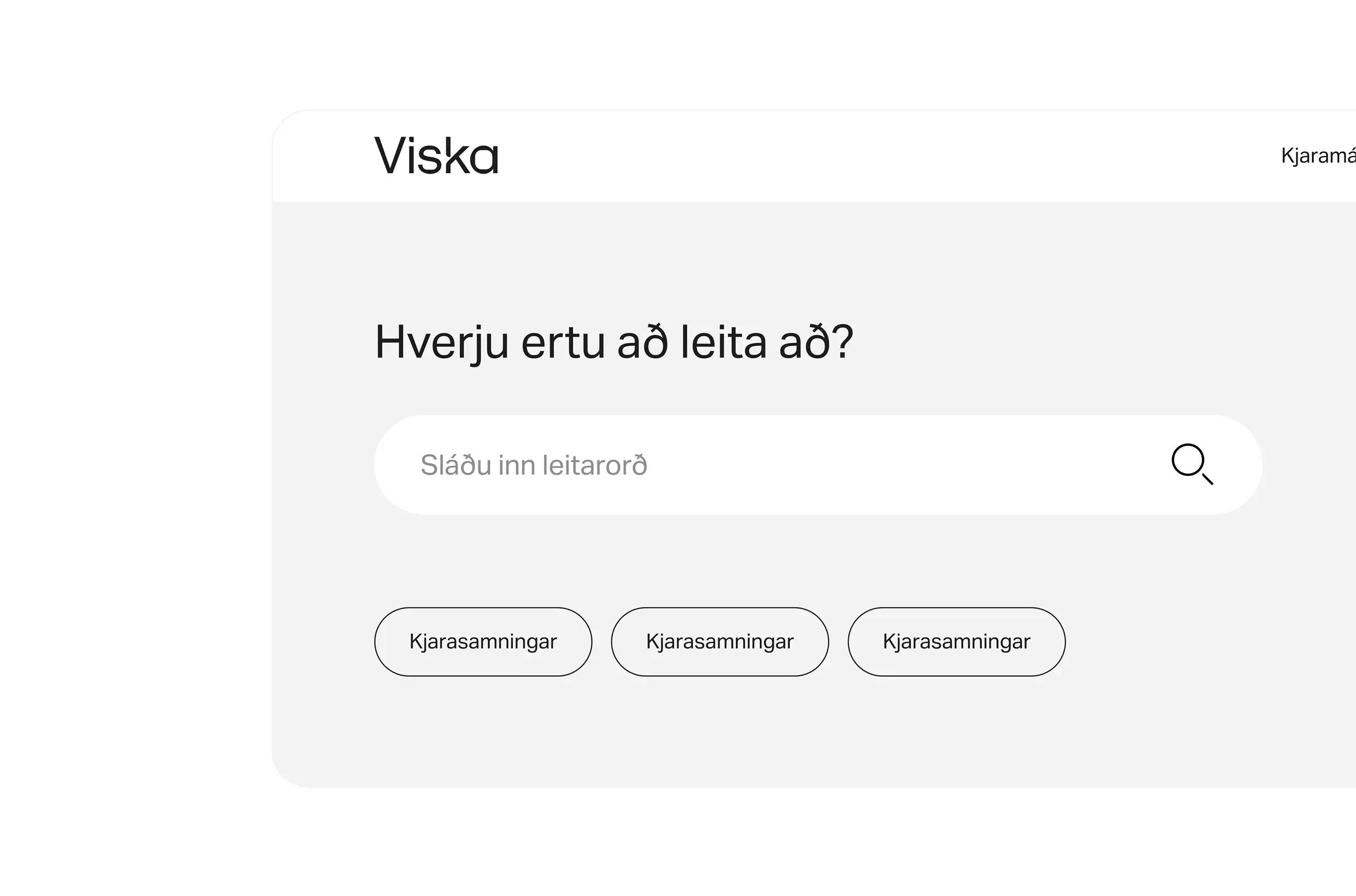
The website was designed to serve both individuals and companies, offering courses and tools for skill-building. Its design reflects Viska’s values of clarity and user-centered thinking, creating an online experience that is professional, intuitive, and welcoming.
Conclusion
Knowledge made accessible
Viska.is fully lives up to its name — offering a clear, easy-to-use platform that supports the mission of lifelong learning. By blending professionalism with warmth, the brand and website strengthen Viska’s image while making education more inspiring and accessible to all.
Next project
A taste of better UX
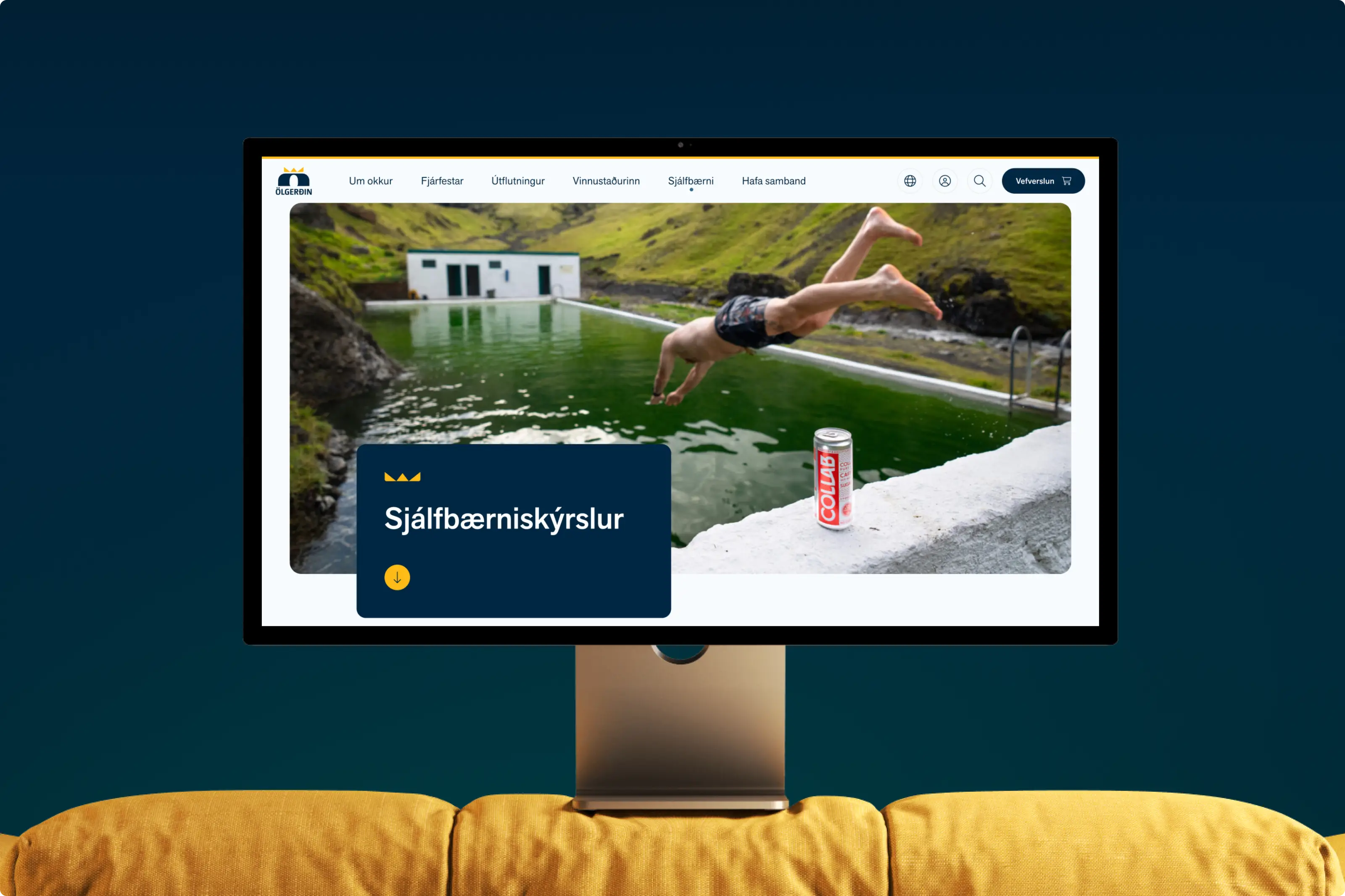
Web accessibility
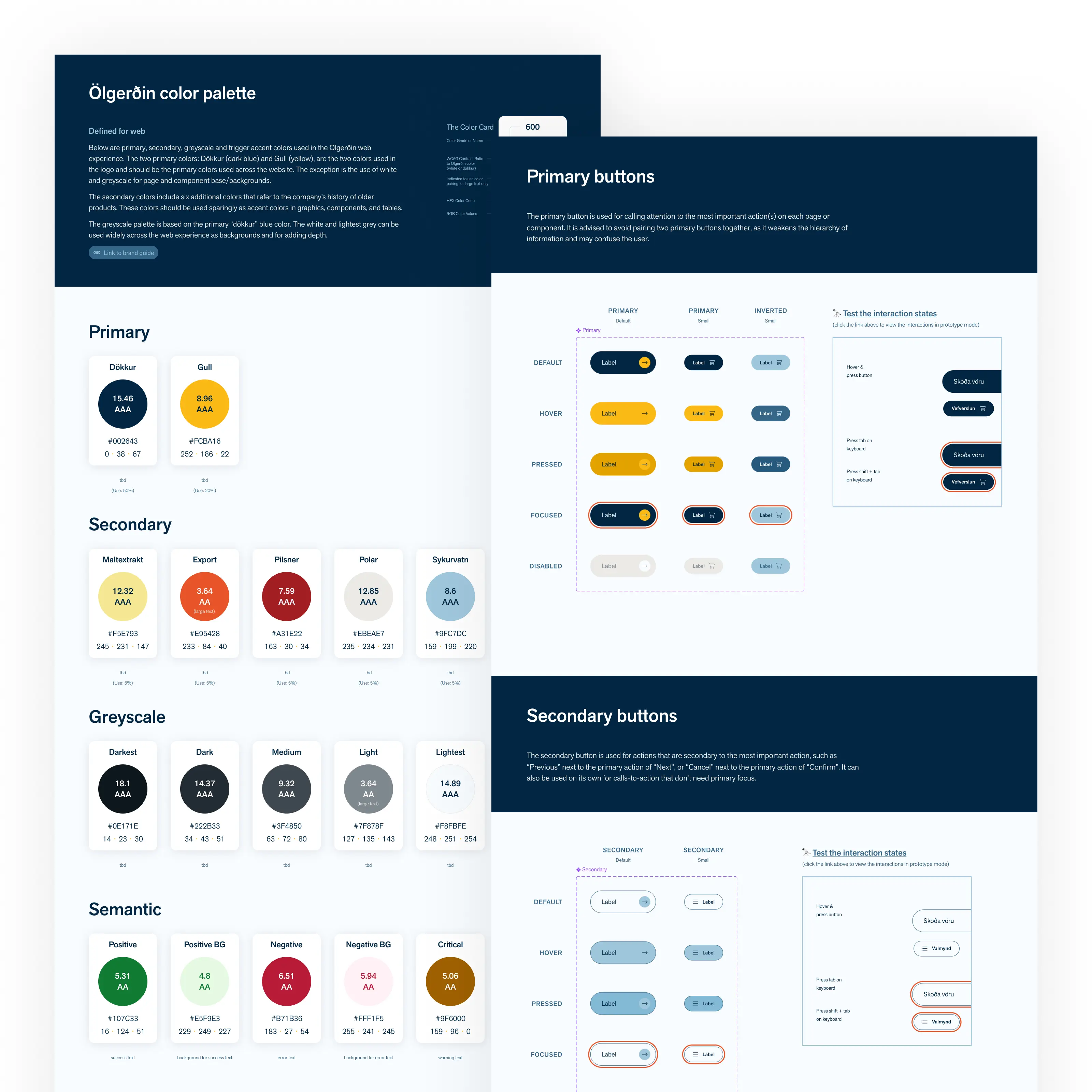
Multi-brand design system


