A fly fishing brand
Our Roles
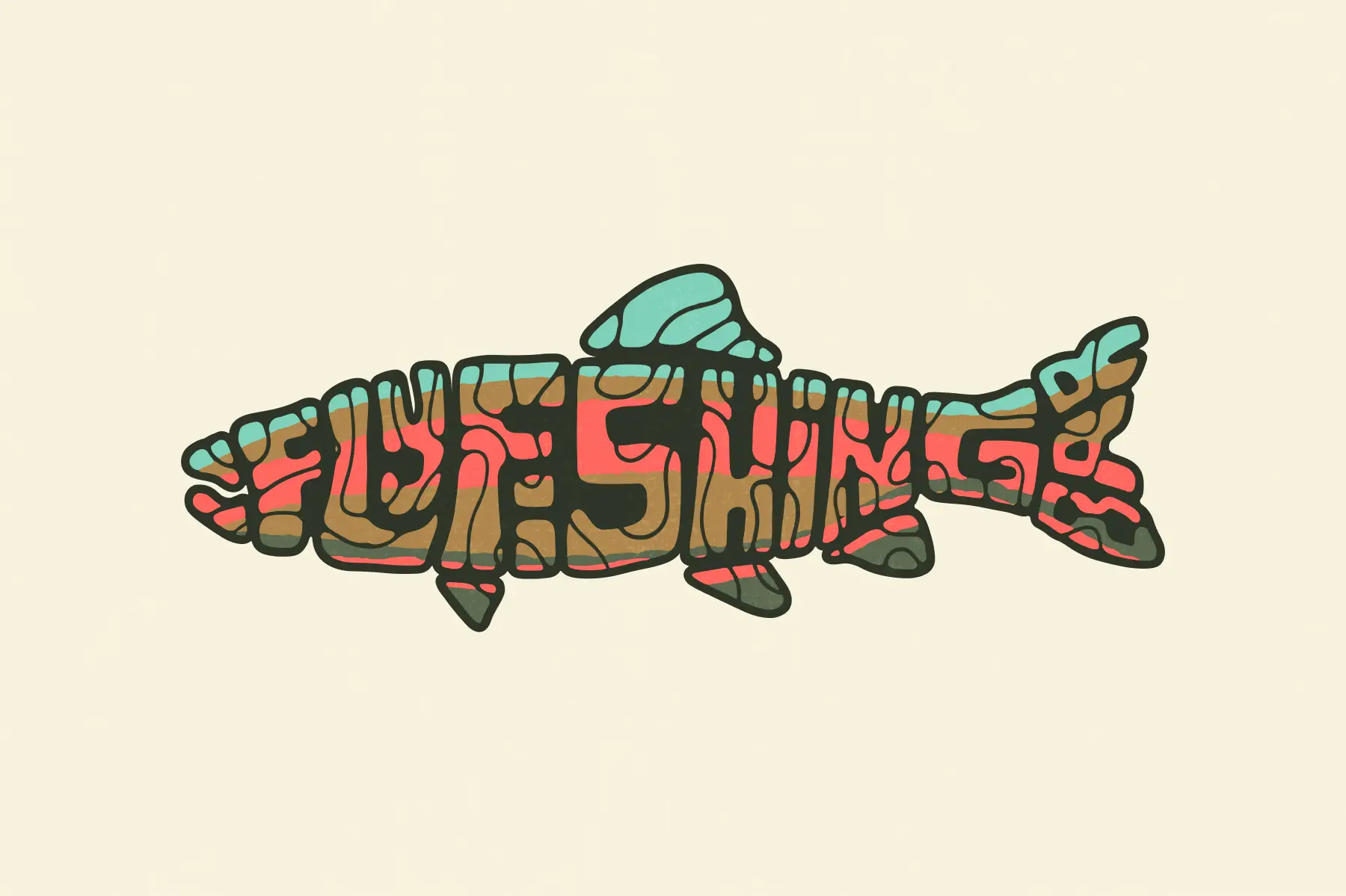
Illustration
Web design
Client
Description
The mission
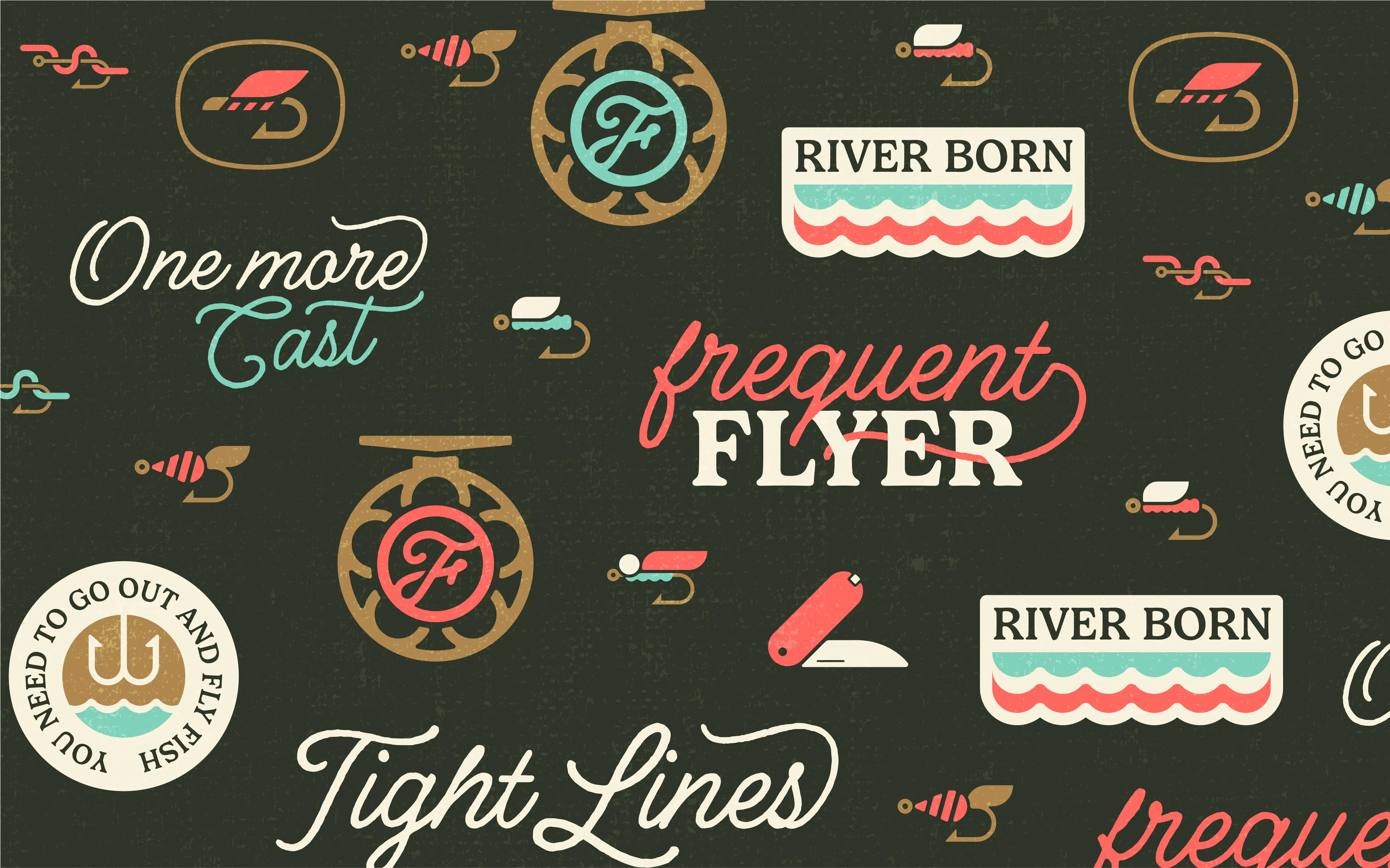
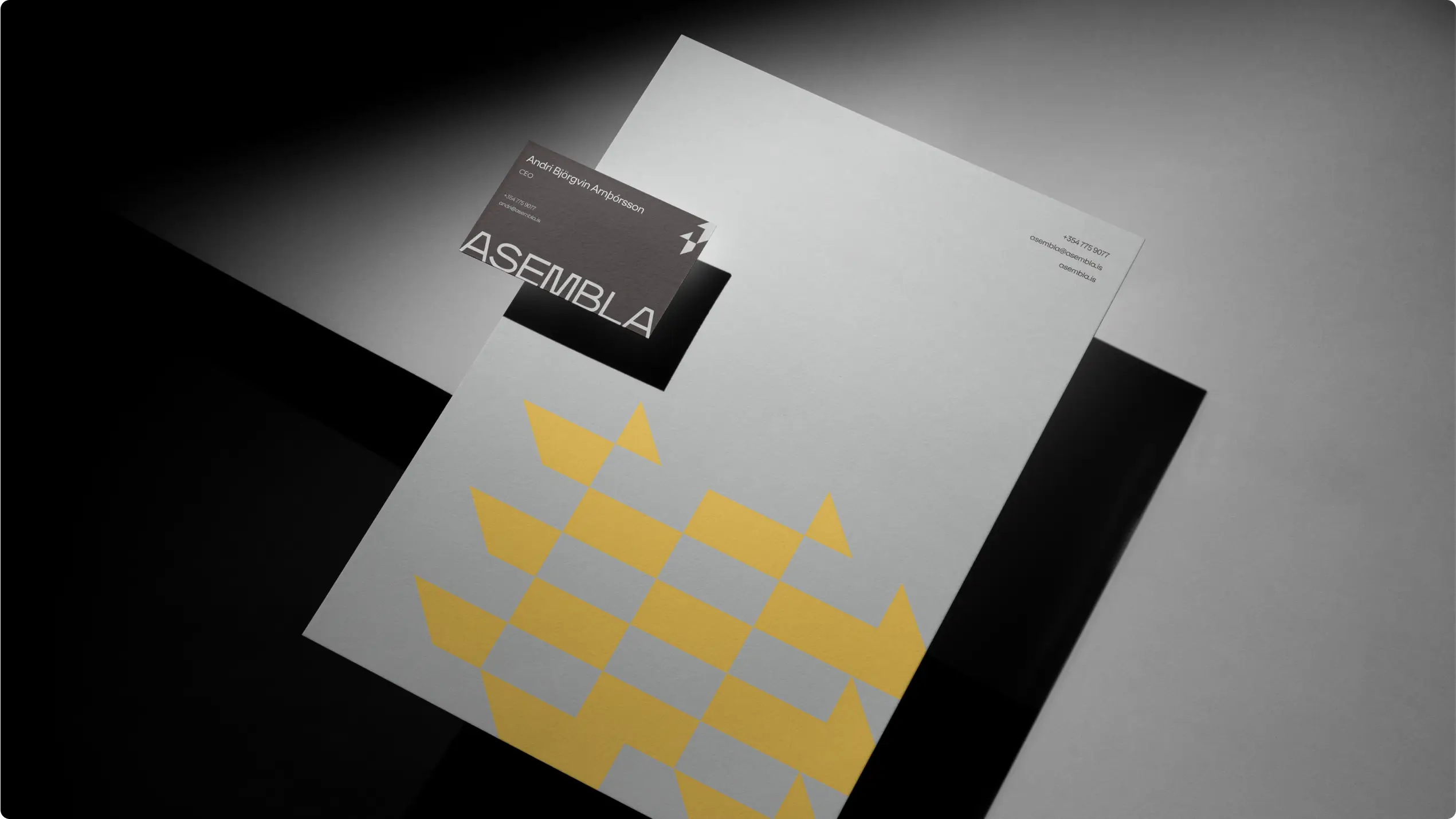
Logo
A fly at the core
The logo is centered around a stylized fishing fly — the heart of the sport. It’s simple, iconic, and flexible, designed to be instantly recognizable whether printed on packaging, embroidered on hats, or stamped onto gear.
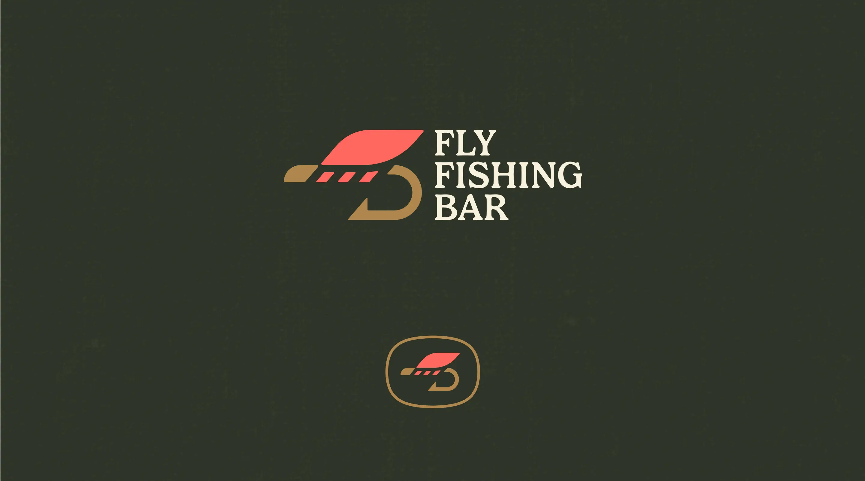
Style
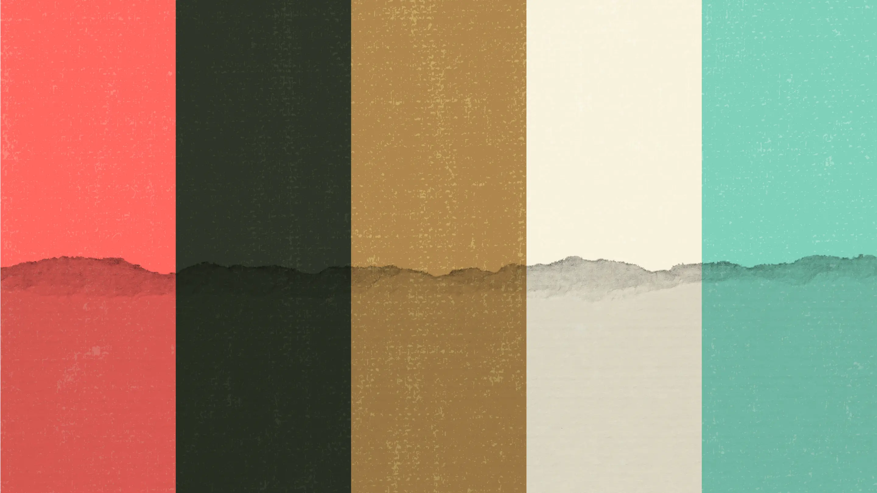
Typography and colors with character
The identity combines two fonts: Espiritu, a script that adds energy and personality, and Gelica, a serif that grounds the brand with outdoor, heritage vibes. A palette of earthy tones and saturated accents balances natural authenticity with a hint of retro flair, echoing the lifestyle of anglers.
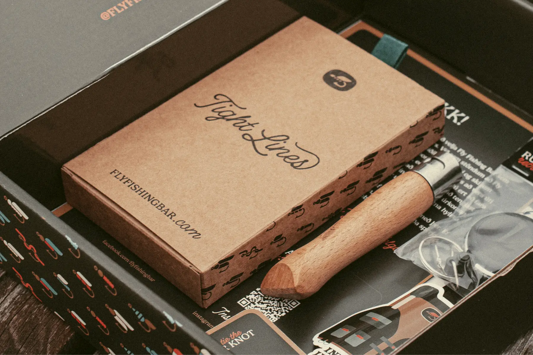
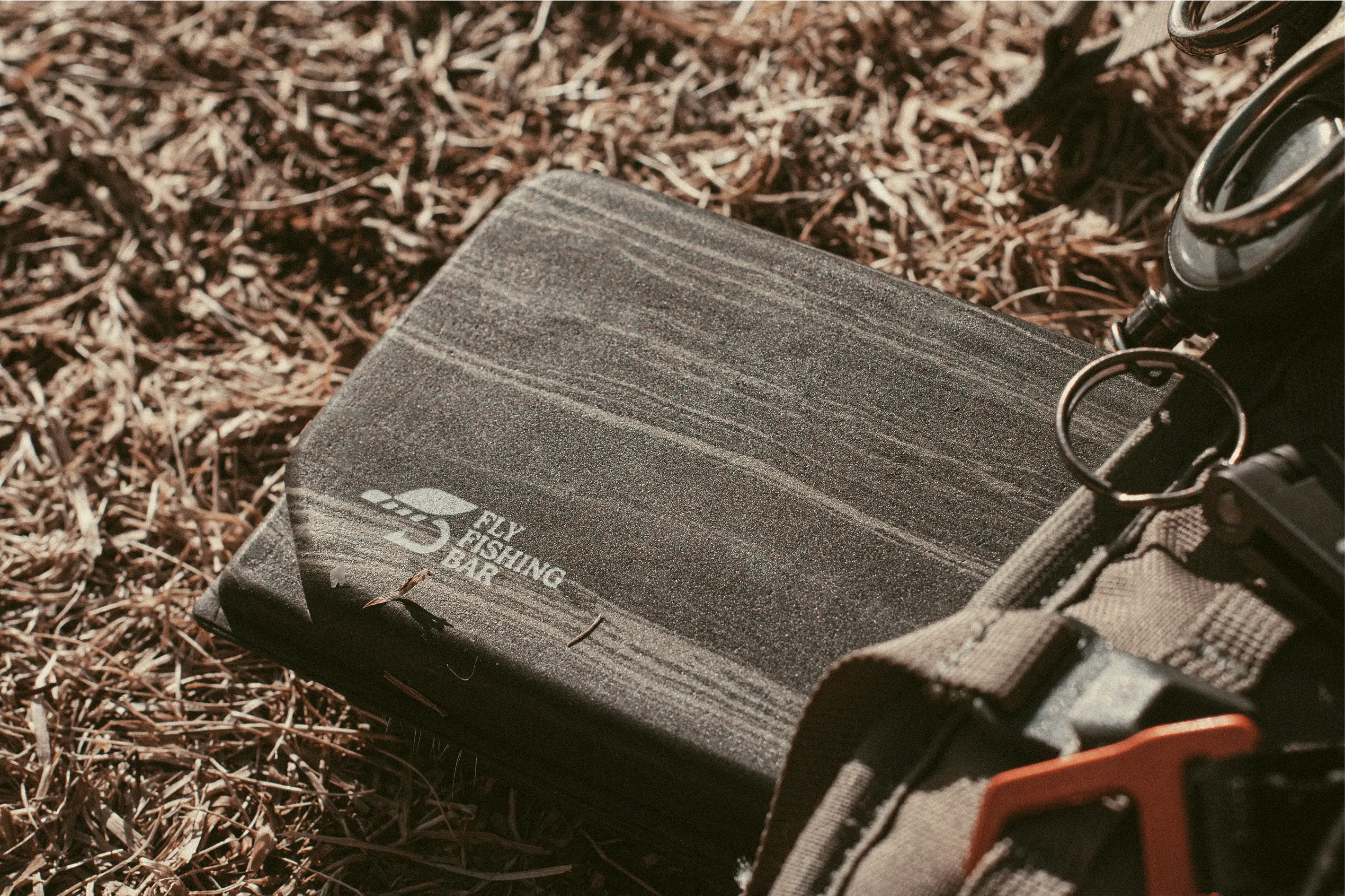
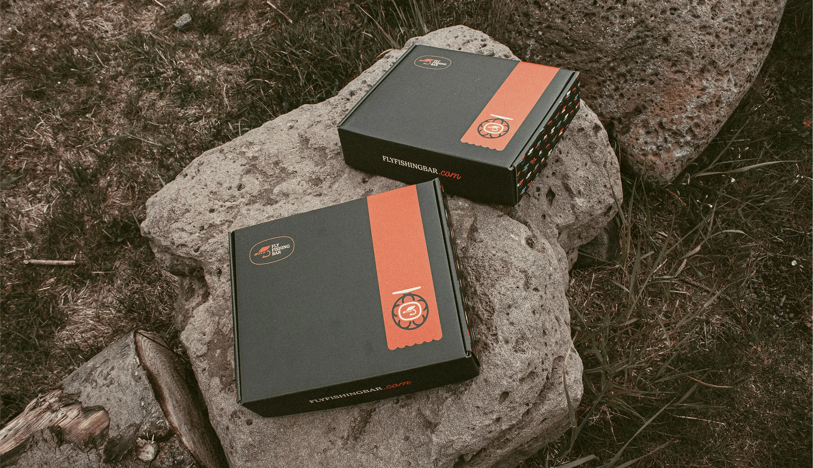
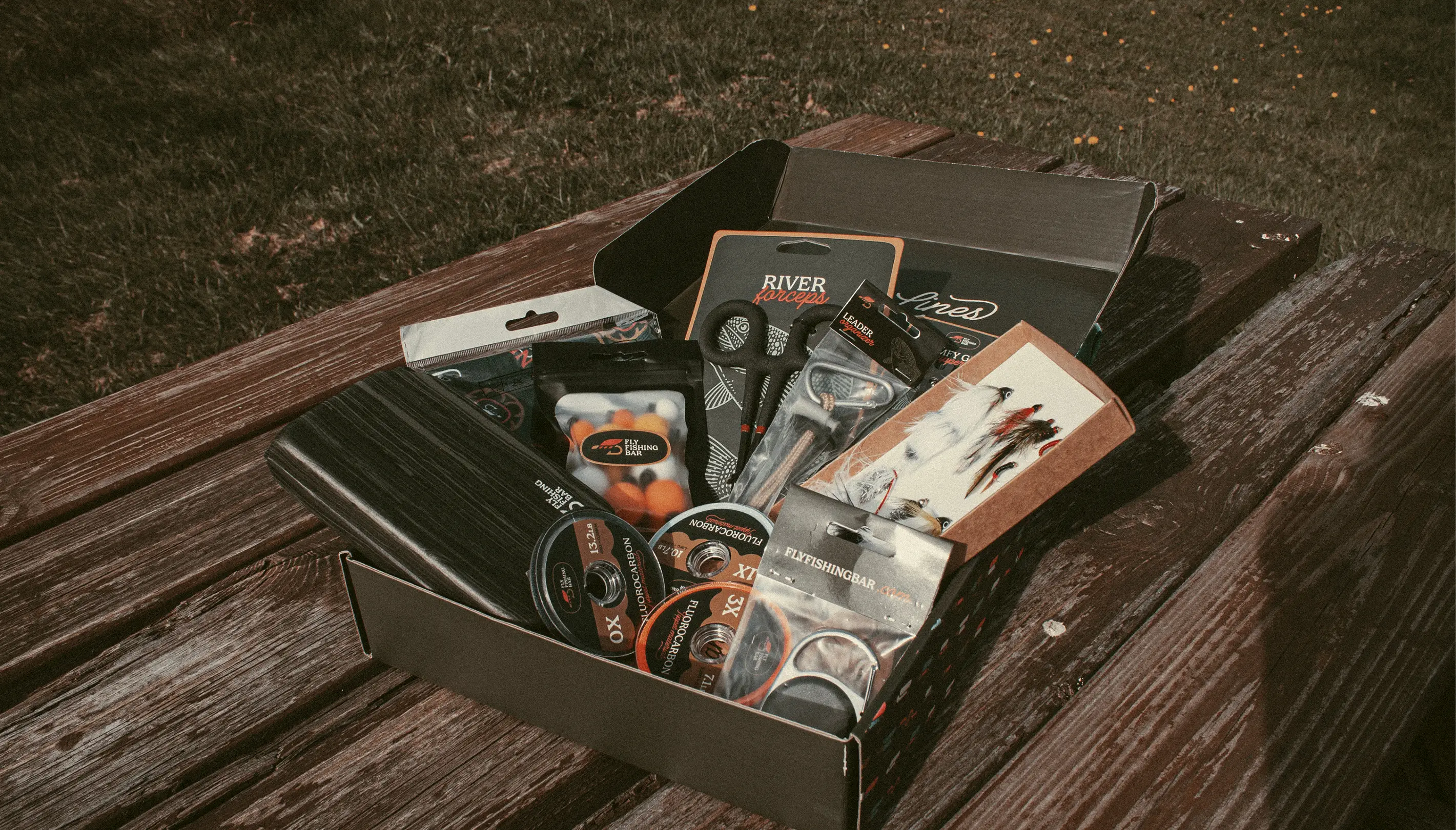
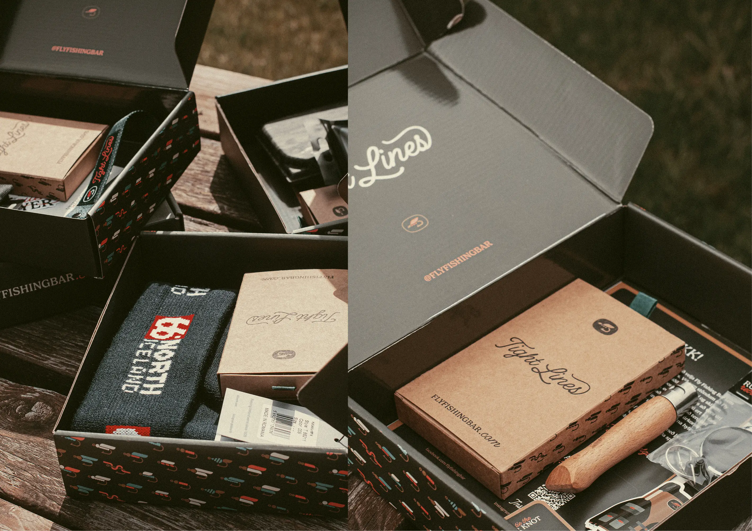
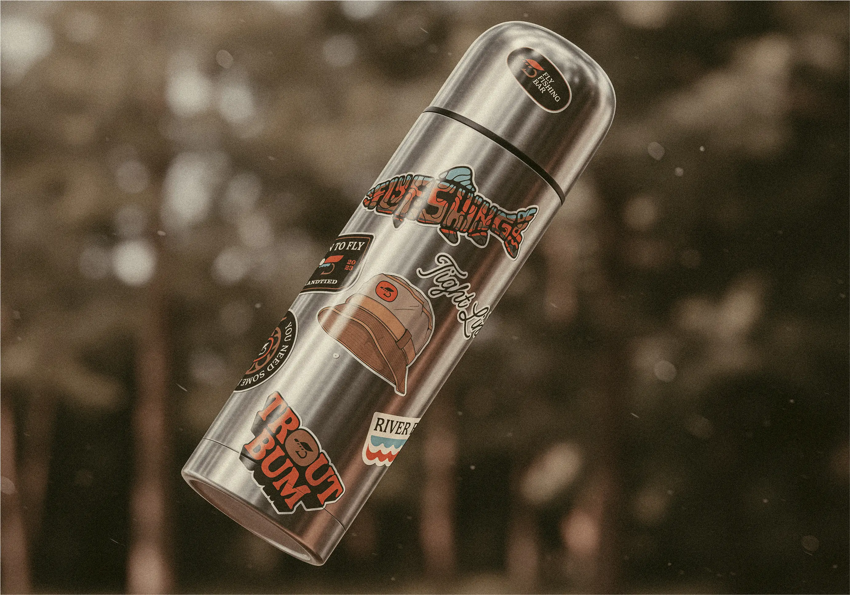
Box
Fly fishing mystery box
We designed the Fly Fishing Mystery Box — each package includes 6–10 flies, two fishing-related products, stickers, and an info booklet. The packaging design and collateral reflect the brand’s adventurous identity, turning every delivery into a special unboxing moment for subscribers.
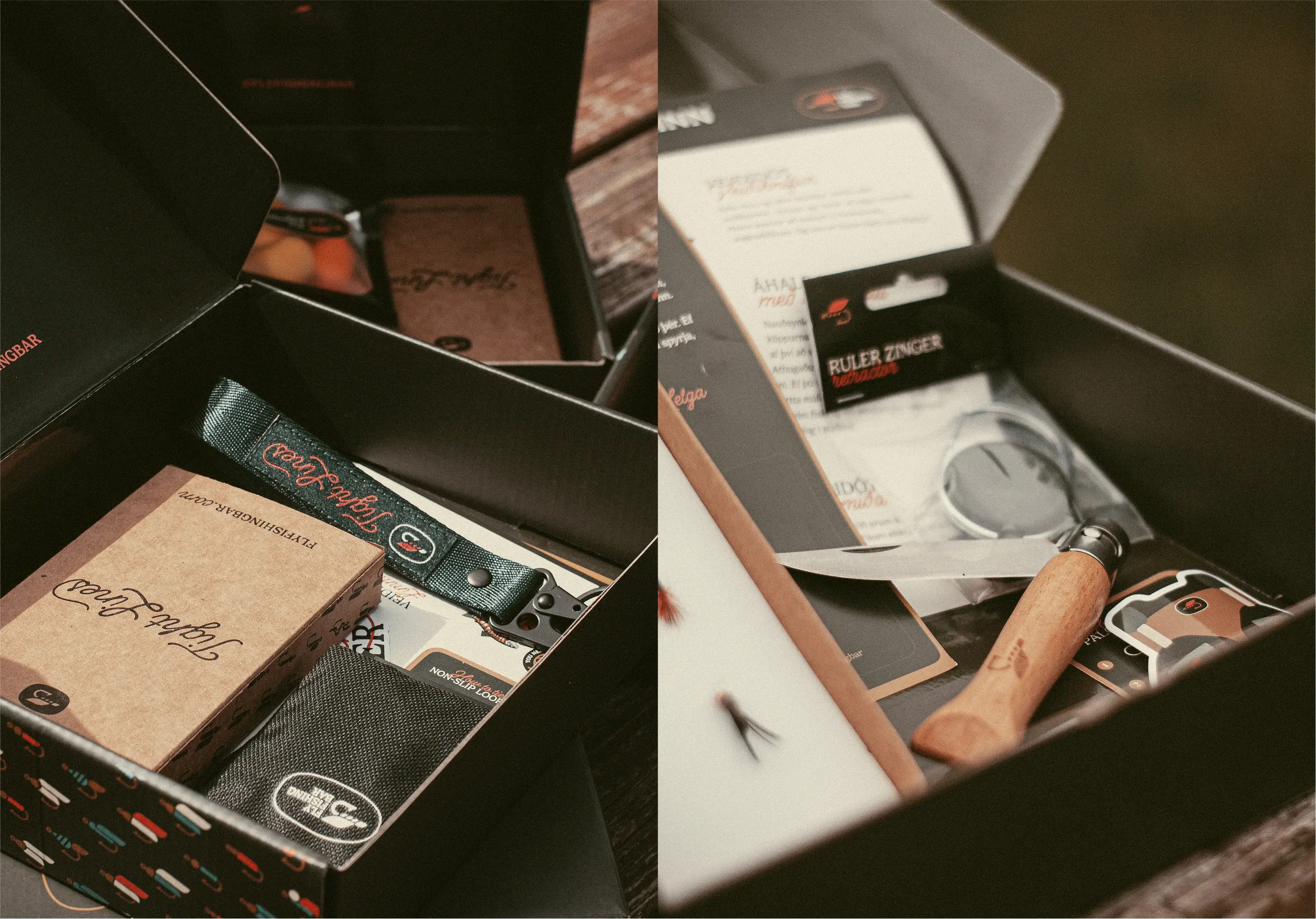
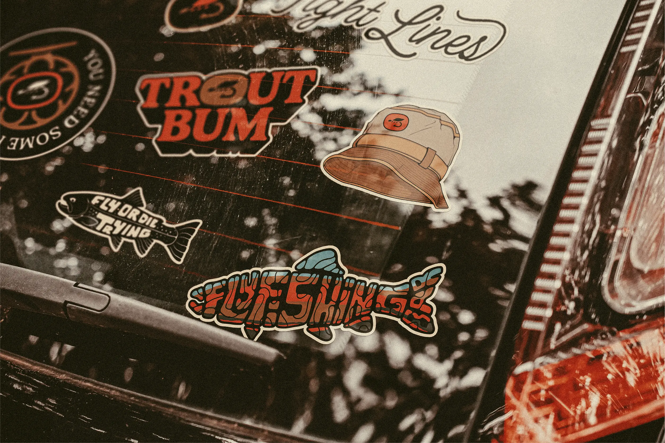
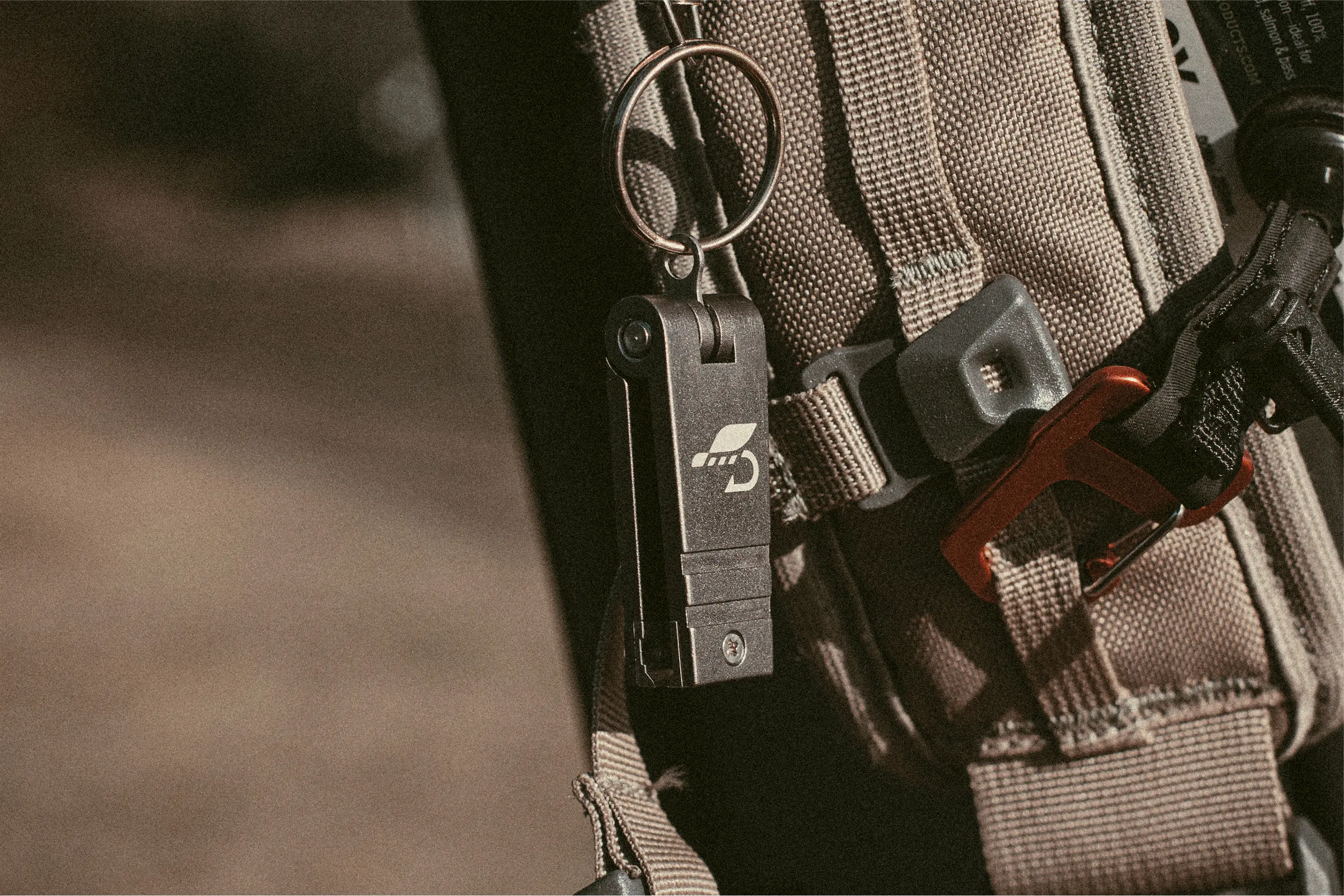
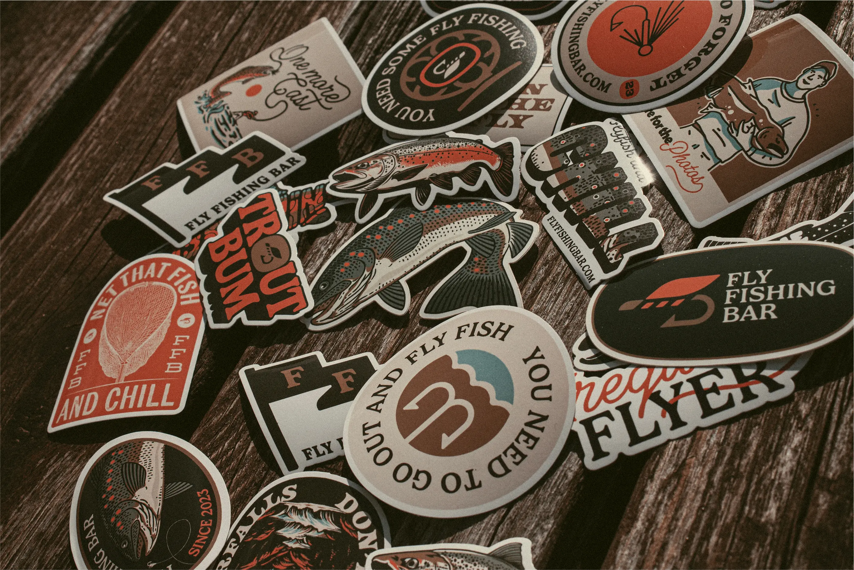
Merch
Gear beyond the box
To extend the brand, we created a wide range of collateral and merchandise — from fly boxes and clippers to trucker hats and collectible stickers. Each product reinforces the identity and helps anglers carry a piece of the Fly Fishing Bar lifestyle wherever they go.
Next project
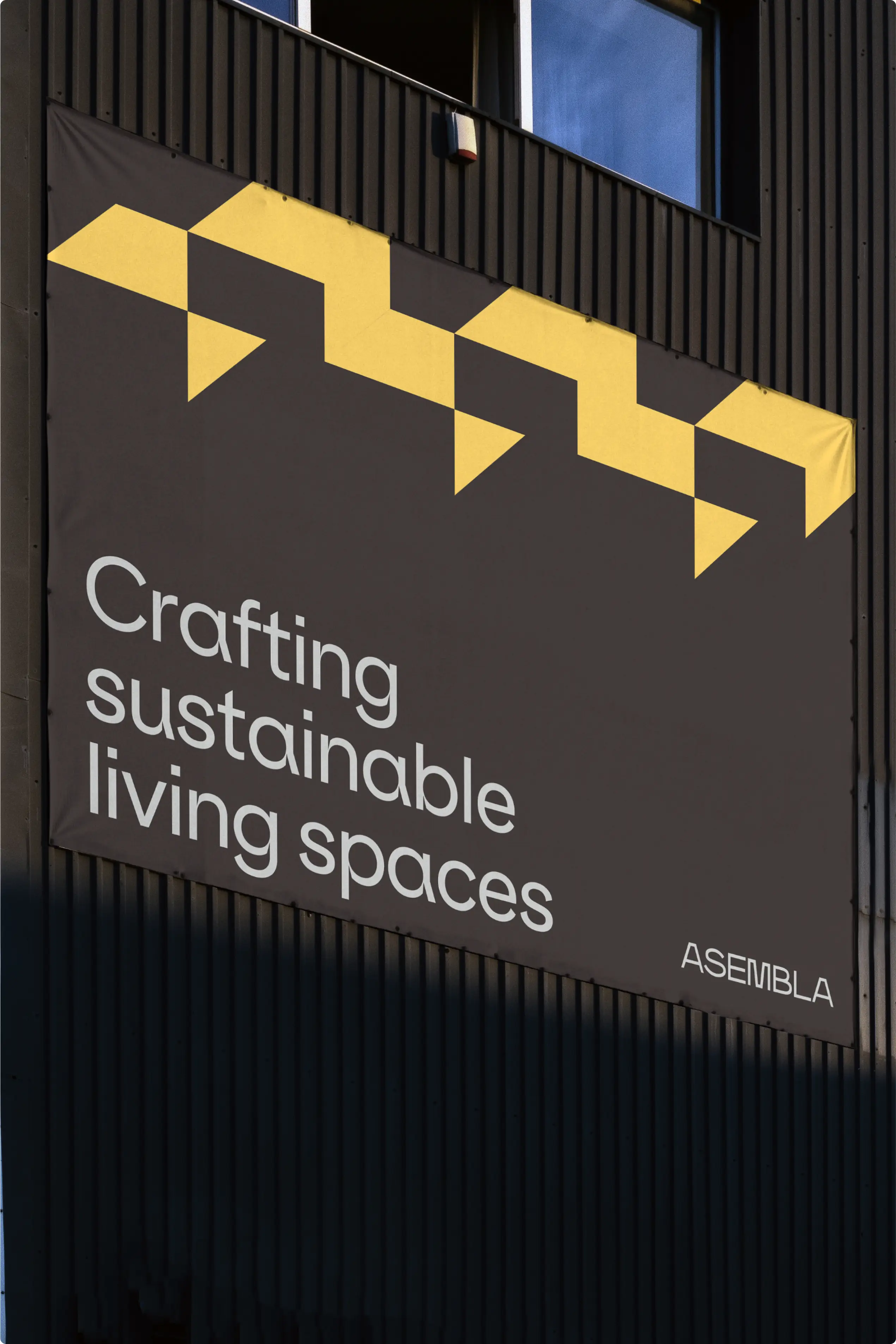
Reimagining building with Asembla
Website


