
A Bold Rebrand for a New Era
Our Roles
Advertising
Illustration
Client
Description
The mission

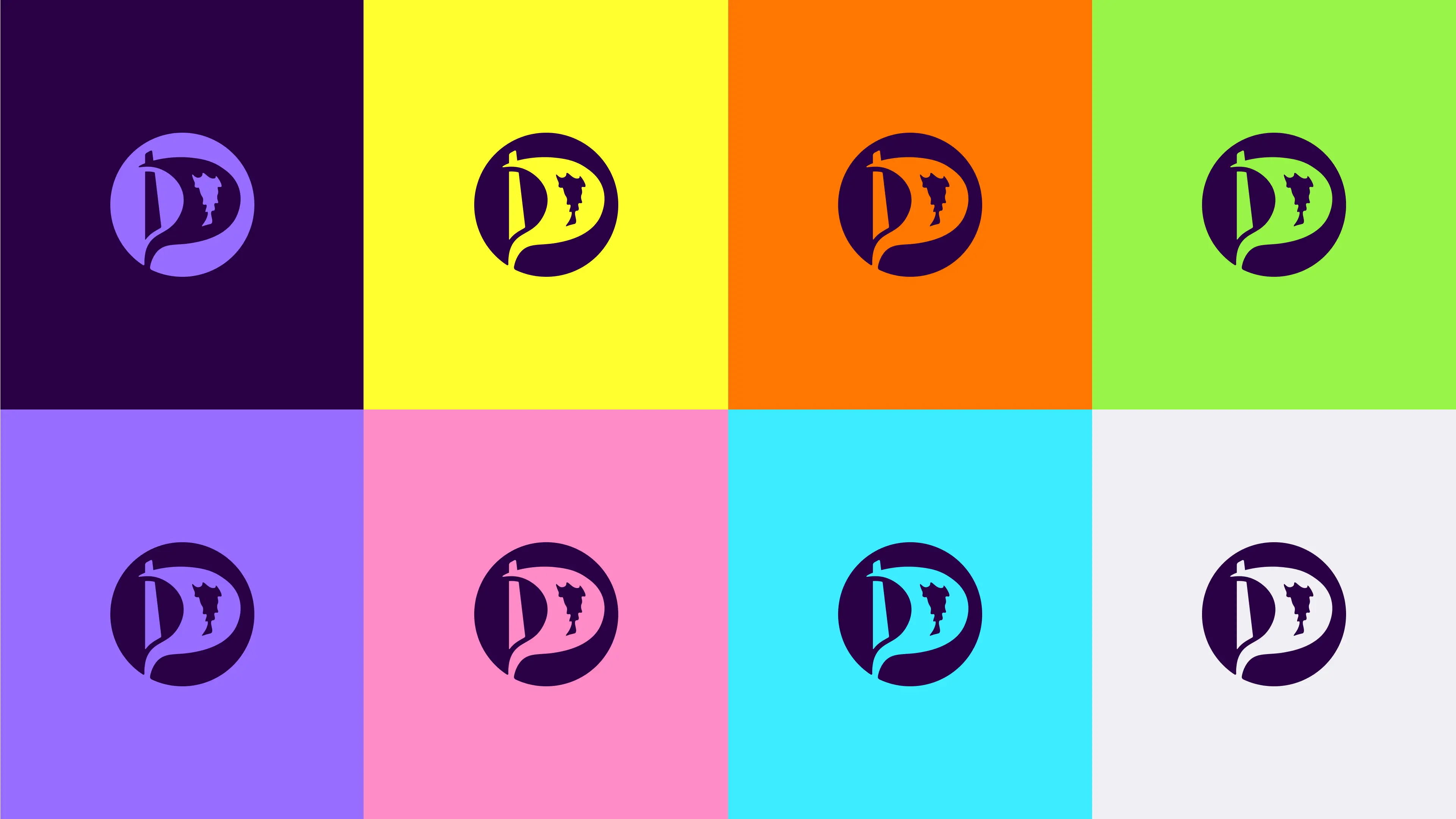
Logo
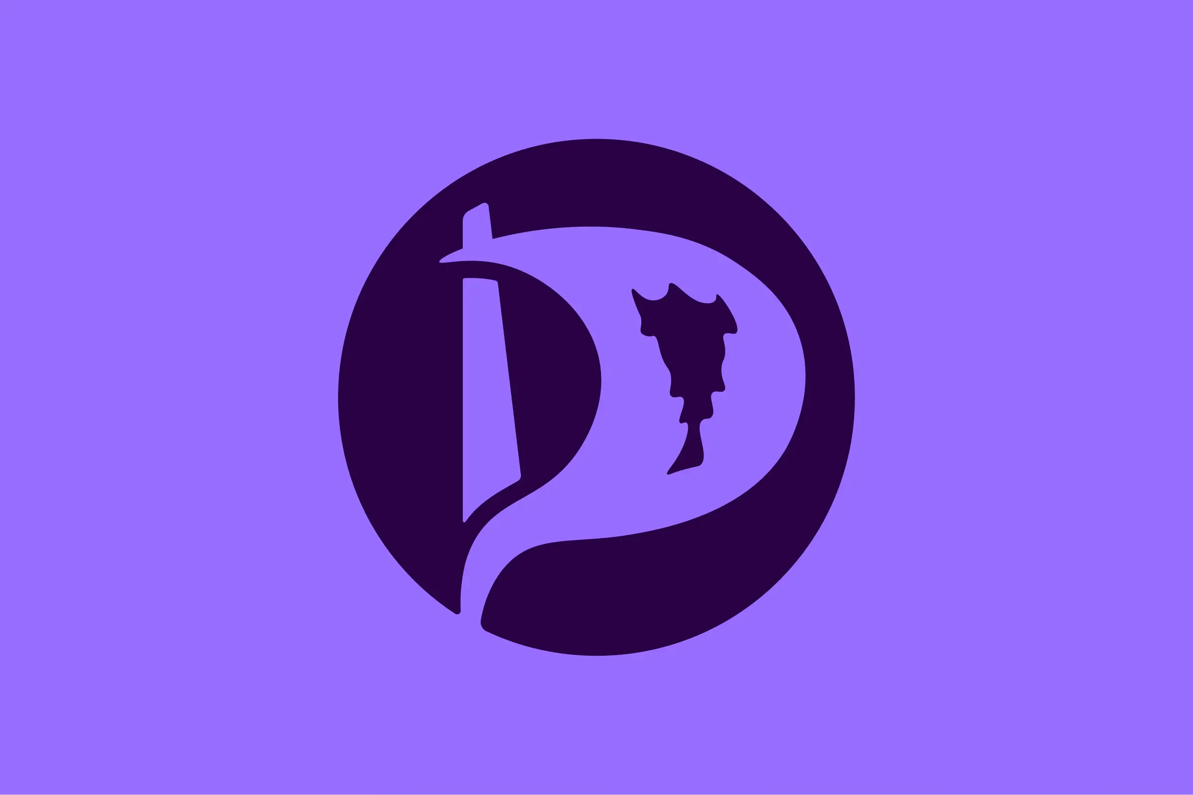
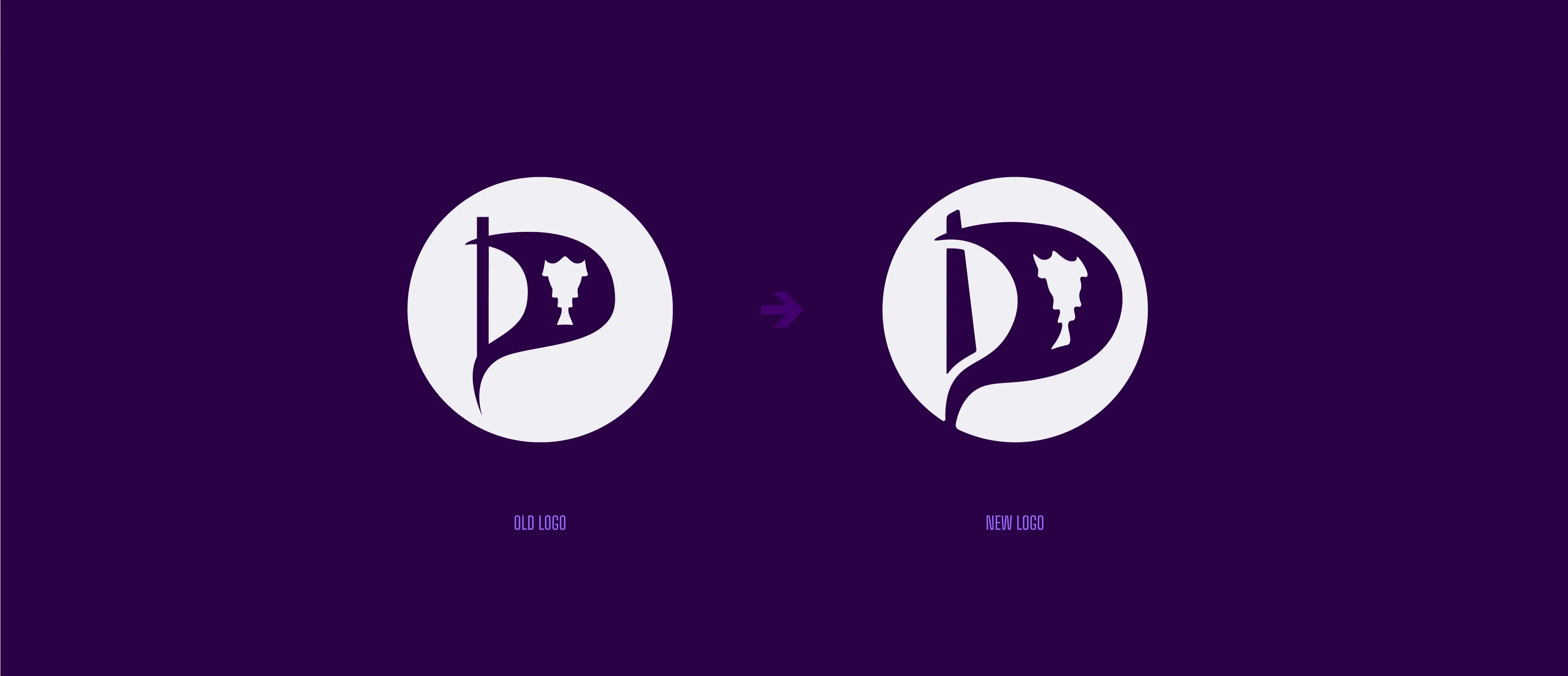
From Flag to Sail
The Pirate Party’s original logo carries strong recognition both locally and internationally. Instead of reinventing it, we refined its form. What was once perceived as a flag now resembles a sail — a symbol of progress and forward momentum, as well as a more sustainable, environmentally conscious metaphor.
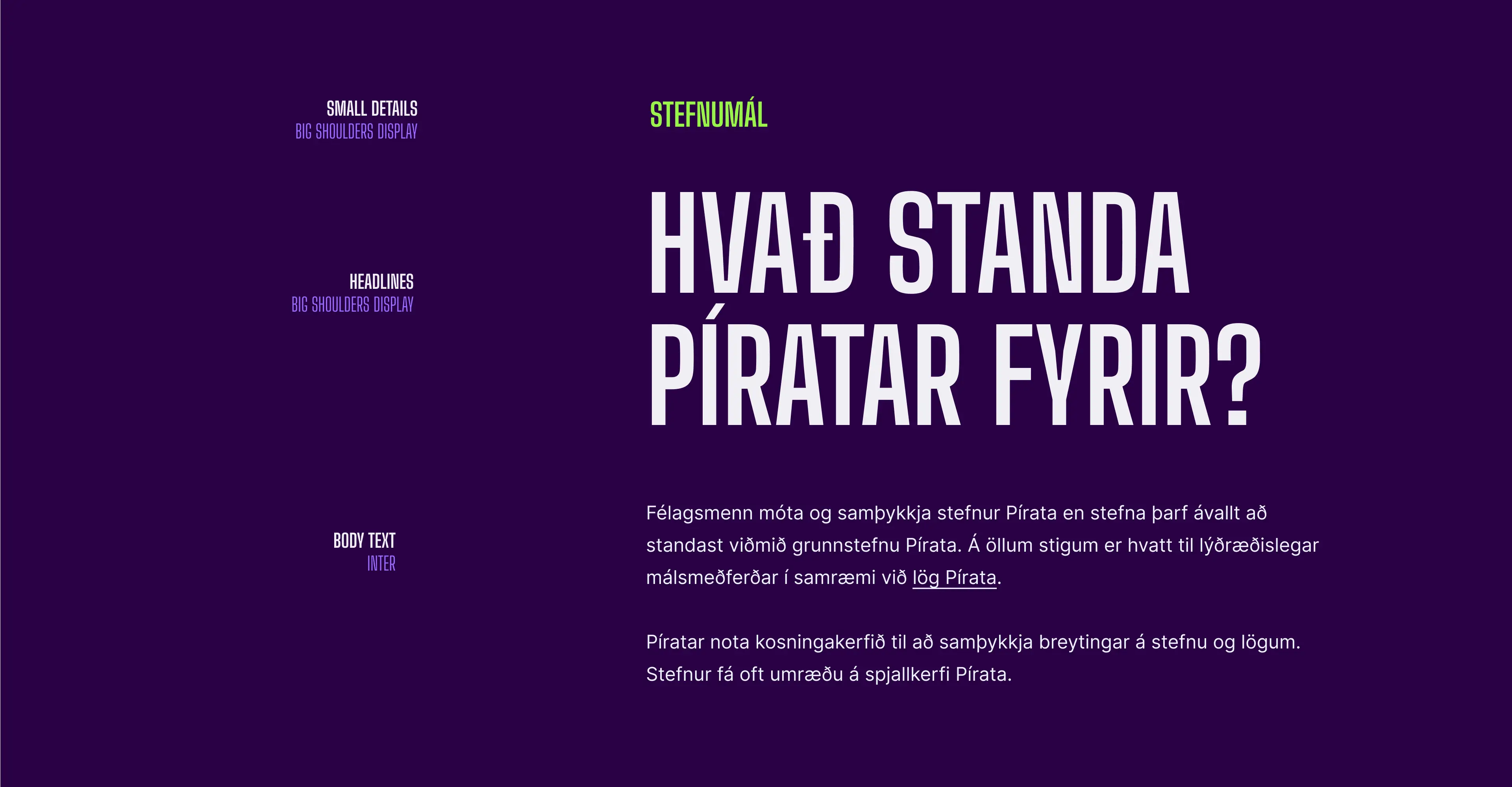
Style
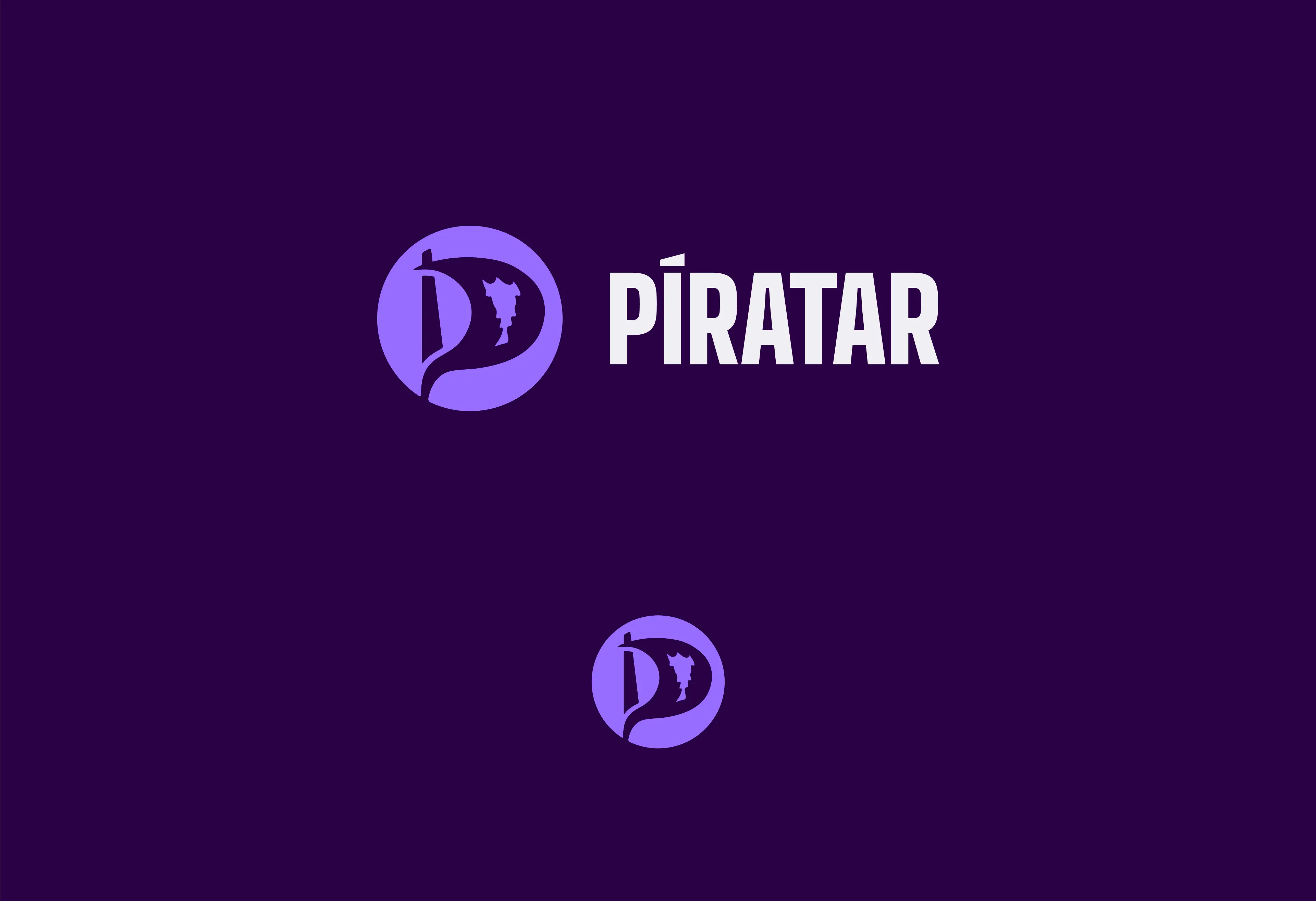
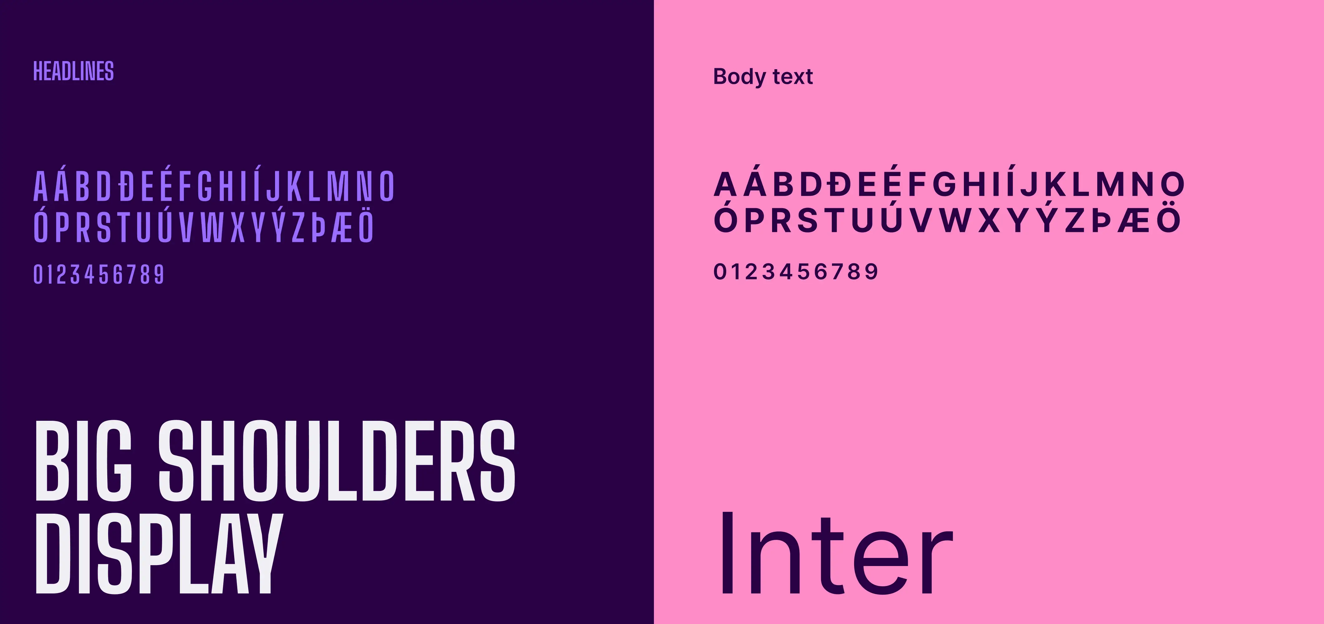
Colors and Typography
We refreshed the iconic purple, enhancing its depth and uniqueness while adding complementary support colors for greater flexibility. For typography, we introduced Big Shoulders Display for bold headlines and Inter for body text — both open-source Google fonts. Together, they deliver a clear, modern, and accessible typographic system.
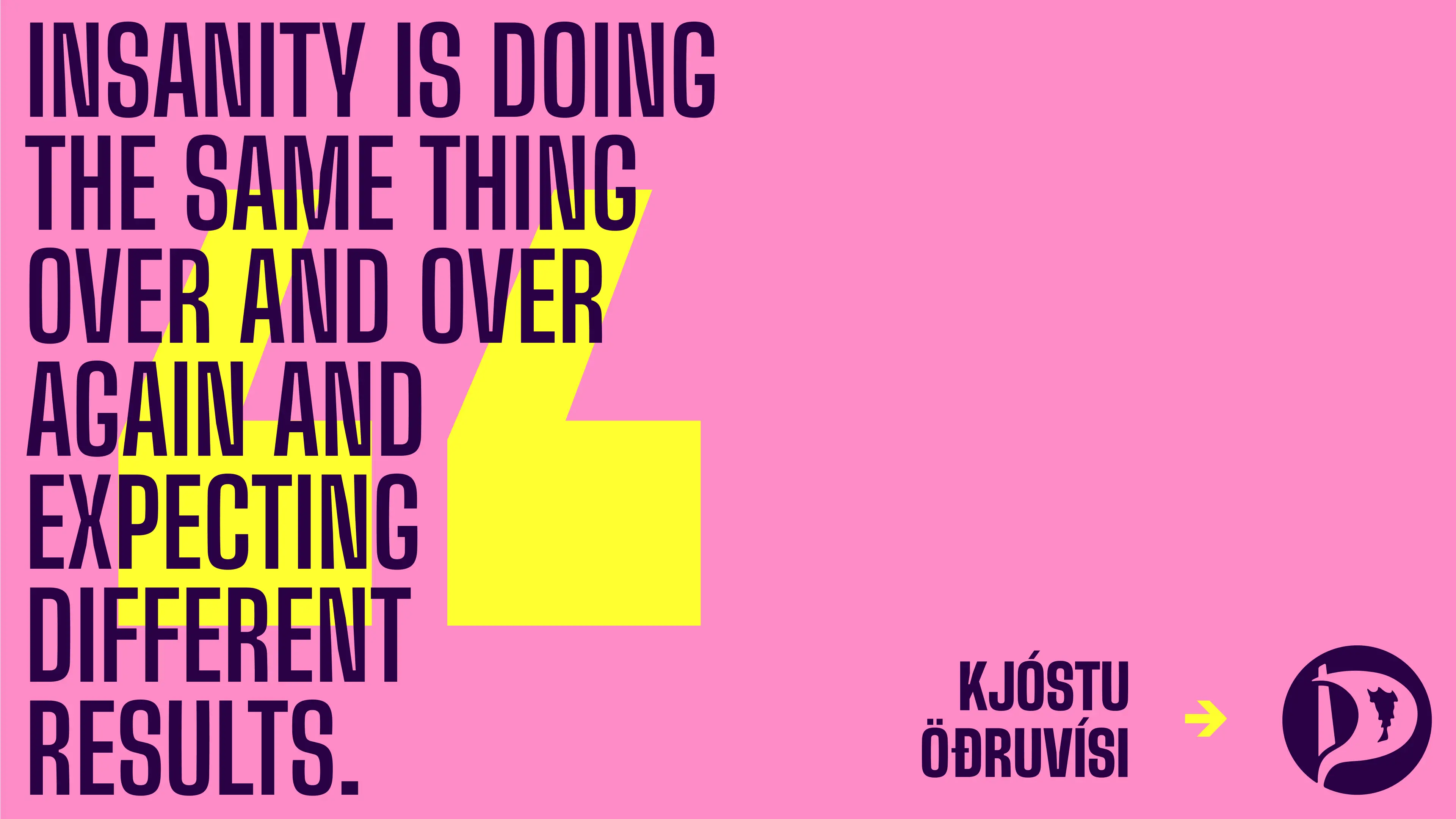
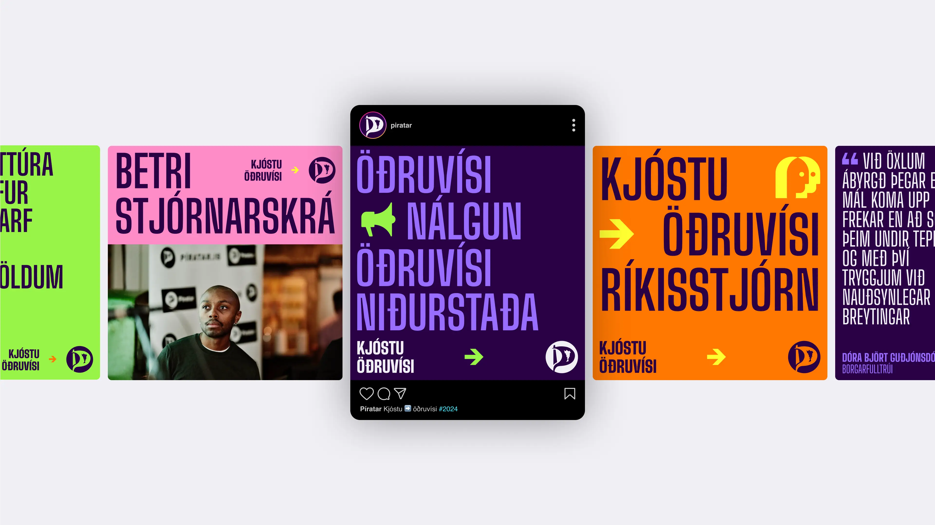
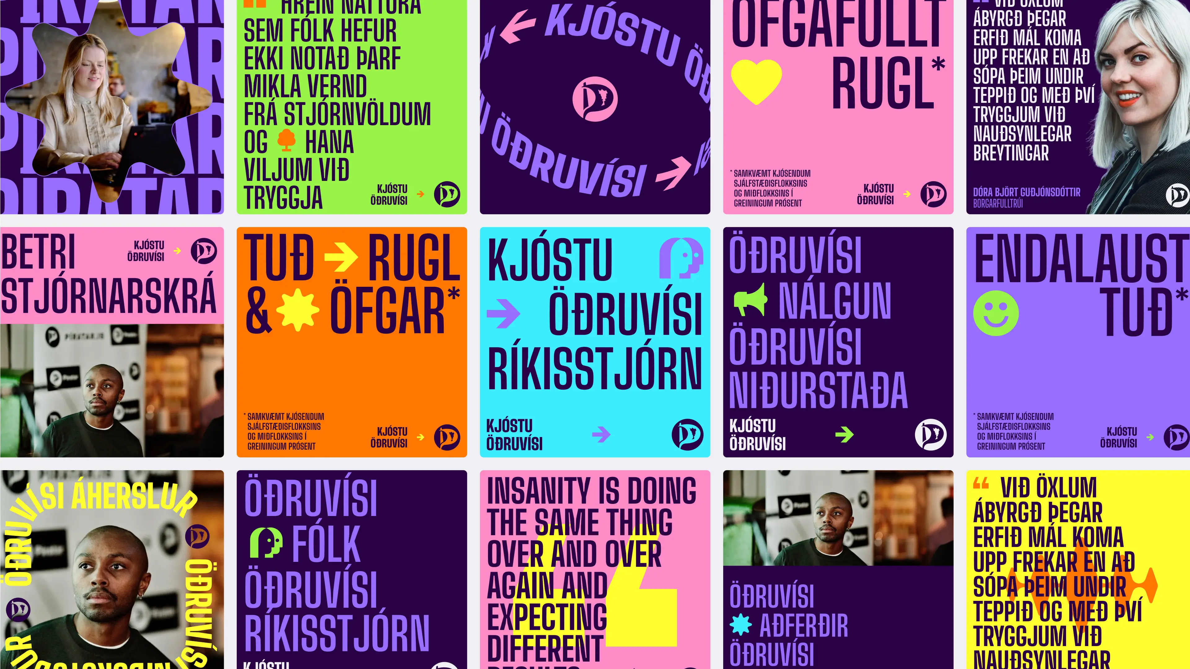
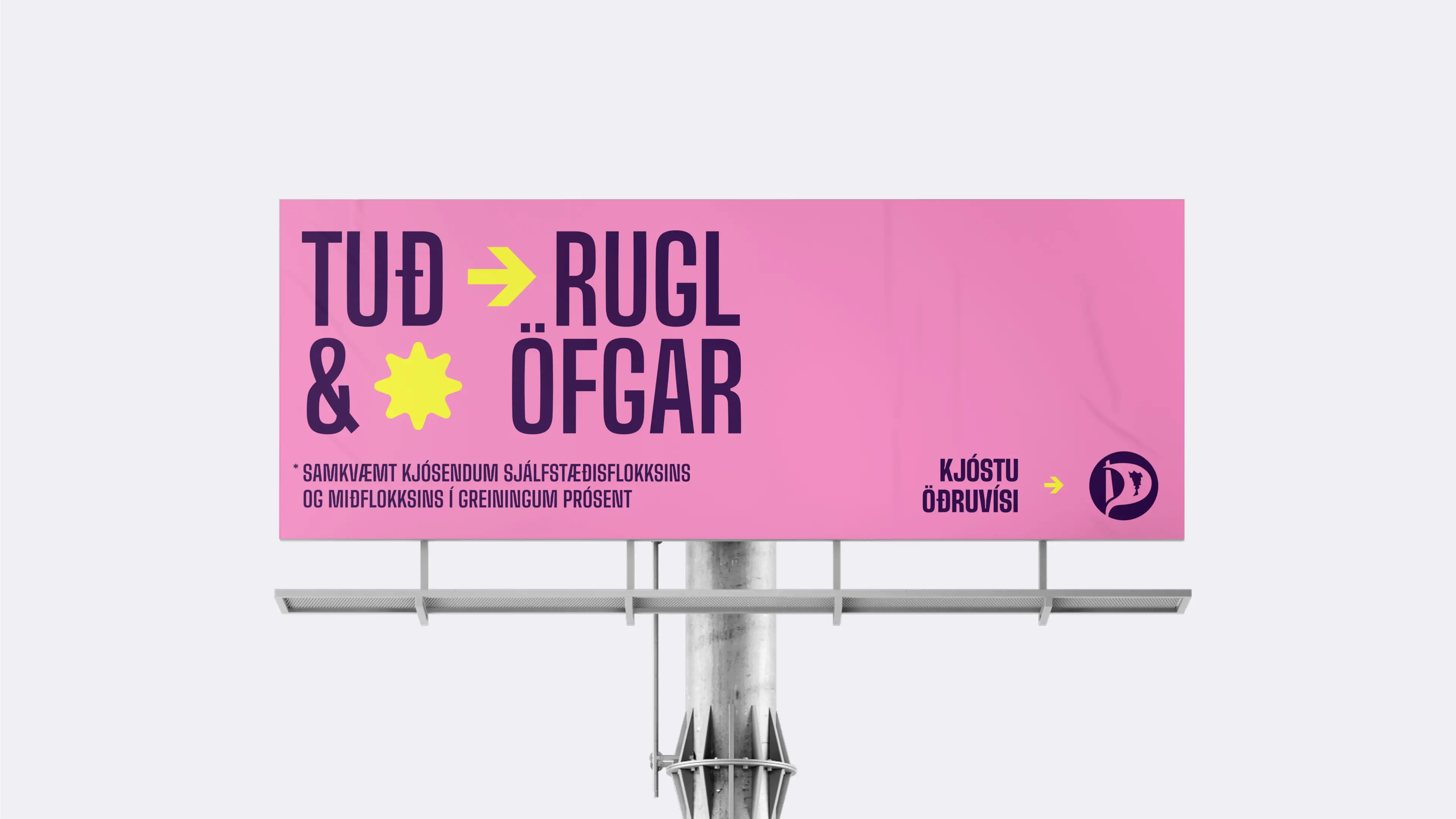
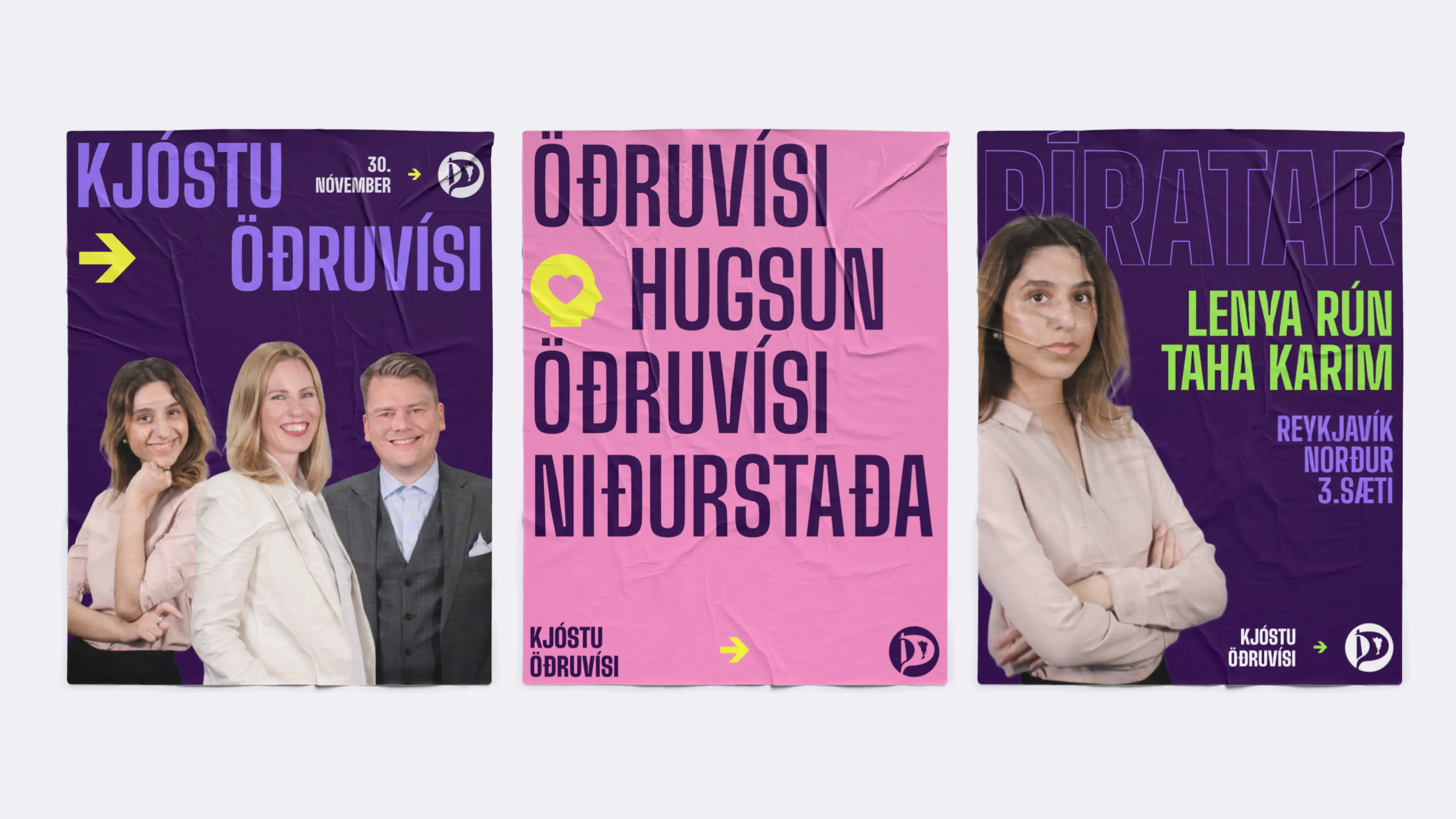
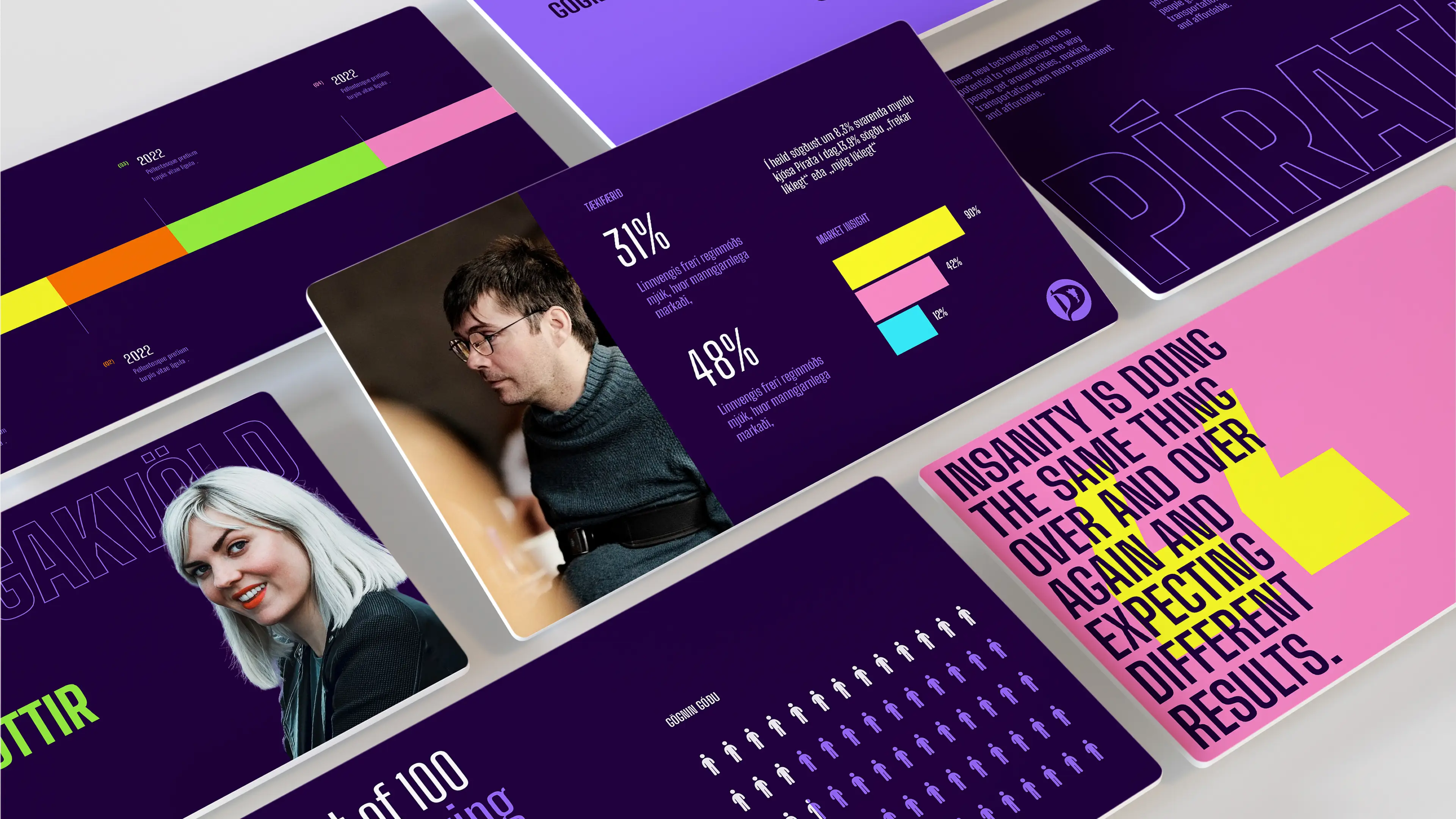
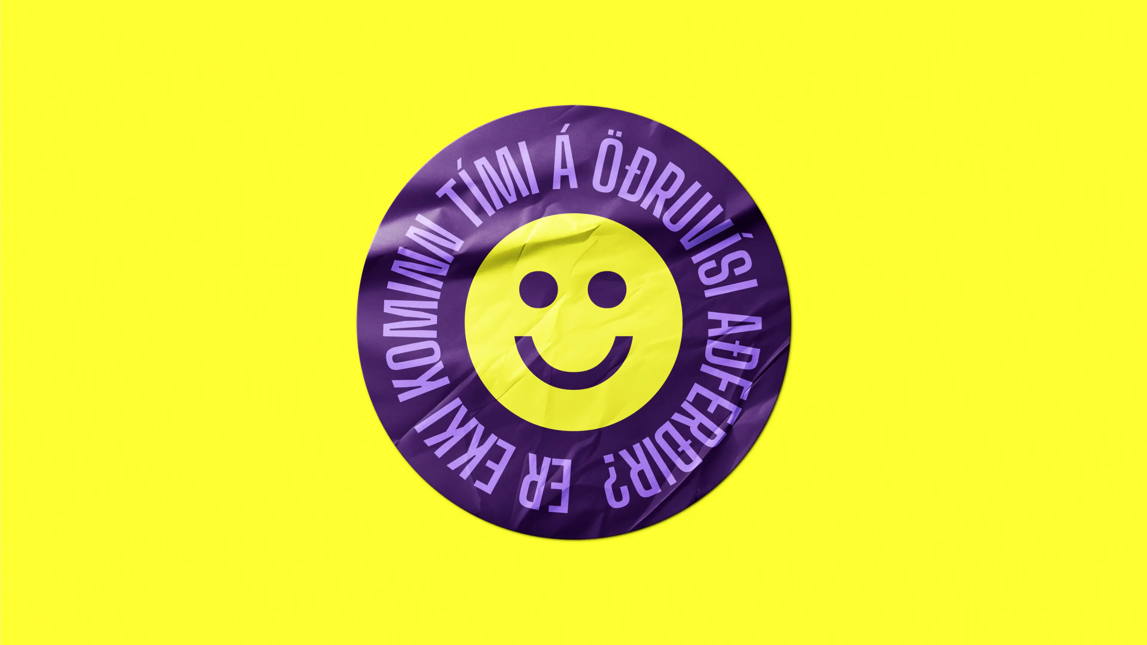
Ads
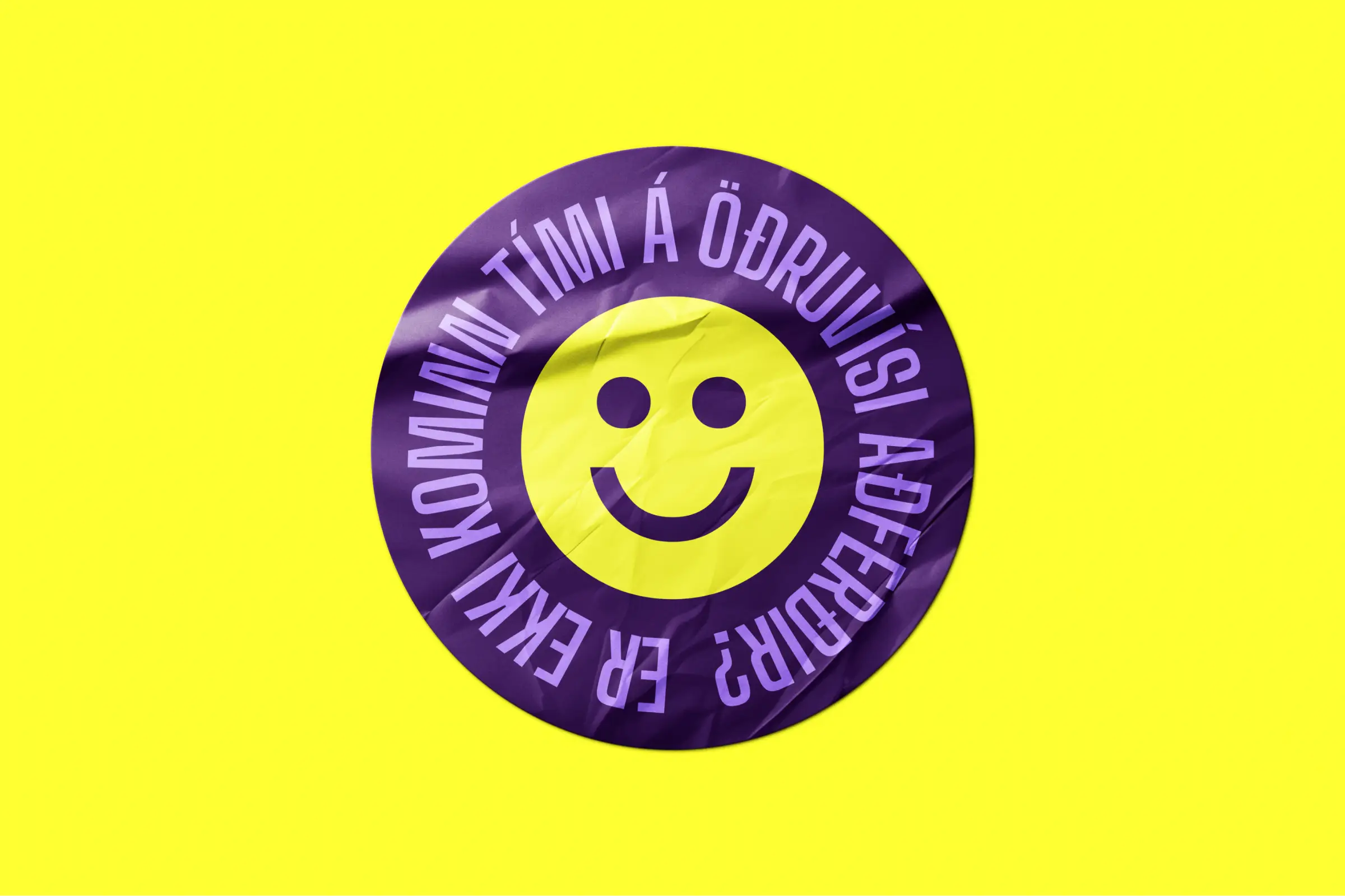
Vibrant, Poster-Like Campaigns
The advertising style is direct, bold, and poster-inspired — designed for both digital and print. With large headlines, striking contrasts, and the key slogan “Kjósum öðruvísi” (Vote Different), the campaign challenges voters to break old habits and consider new political directions.

Visuals
Tools for Every Touchpoint
To support the new identity, we designed a range of visual assets including custom icons, presentation templates, stickers, pins, and other campaign materials. These ensured the Pirate Party could present a unified, recognizable identity across all channels and contexts.


Next project

A fly fishing brand
Illustration
Web design


