Fuglar’s New Identity & Digital Presence
Our Roles
Design System
Web design
Client
Description
The mission
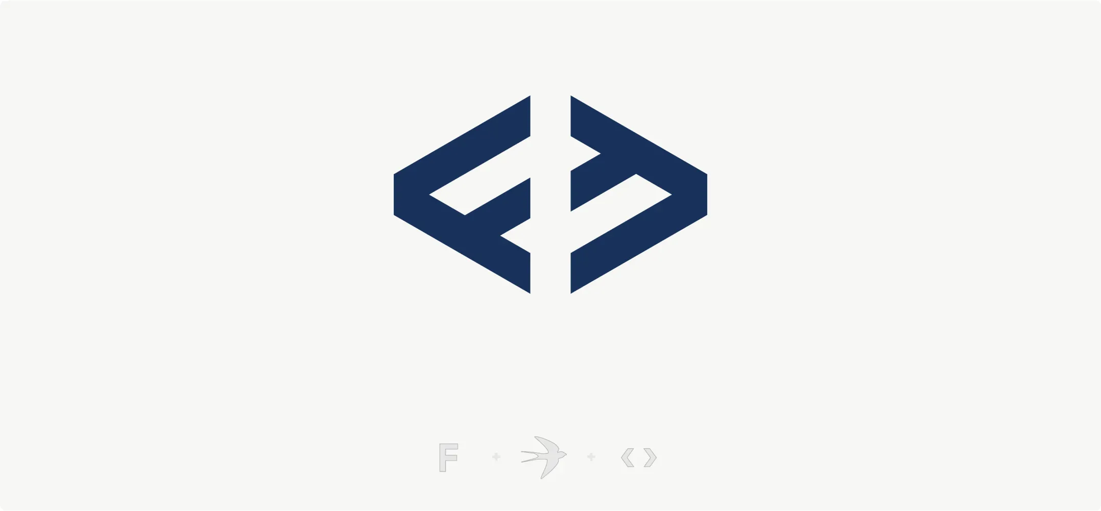
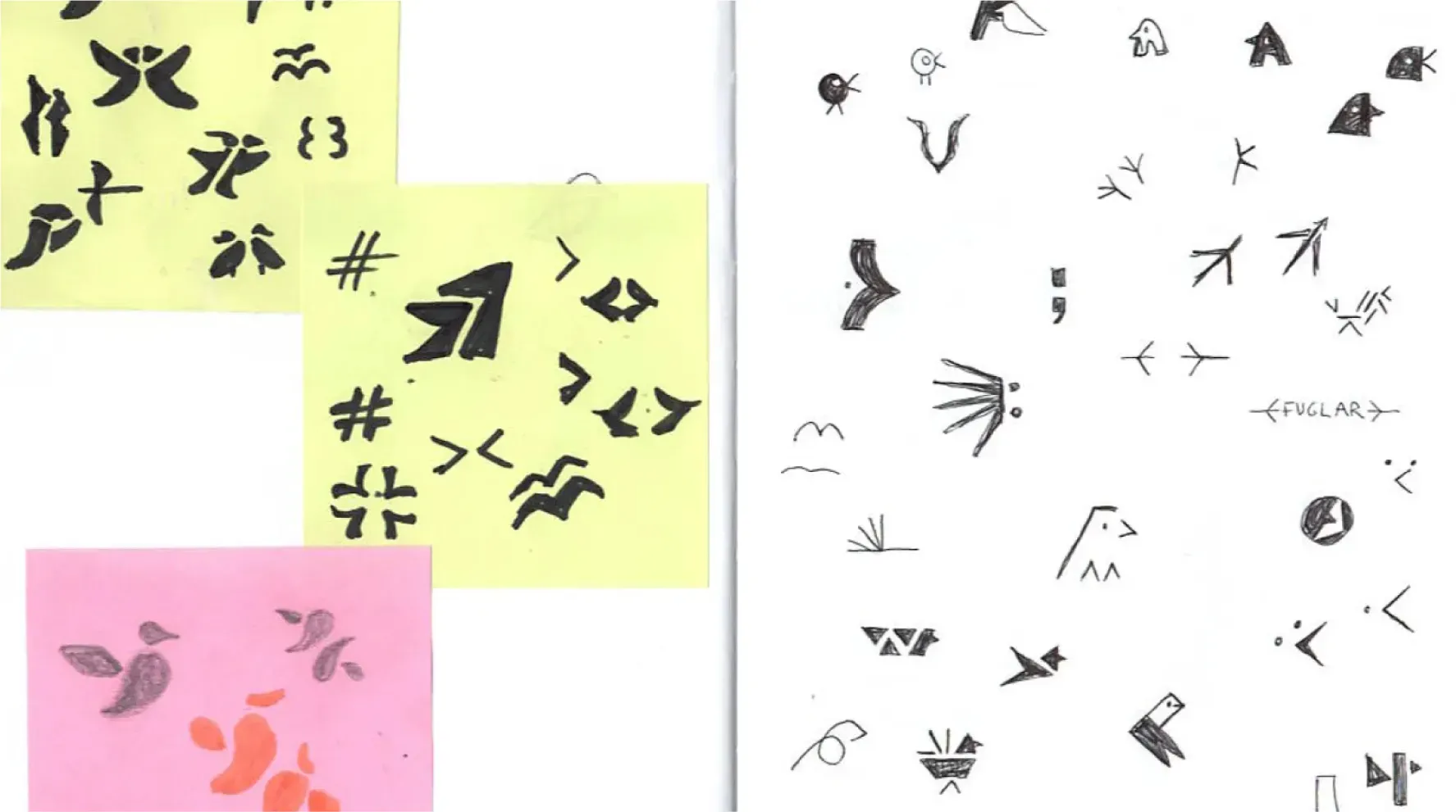
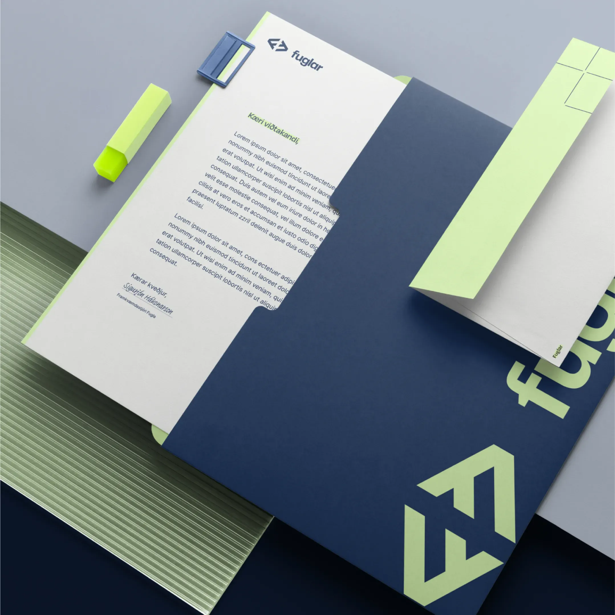
LOGO
A Modern Mark with Meaning
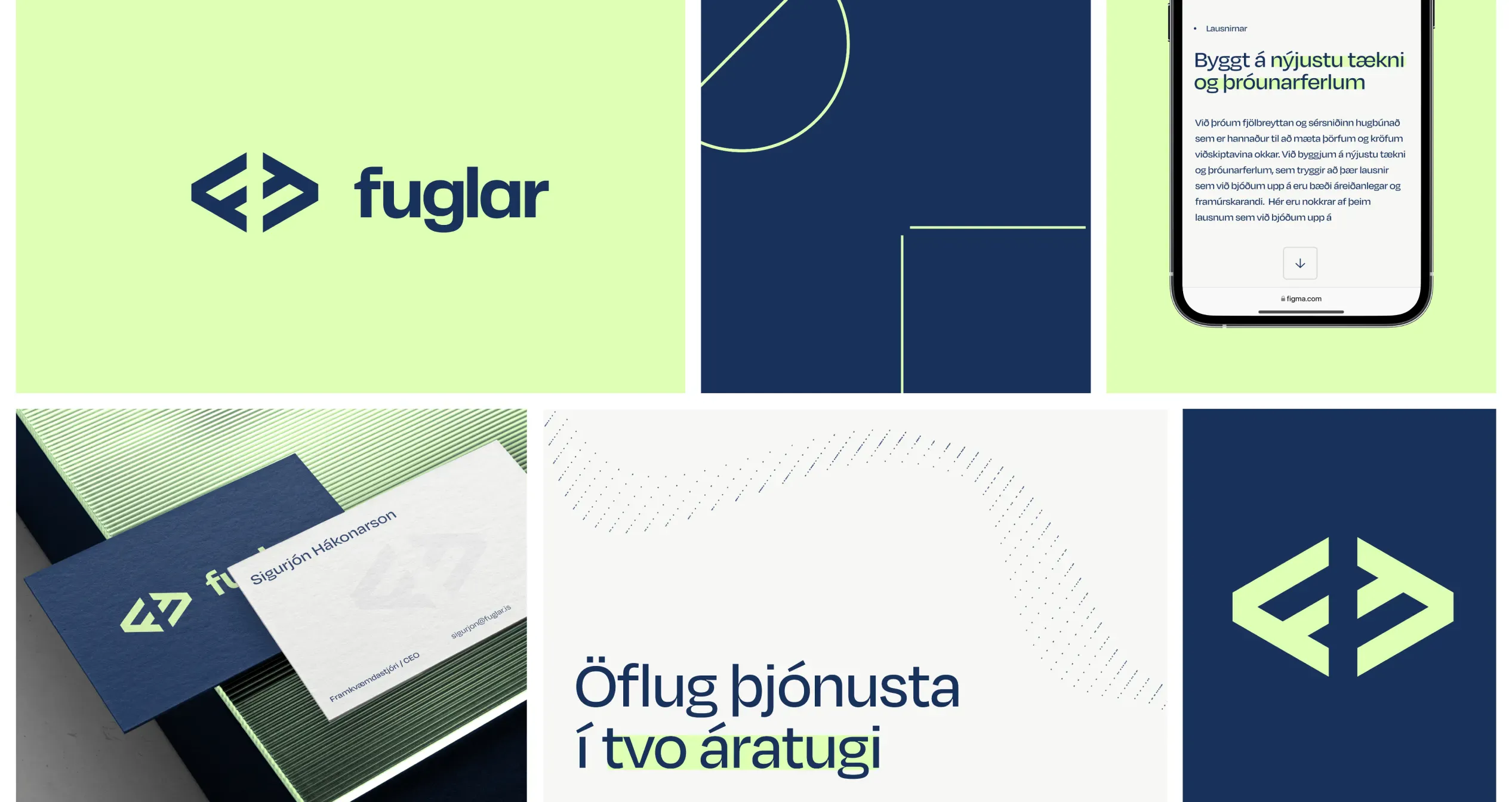
The new Fuglar logo draws inspiration from programming brackets and the letter “F,” forming a geometric symbol that reflects the company’s roots in technology. Its abstract bird-like shape pays homage to Fuglar’s name, which means “birds” in Icelandic, symbolizing freedom, innovation, and forward motion. The result is a logo that embodies trust, reliability, and creativity.
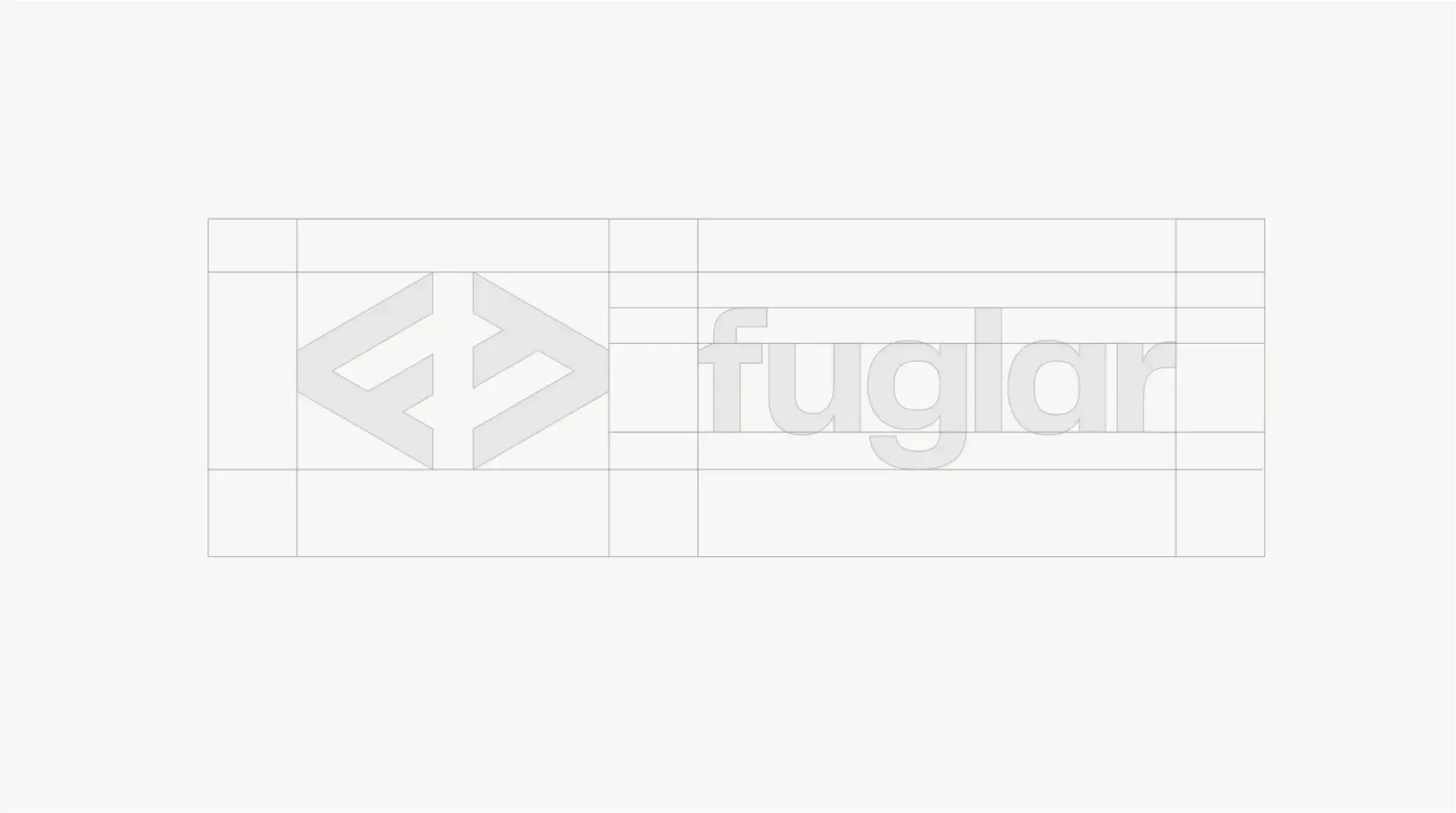
TYPOGRAPHY
Designing for Clarity and Personality
Inter was chosen for clarity in long-form text, while Degular adds personality to headlines. The pairing creates a voice that feels modern, approachable, and easy to read across all platforms.
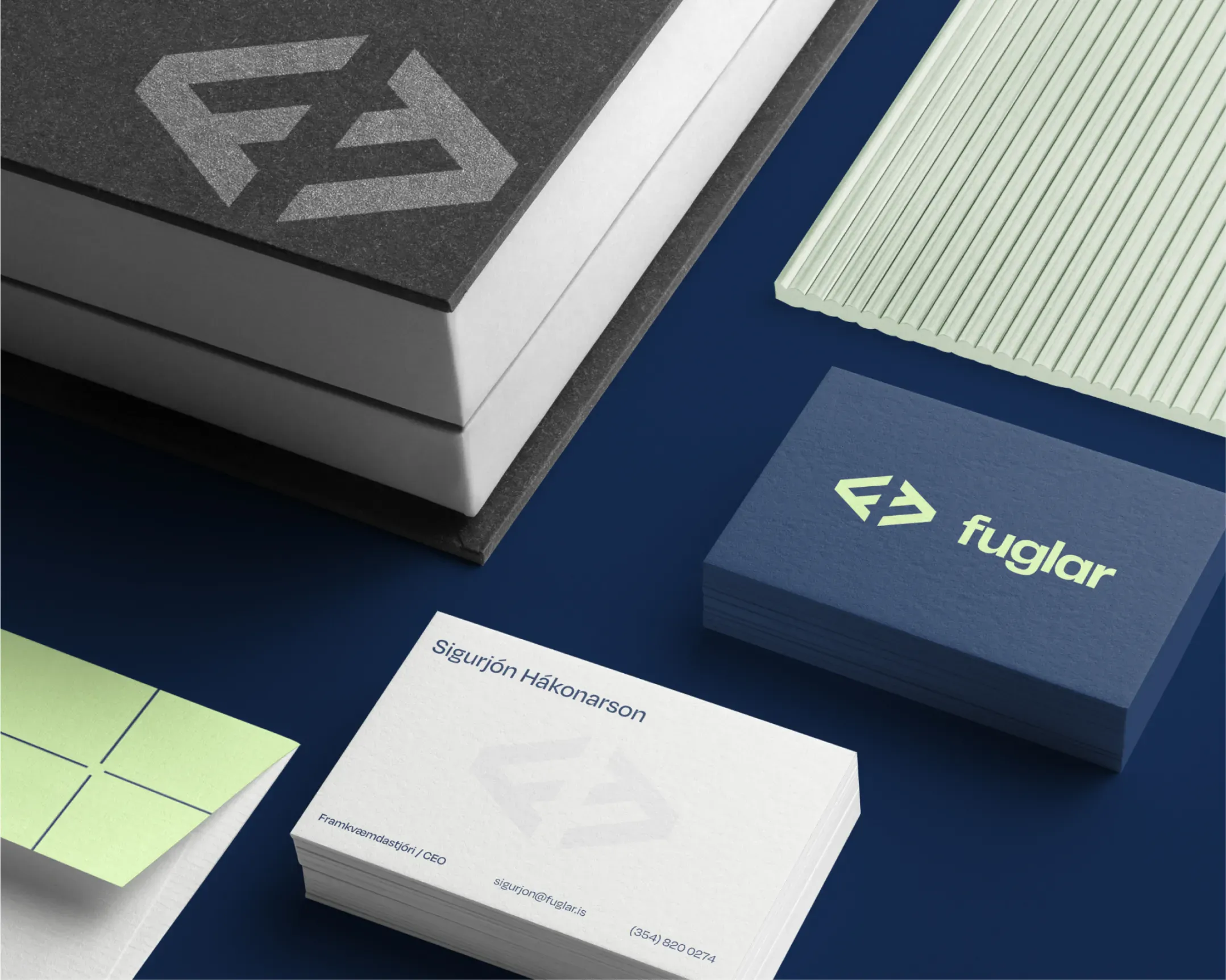
BRAND
Crafting a fresh and trustworthy identity
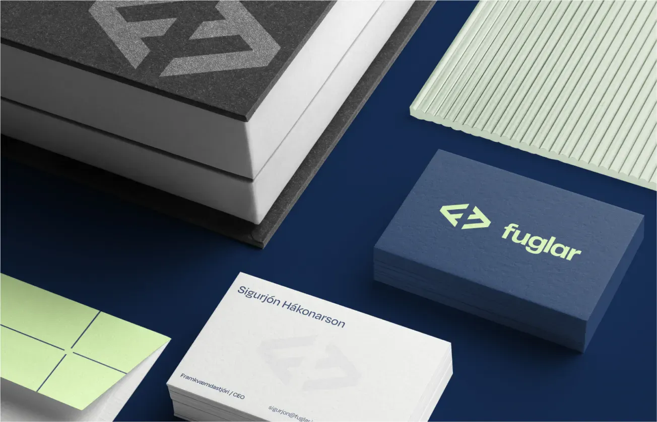
Fuglar’s rebrand centers on a deep navy and crisp white palette for trust and stability, paired with a lime green accent for energy and innovation. Together, they strike a perfect balance between professionalism and creativity.
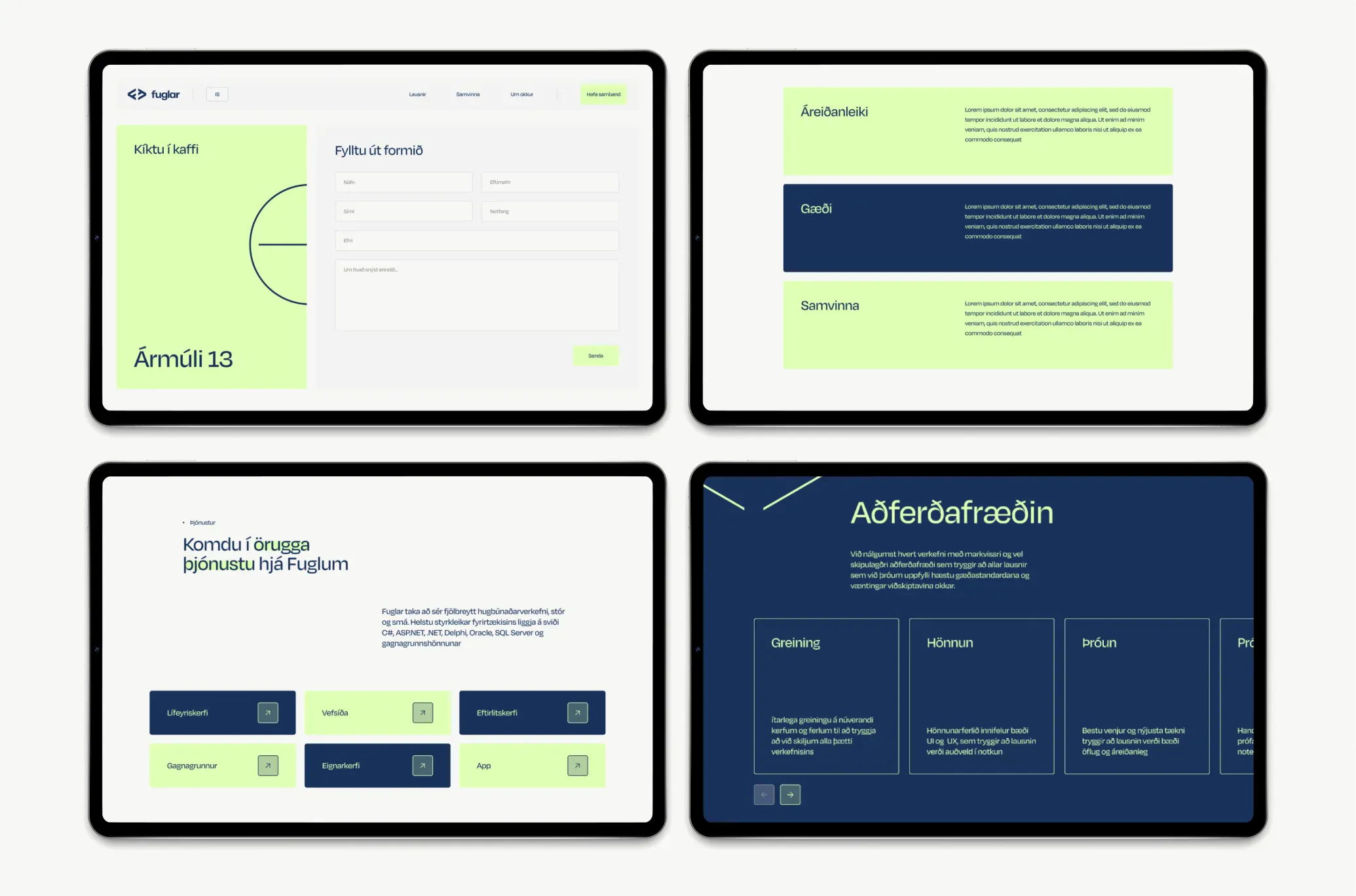
DIGITAL
Building a Seamless Online Presence
A refreshed brand deserved an equally strong digital home. We collaborated with Fuglar to design a website that highlights innovation, simplicity, and technical expertise. Clear navigation, mobile-first accessibility, and cleanly organized service pages ensure visitors can easily engage with the content. The result is a functional, user-friendly site that reflects Fuglar’s commitment to excellence.
Next project
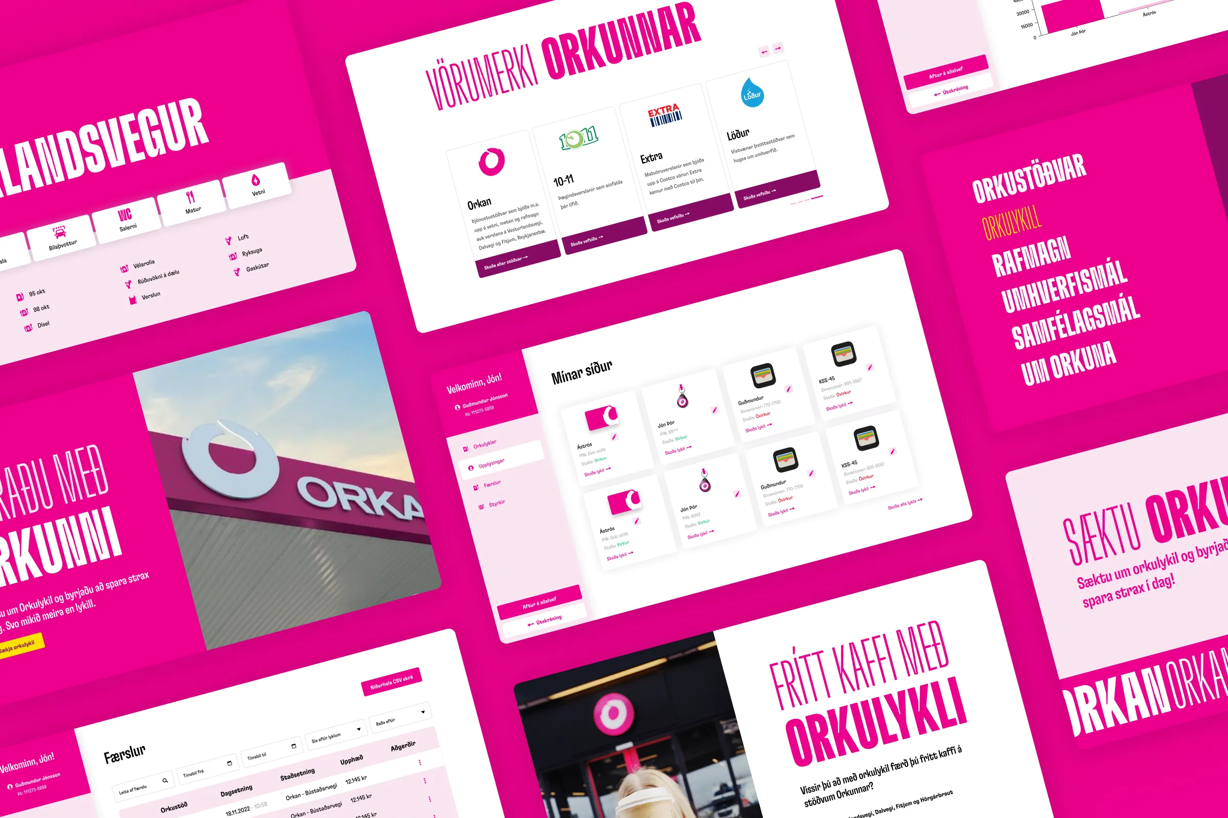
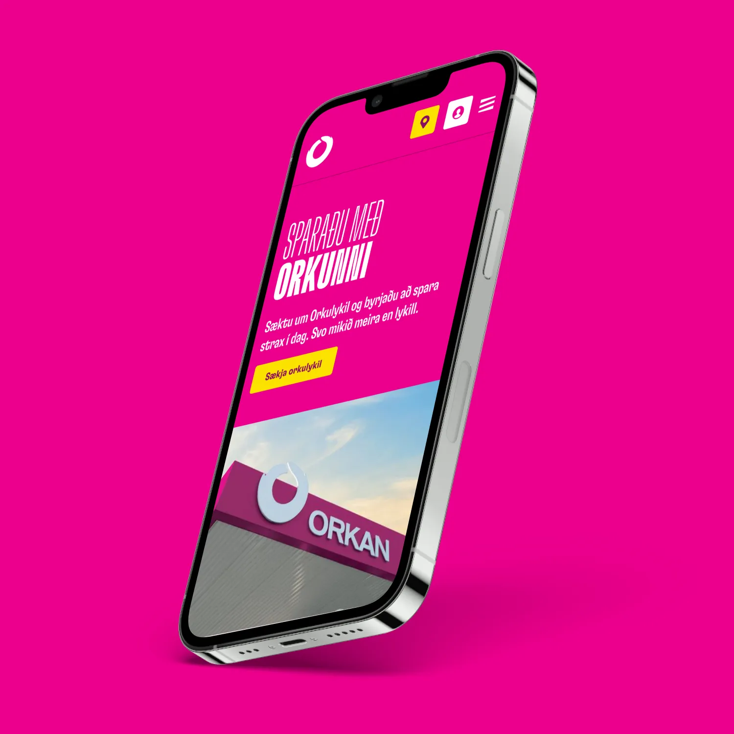
New web and design system for Orkan
Web design


