A taste of better UX
Our Roles
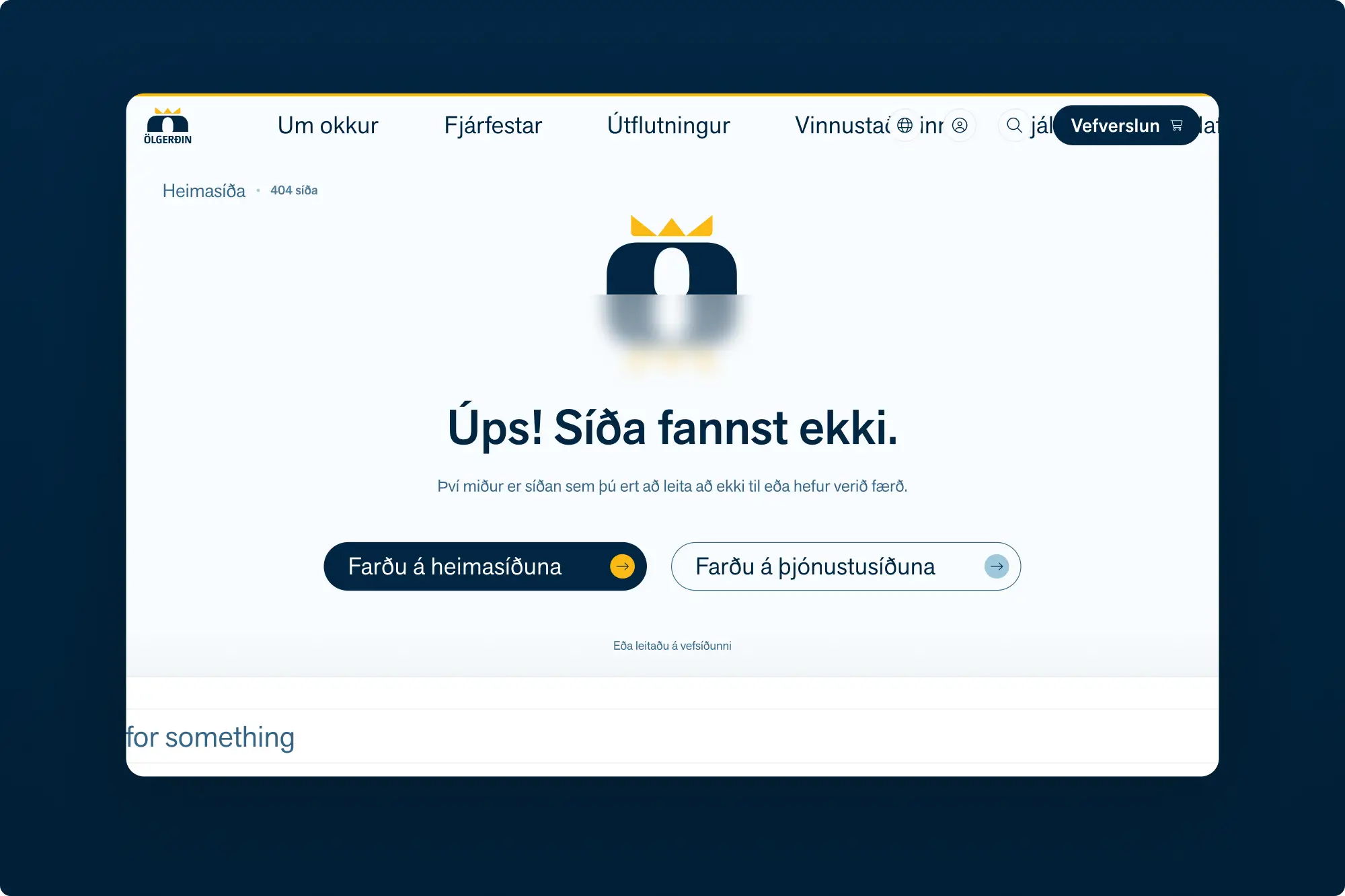
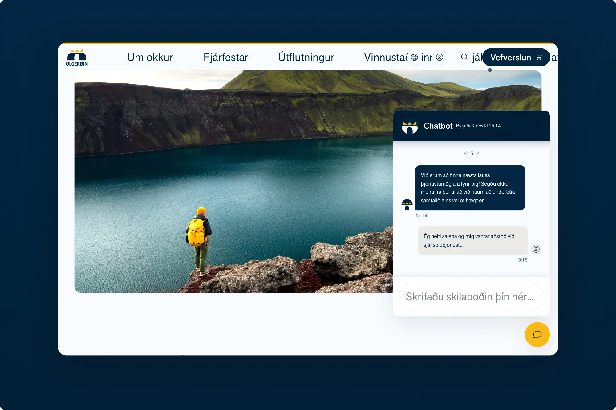
Web accessibility
Multi-brand design system
Client
Description
The mission
Visual direction
A balanced look and feel
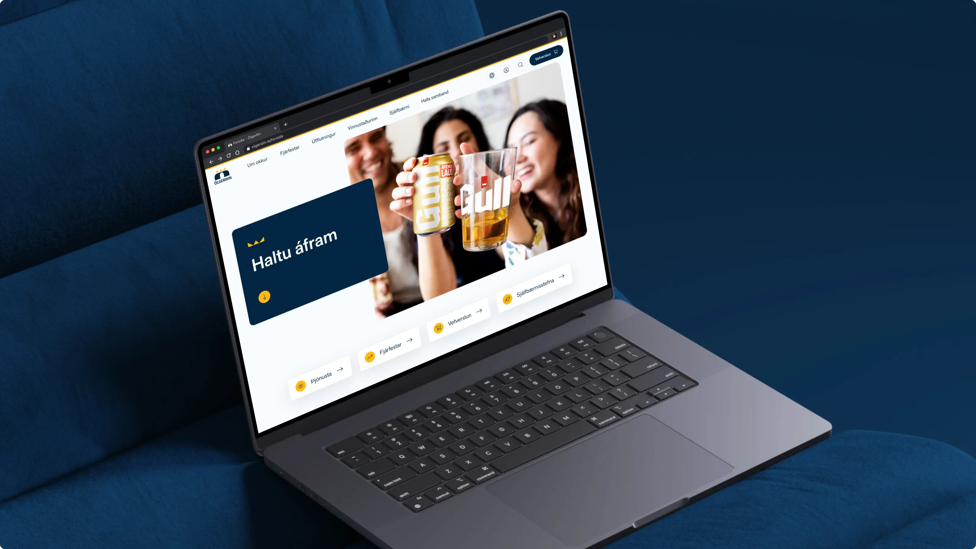
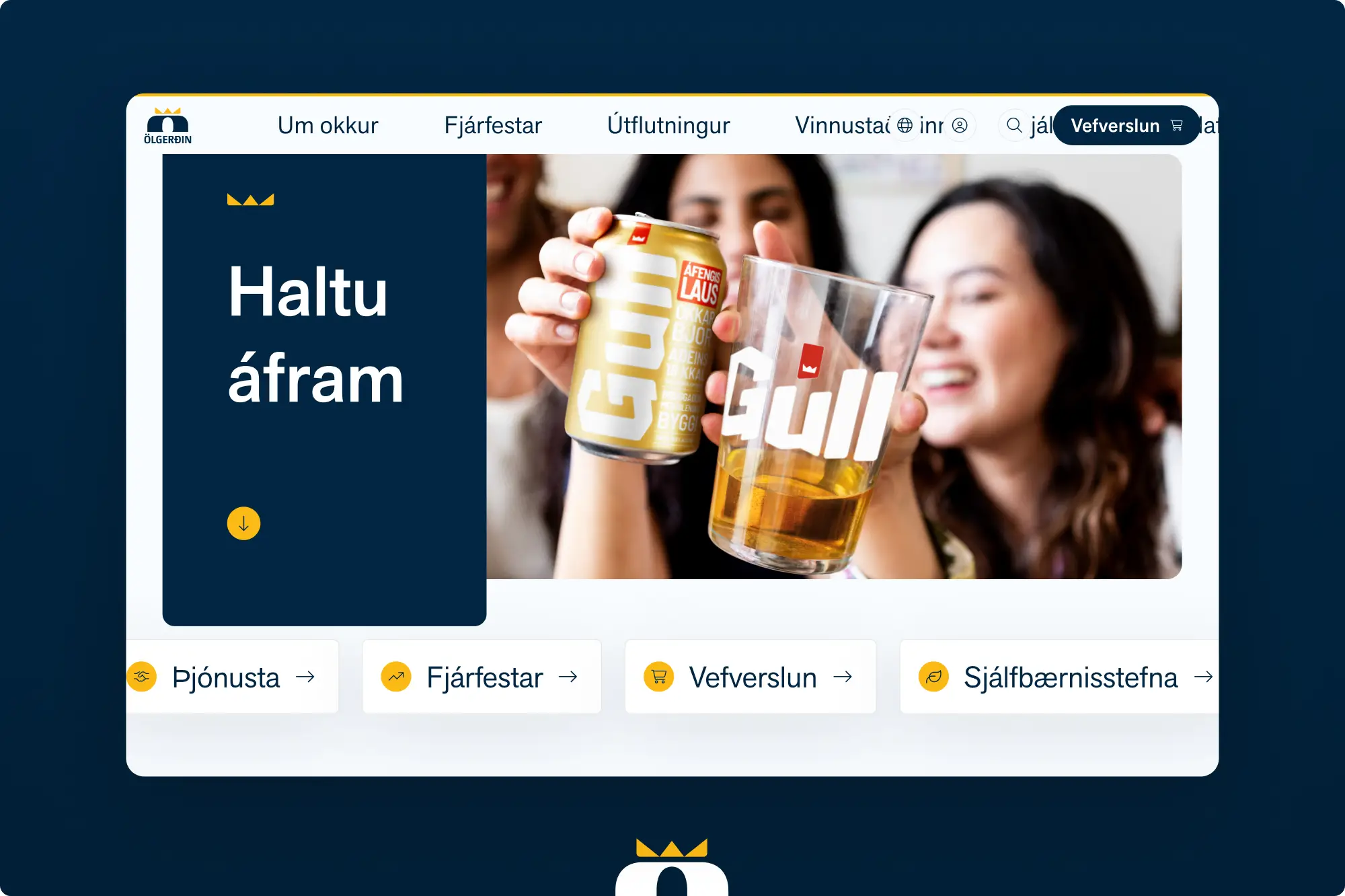
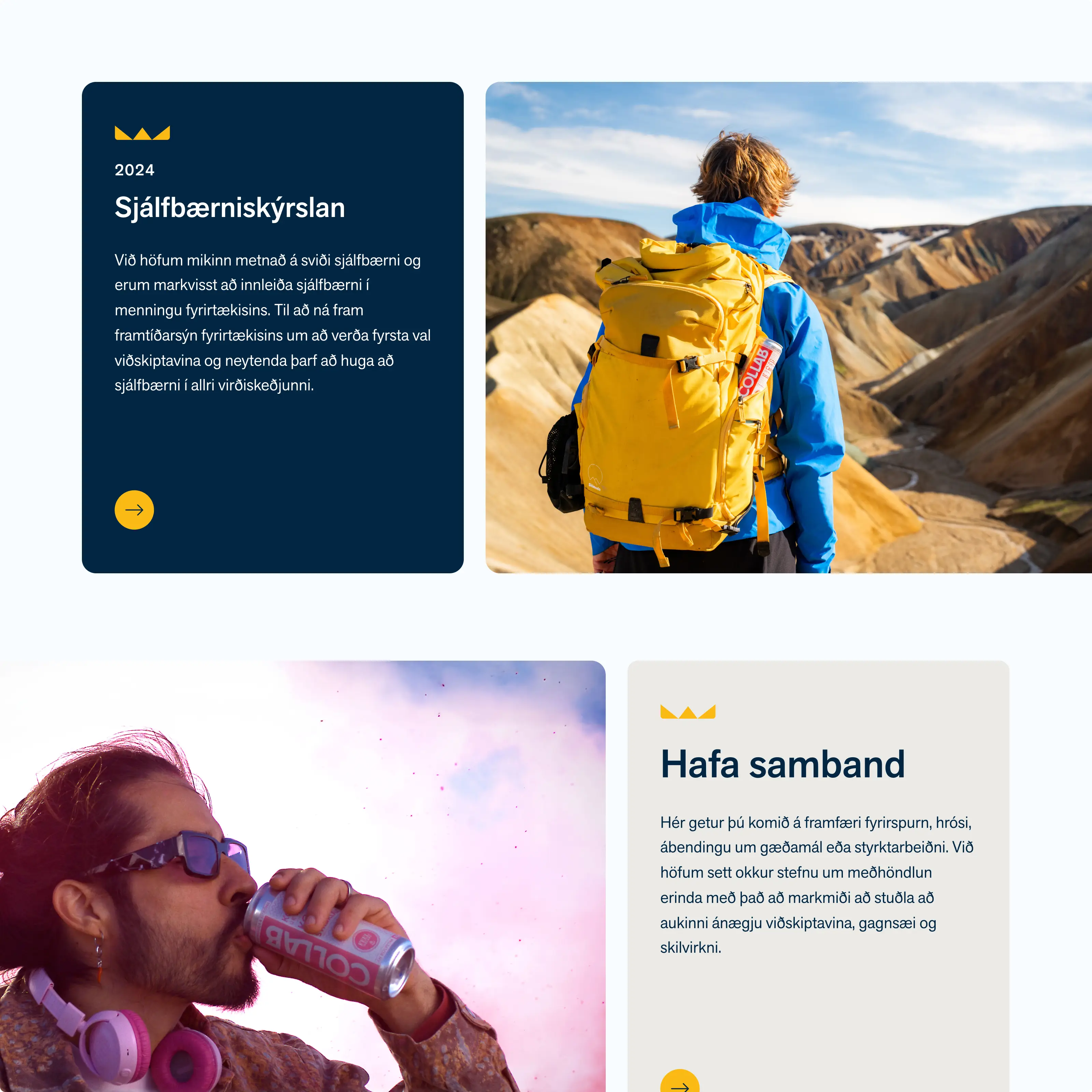
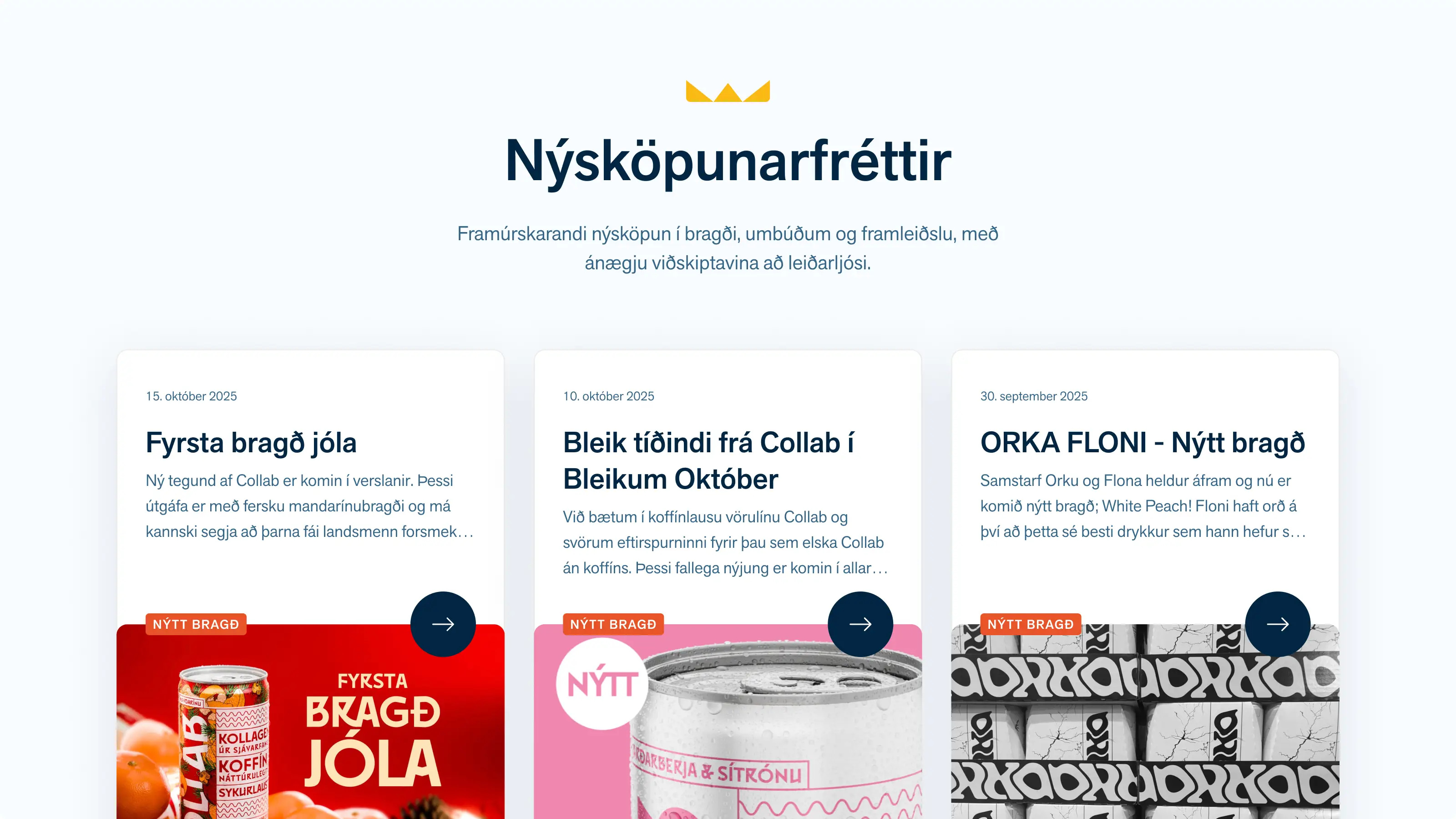
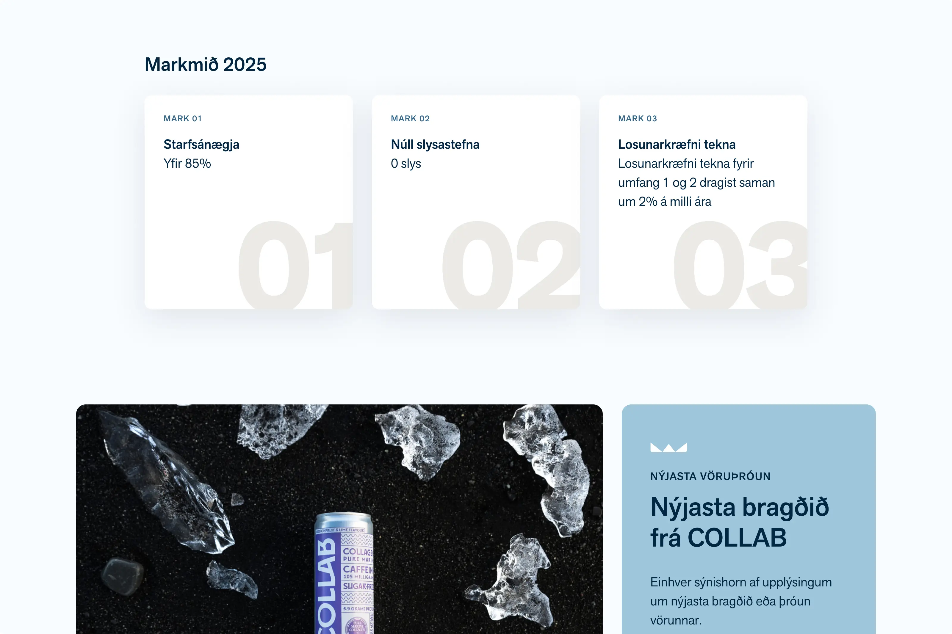
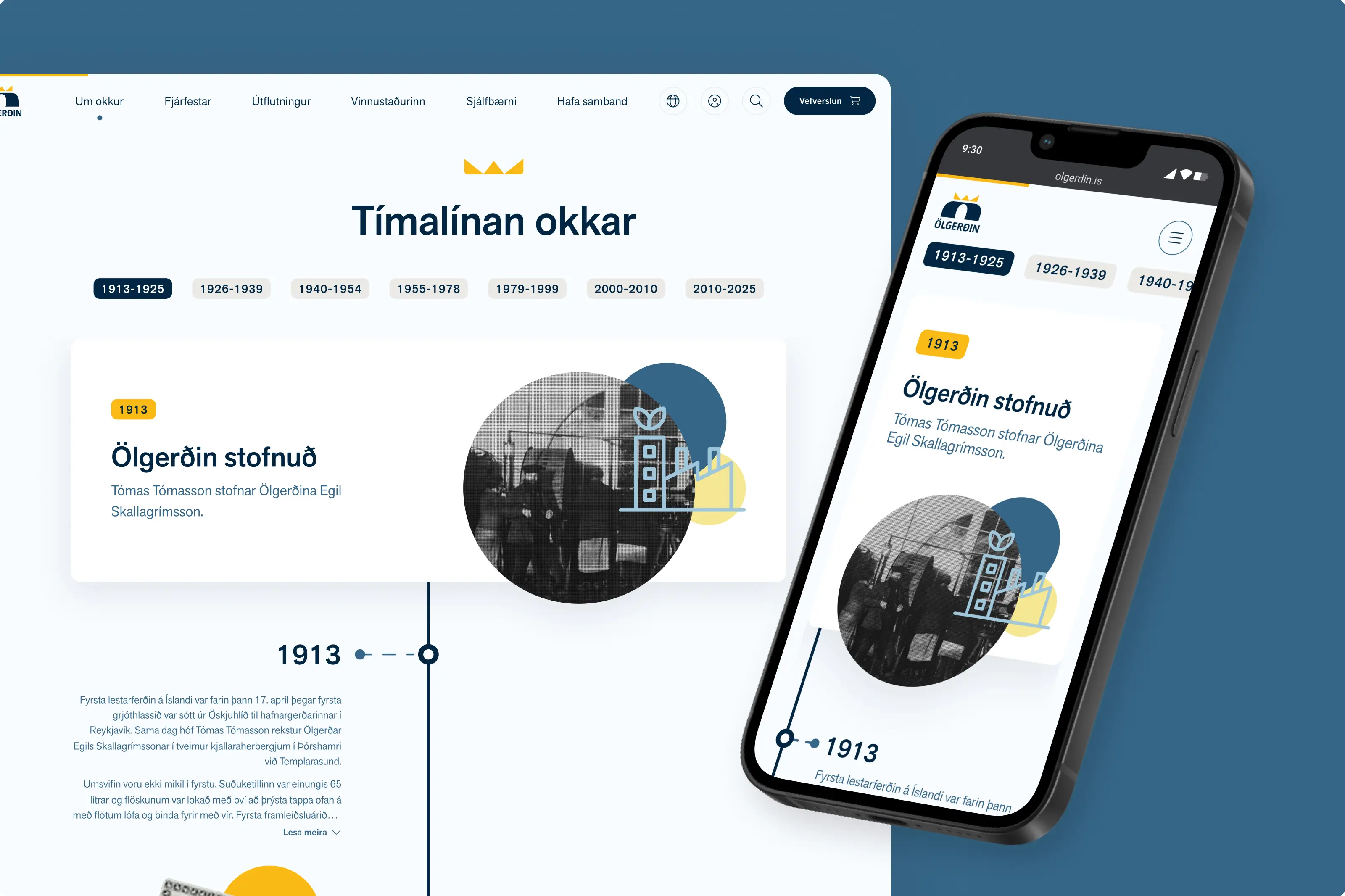
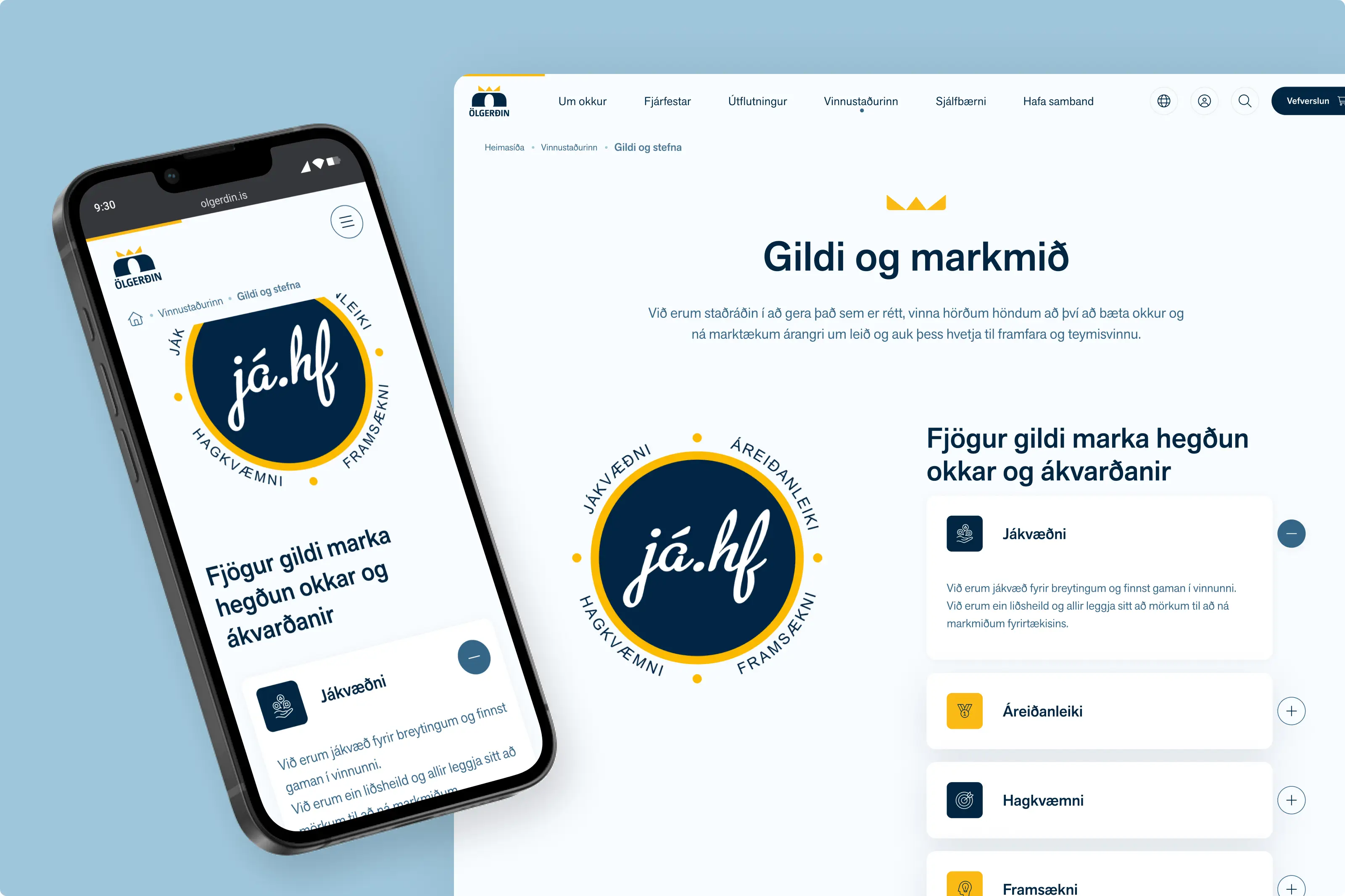
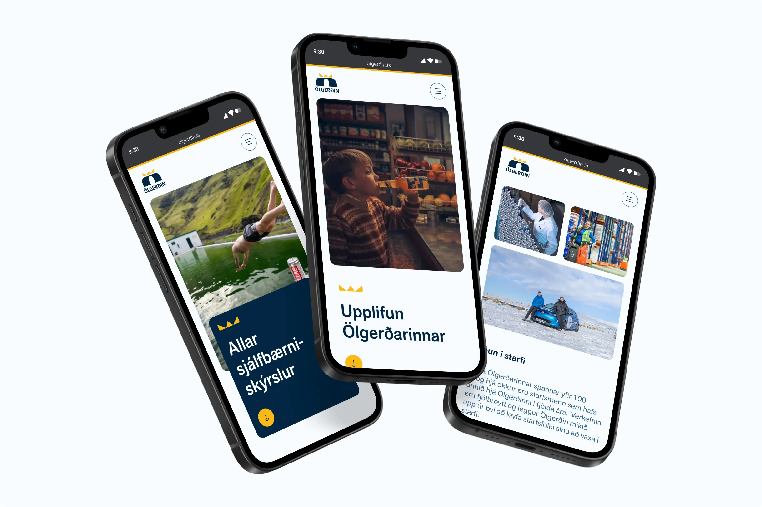
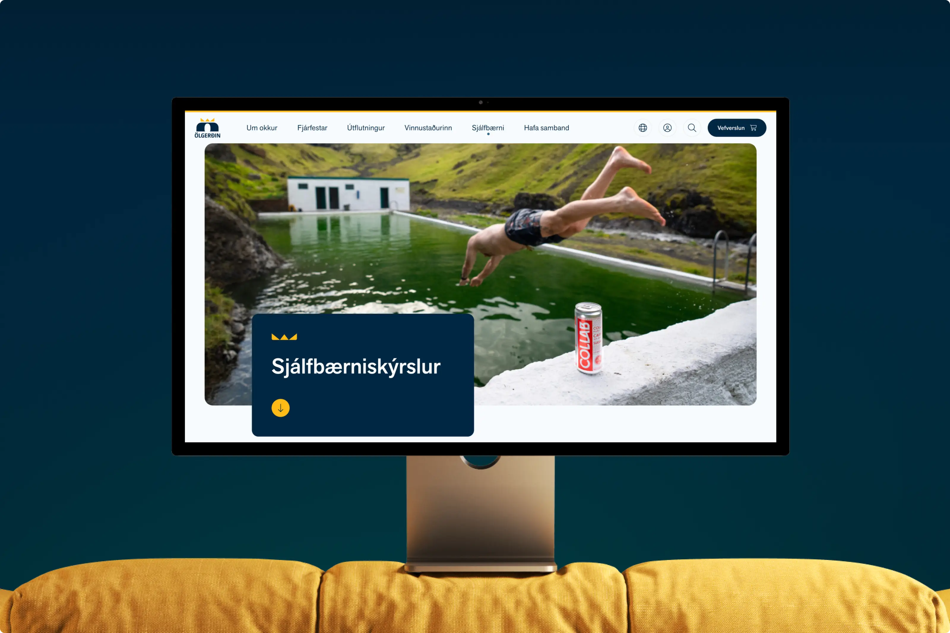
In collaboration with Ölgerðin, we defined a refreshed visual direction for their digital experiences. Building on their updated brand guidelines, we created a clean and professional interface infused with warmth and energy. Rounded corners, various lifestyle imagery, and generous use of white space brings a sense of balance, approachability, and expertise throughout the design.
UI/UX design
Improved UX and accessibility
After defining the refreshed visual direction, we focused on improving the user experience of the website structure. Improvements were made both in the navigation structure and within the page content. Information became more easily accessible to investors, customers, and future employees. Additionally, the company’s values and mission are more clear within the new layouts and information architecture.
Design system
A multi-brand design system
We created a unified design system of reusable, responsive components — a flexible framework built to serve not only Ölgerðin but also its family of brands, including Danól and Iceland Spring. The system enables each brand to stay visually connected while maintaining its unique character. With extensive UX documentation, design variables, and UI use cases, the result is a scalable system that balances structure and individuality.
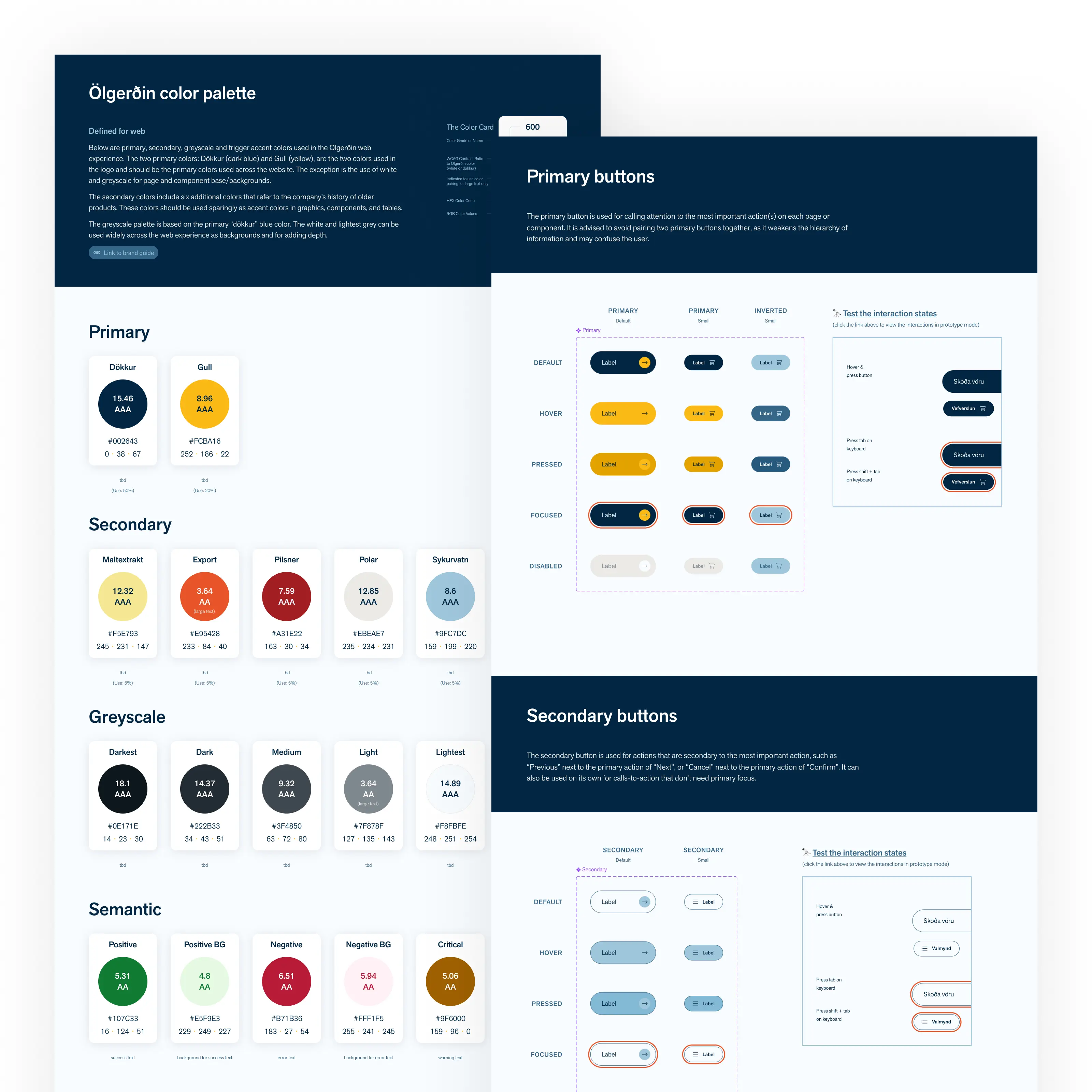
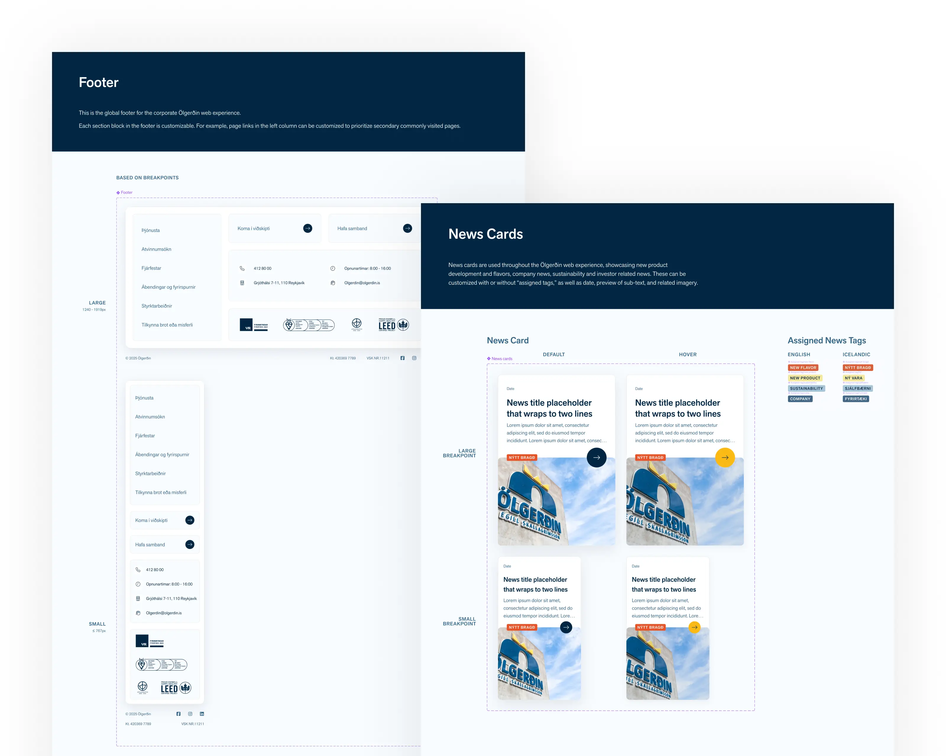
7 Figma design & Figjam files
128 Component Sets
103 Figma Comments
Next project

Turning emissions into decisions
UX design


