Brand identity for Þétt
Our Roles
Illustration
Client
Description
The mission
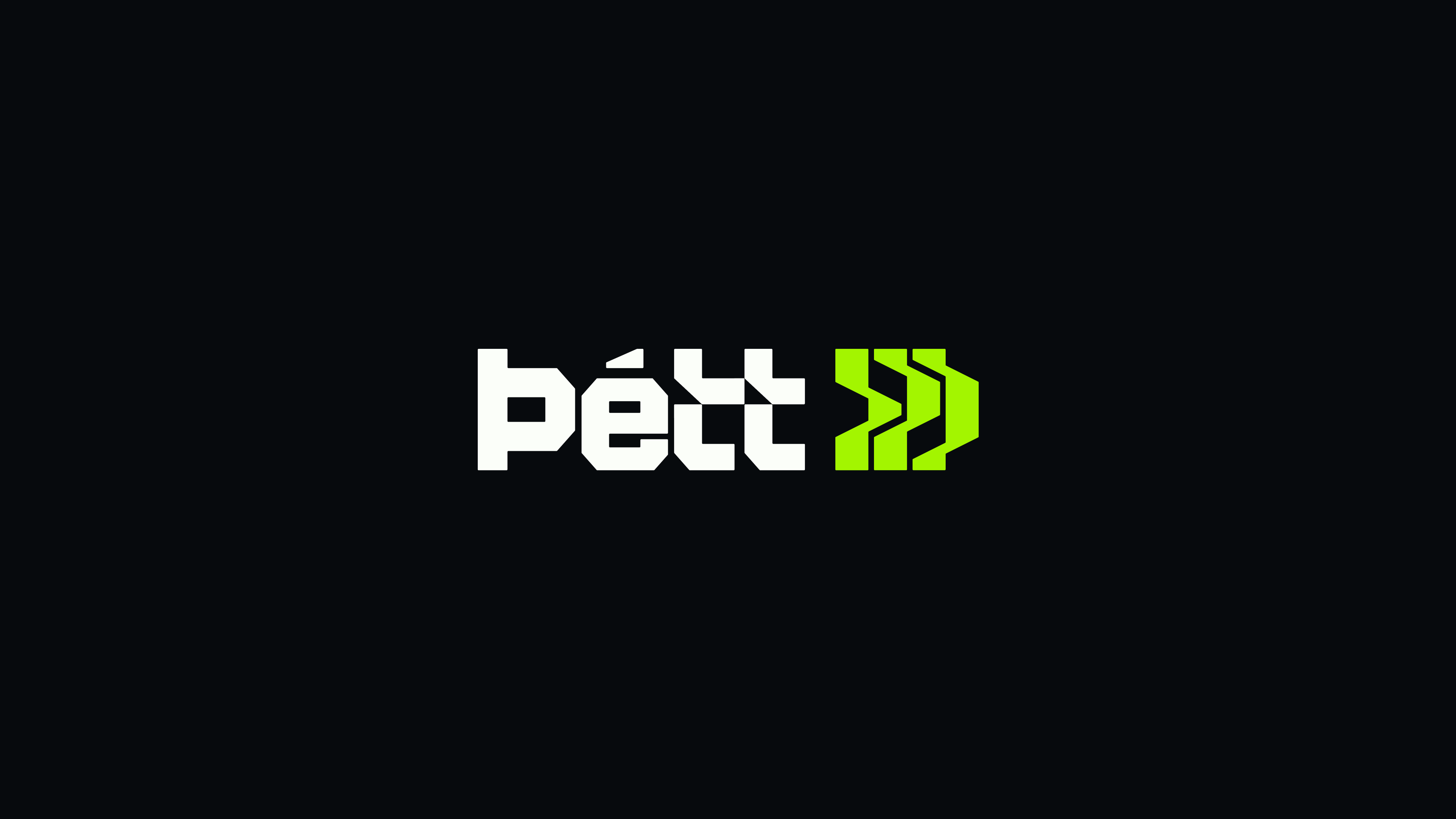
Logo
A Symbol of Structure
The logo icon was designed by combining multiple ideas: the concept of ventilation, the inner and outer wall layers, and the letter Þ, the first letter of the company name. The result is a structured and memorable mark that embodies both the technical world of sealant solutions and the strength of the brand name.


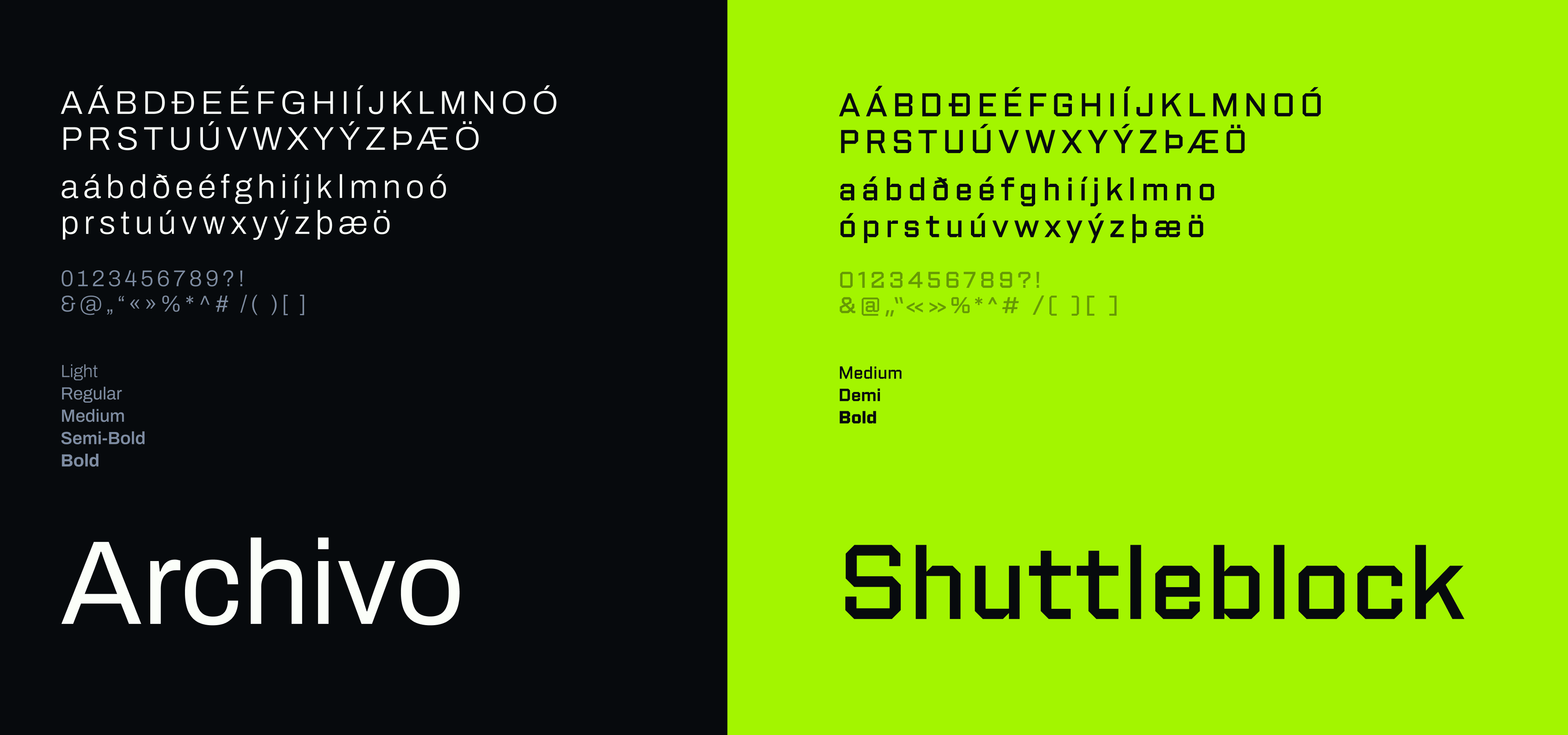
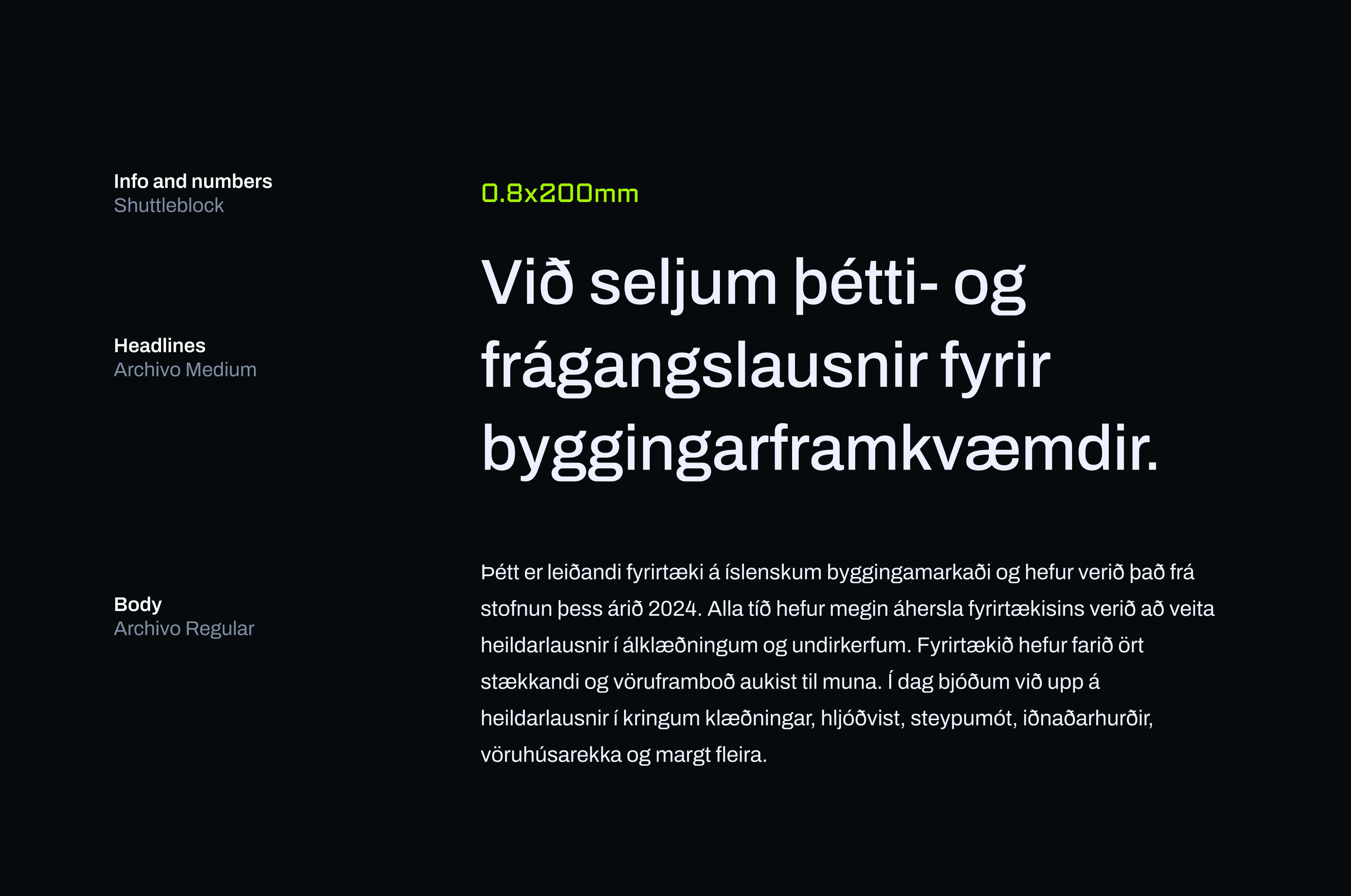
Style
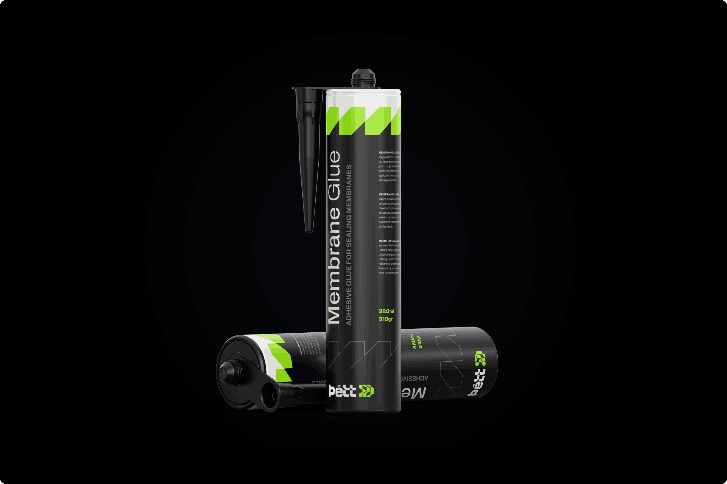
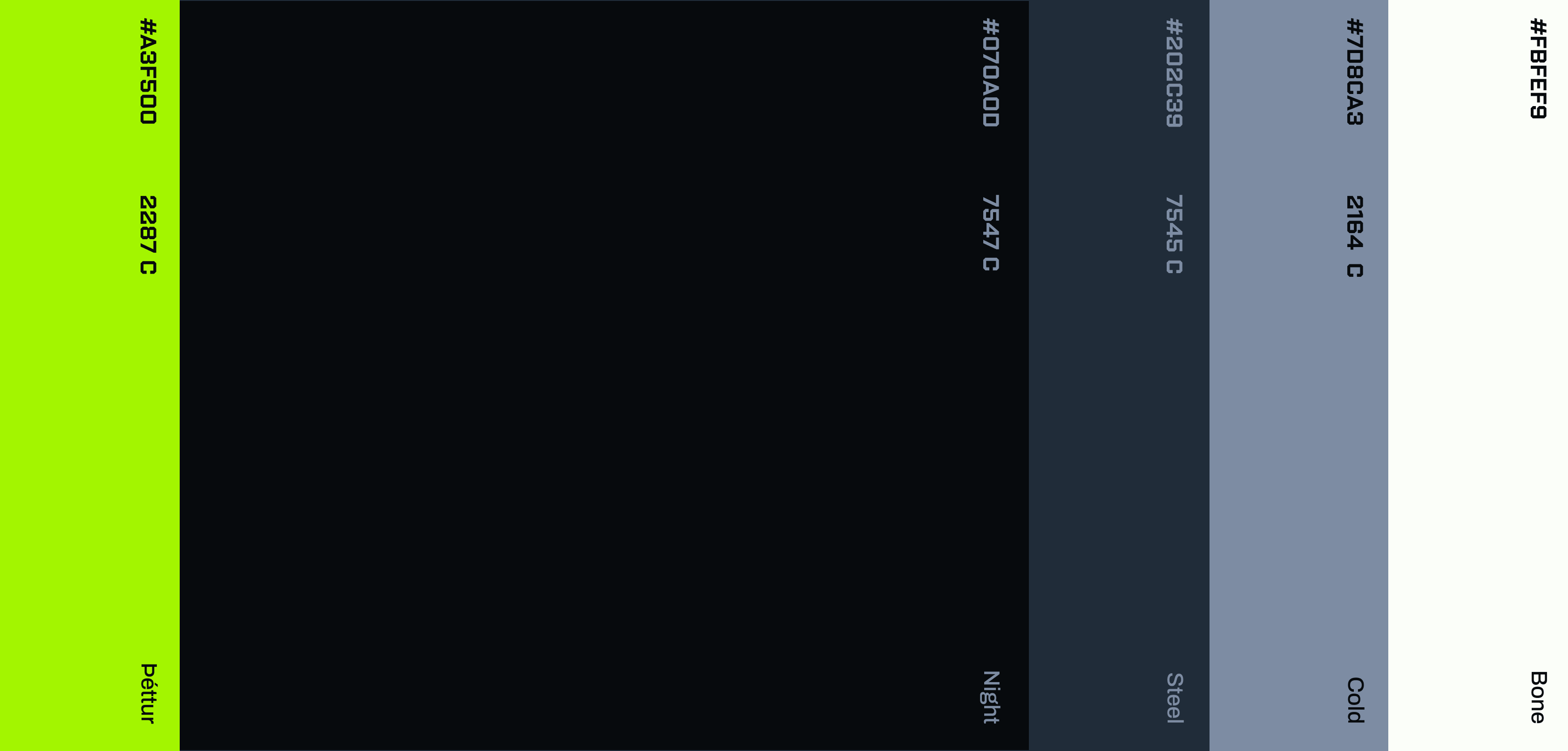
Colors and Typography with Impact
The brand identity relies on a vivid green as its primary color, supported by darker and gray tones that reinforce reliability and strength. Typography plays an equally important role: Archivo ensures clarity and professionalism, while Shuttleblock is used for numbers and graphic text elements, adding a technical and industrial feel.
System
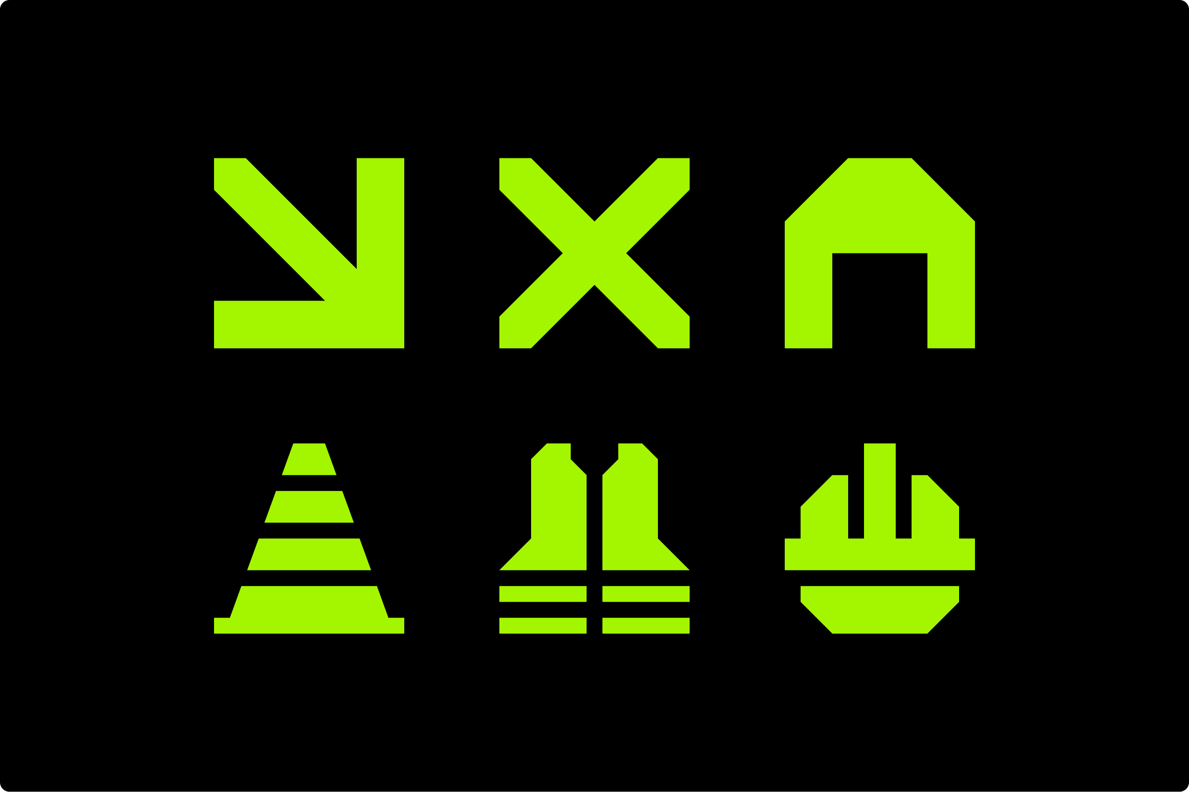
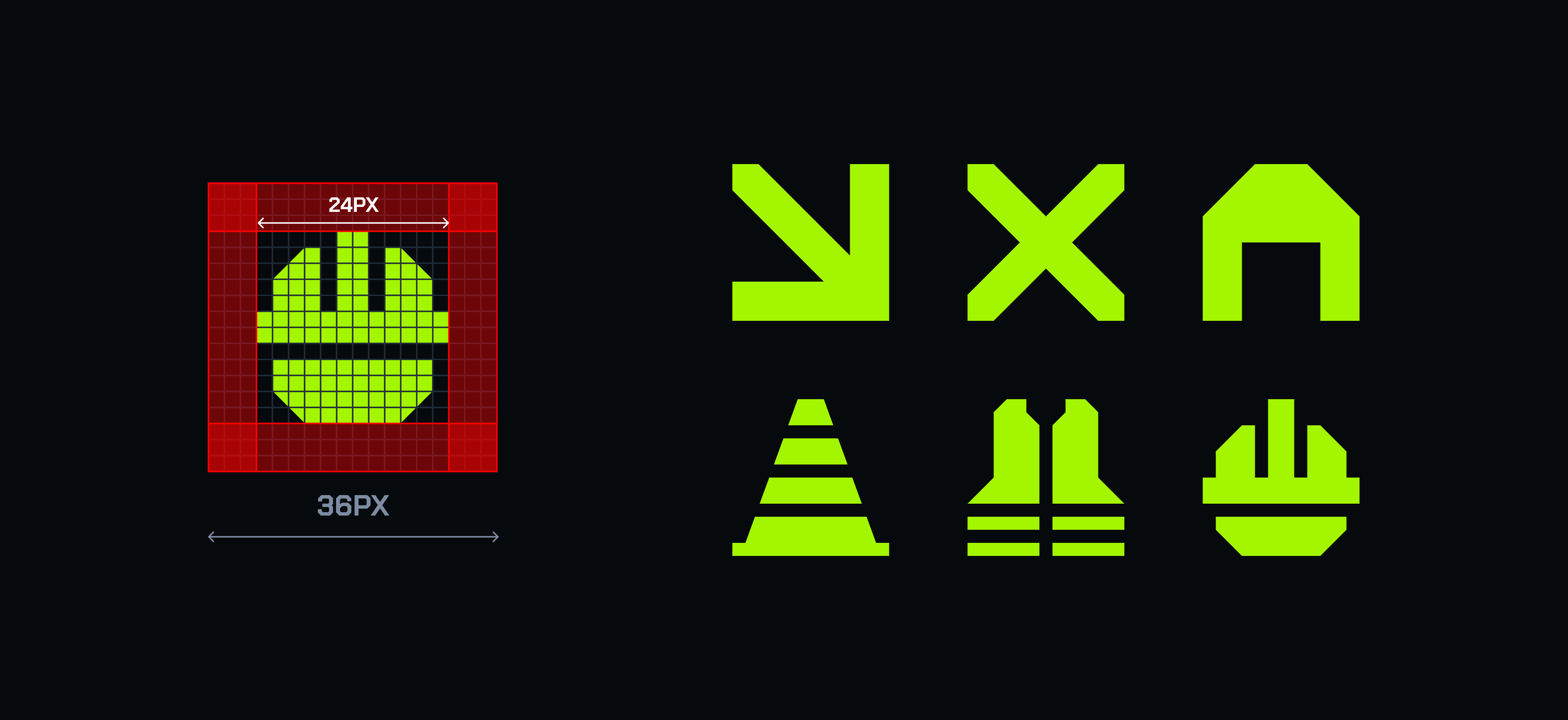
Patterns, Icons, and Visual Assets
We created a geometric pattern system used across backgrounds and decorative elements, giving the identity a distinctive and cohesive feel. A custom icon set was also designed, built on the same geometric grid, ensuring all visual communication feels consistent and engineered with precision.

Reach
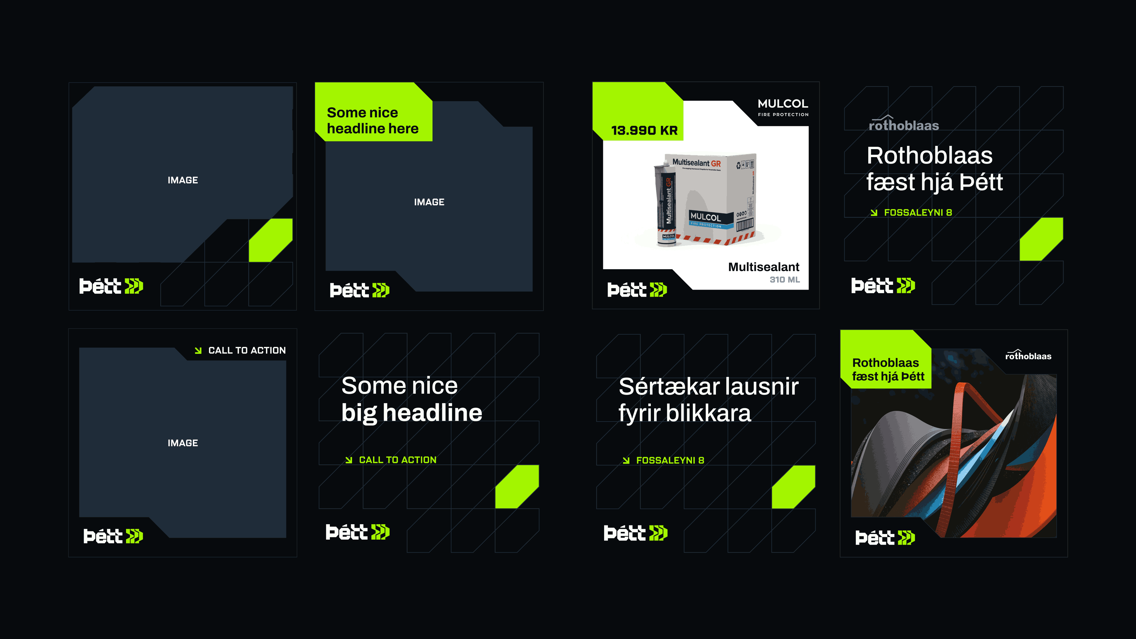
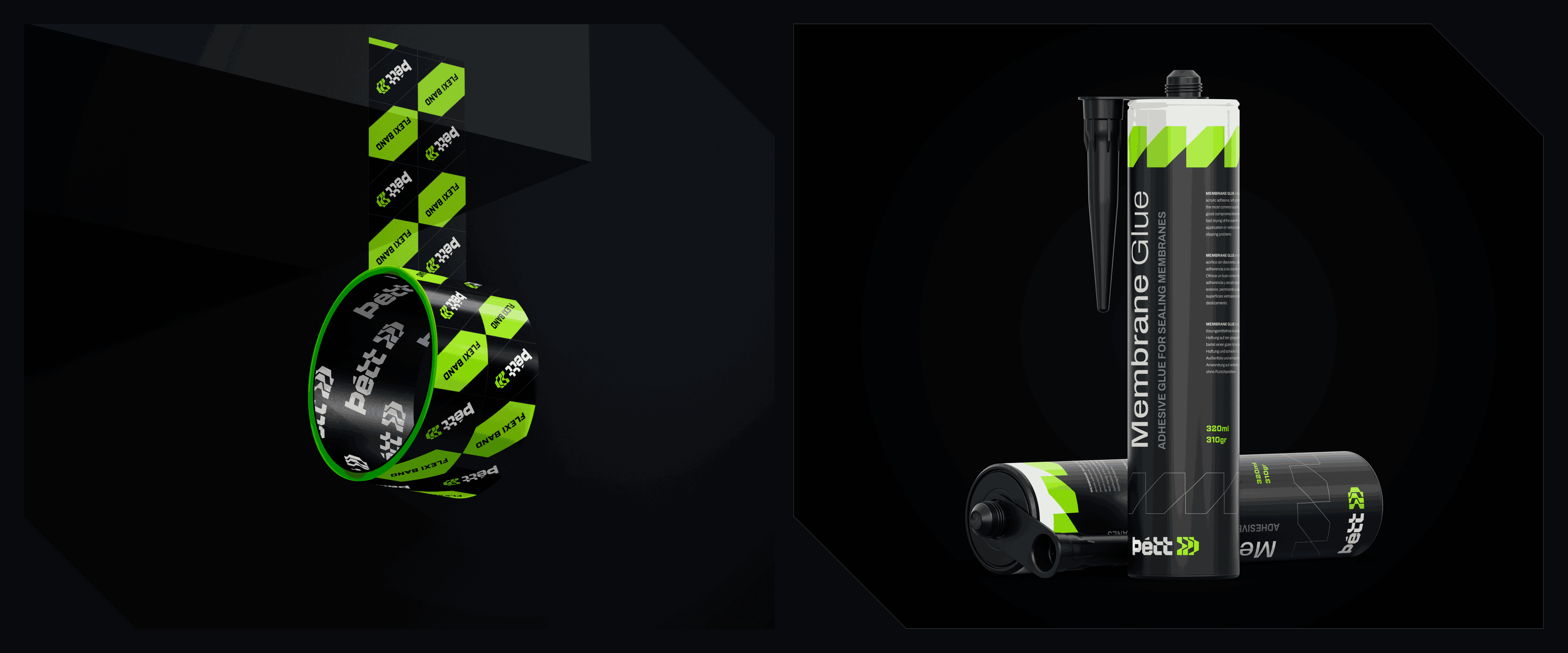
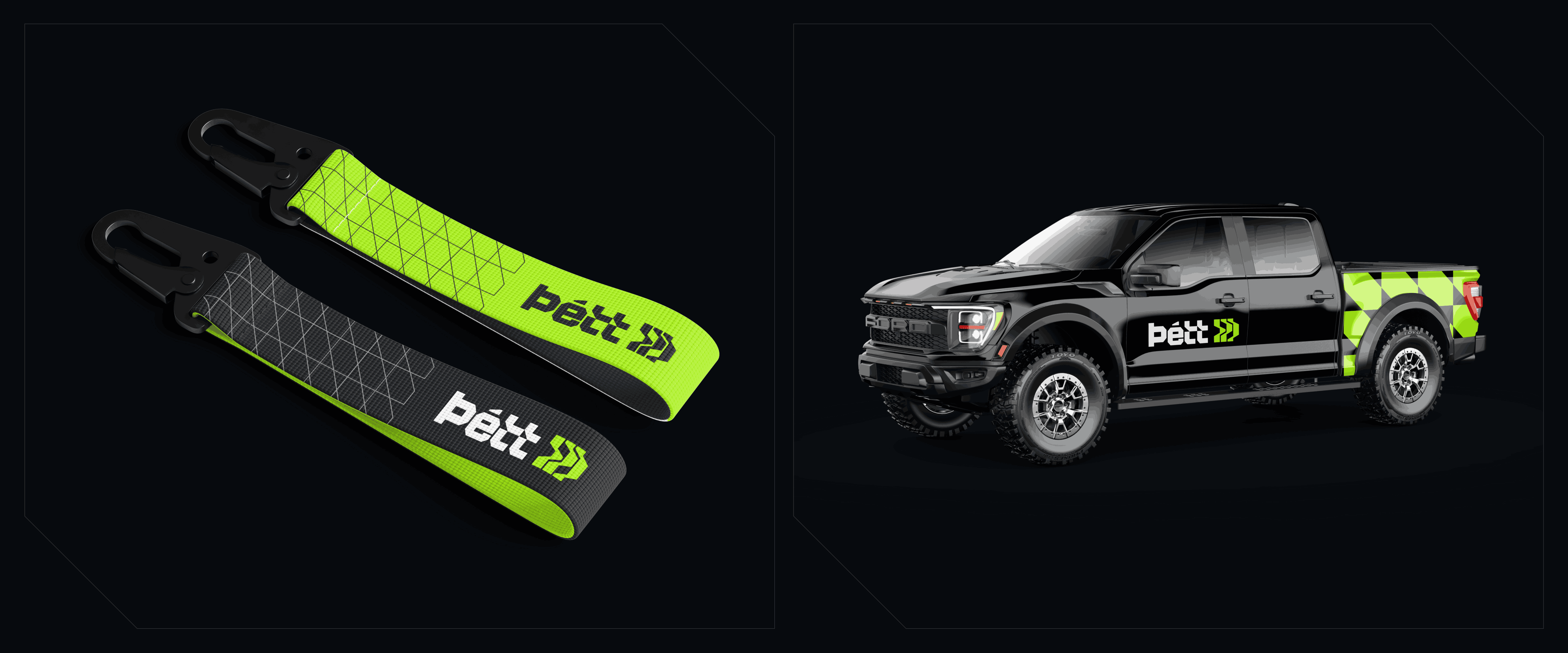
Ads, Merchandise, and Signage
To help Þétt reach different target audiences, we developed an ad library and flexible templates tailored for multiple segments. In addition, a full range of merchandise and signage was created, ensuring the brand identity extends seamlessly into every customer touchpoint.
Next project


A Bold Rebrand for a New Era
Advertising
Illustration


