Inspiring lifelong learning
Our Roles
Web design
Illustrations
Client
Description
The mission
INITATIVE
The initiative
An analysis conducted by Aton showed that employees were interested in more learning but did not know where to find information and did not know about grants from their unions. On the other hand, employers were not aware of their employees' interest in learning. We needed to increase access to information and raise awareness. Lifelong learning is important in modern society; people work longer and technology is changing quickly.

THE START
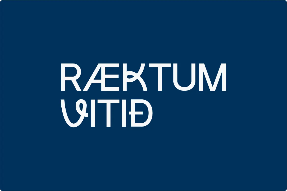
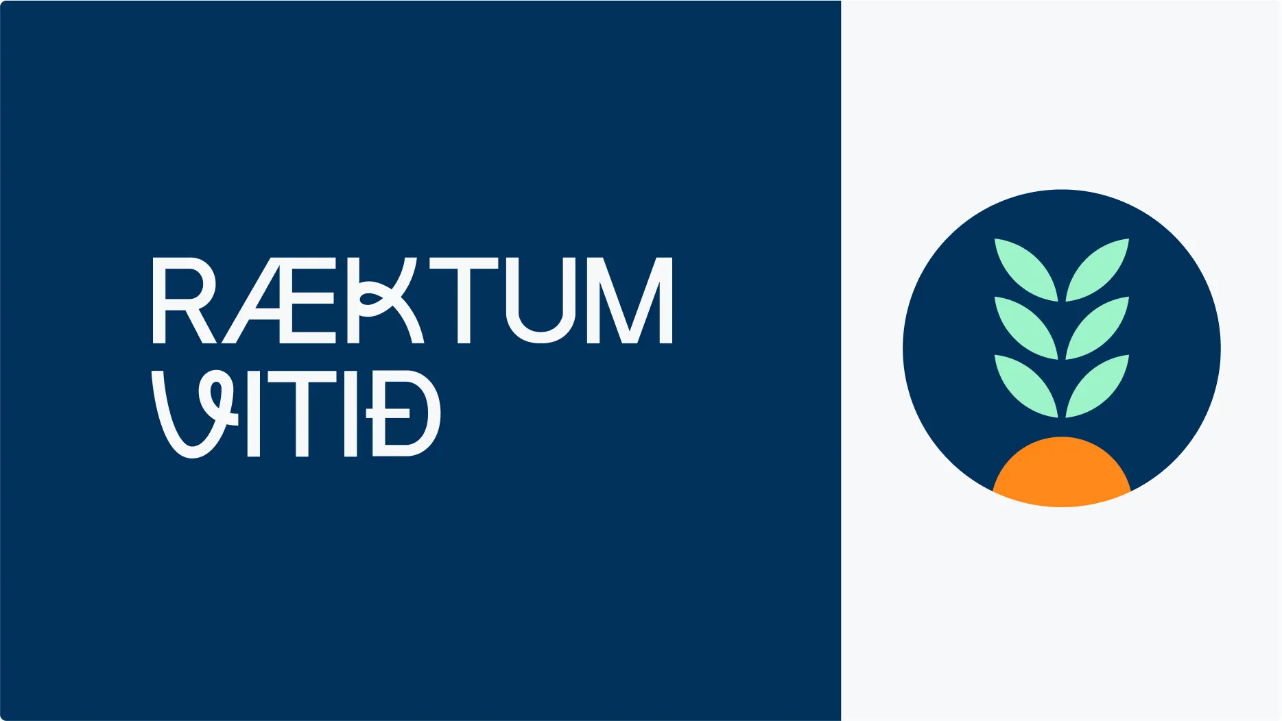
The name
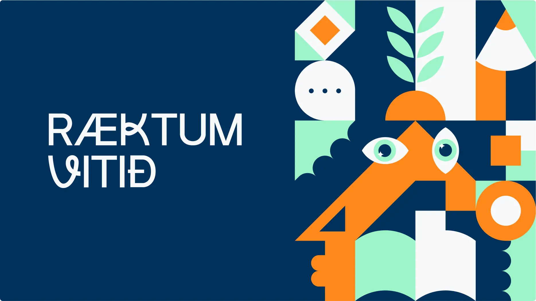
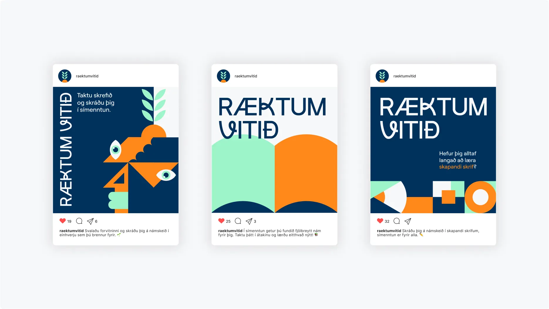
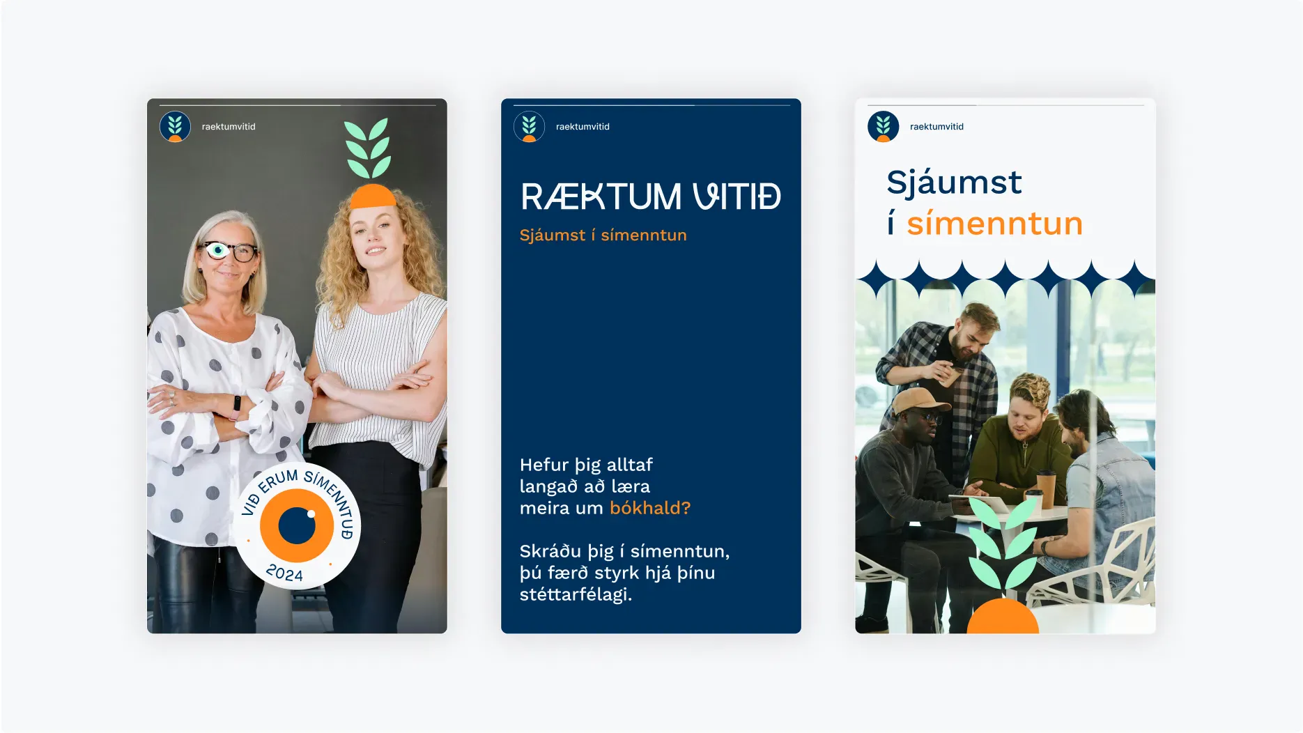
The project needed a name that was memorable, unique, and captured the spirit of the project in a clever way. That’s howRæktum vitið(Grow your mind) came to life, it is short, catchy, and full of rhythm. From there, we designed a visual identity that’s light, playful, and positive, reflecting the idea that lifelong learning can be fun and rewarding. The logo is a lively text mark with distinctive details, as well as a growing plant symbol. The plant represents growth in life and work, echoing the project name and reminding us to nurture and develop our minds.

LOOK & FEEL
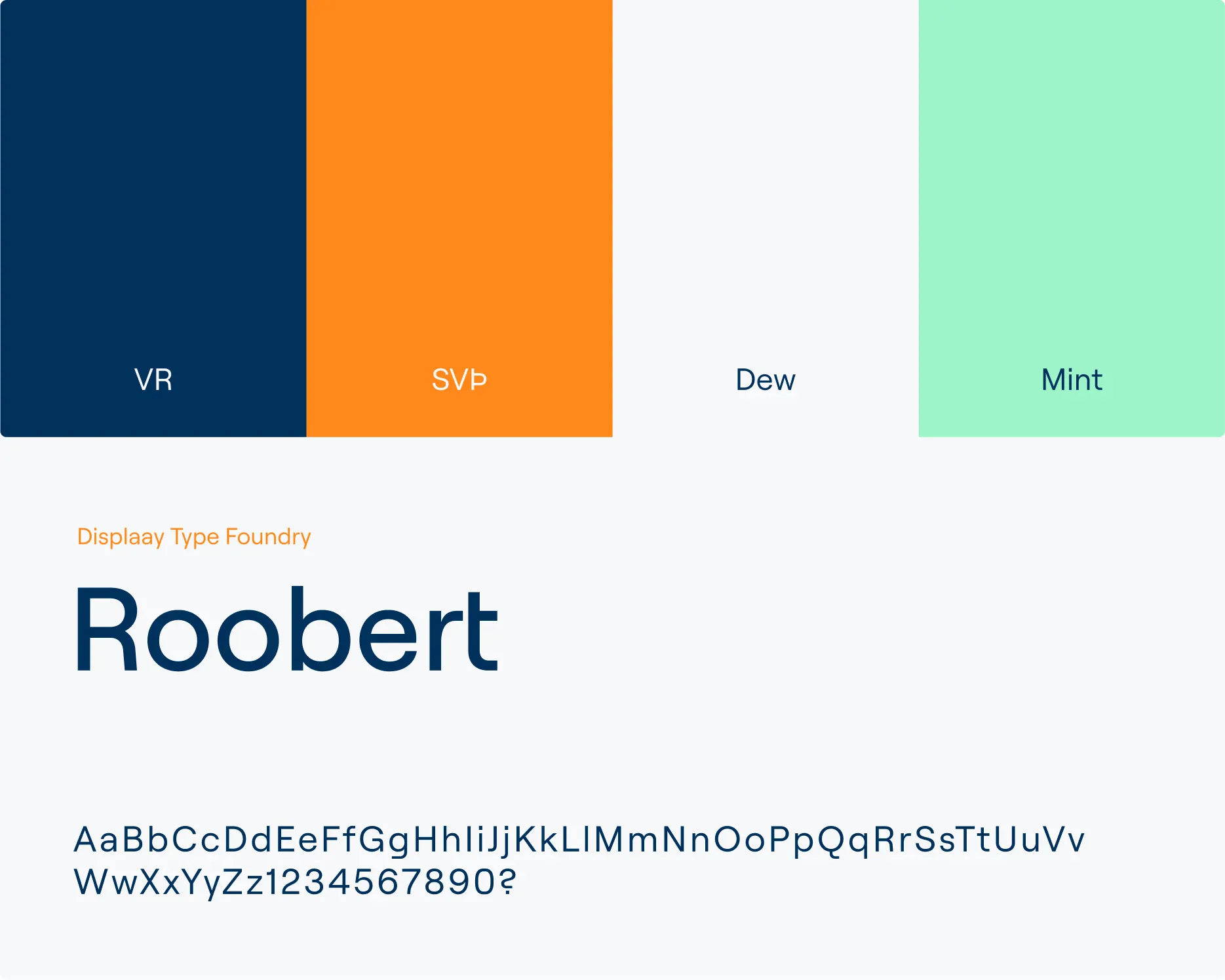
The colors
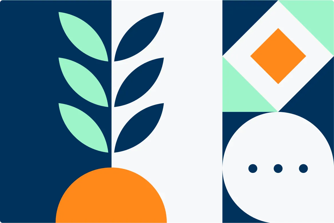
Since the project is a collaboration between VR and SVÞ, we explored ways to combine their visual identities. VR's bold dark blue and SVÞ's vibrant orange were chosen as the primary colors. The two colors are dark and vibrant but go surprisingly well together. To create balance and contrast, we added white and mint green to the palette, softening the intensity while keeping the overall look fresh and dynamic.
ILLUSTRATIONS
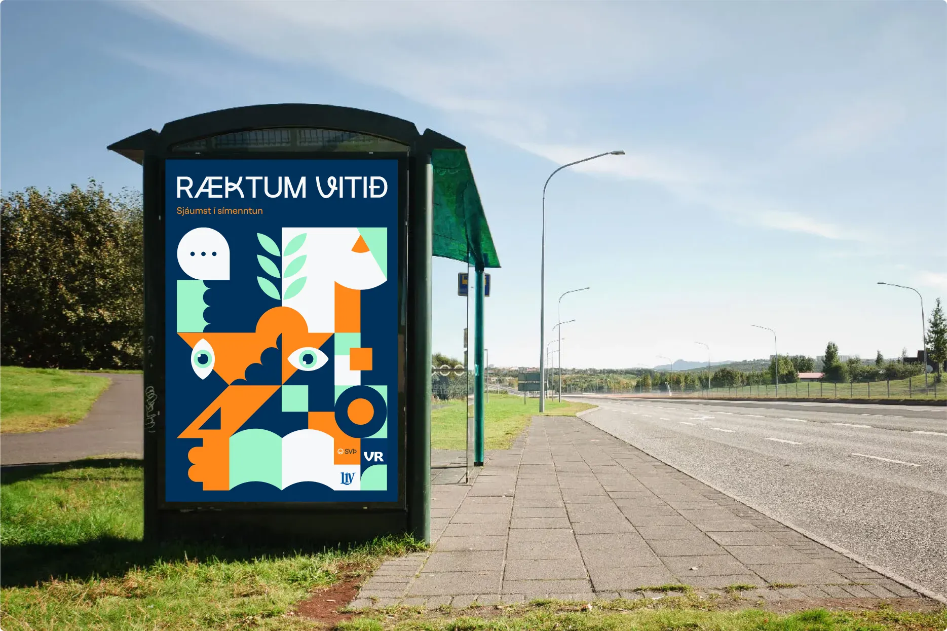
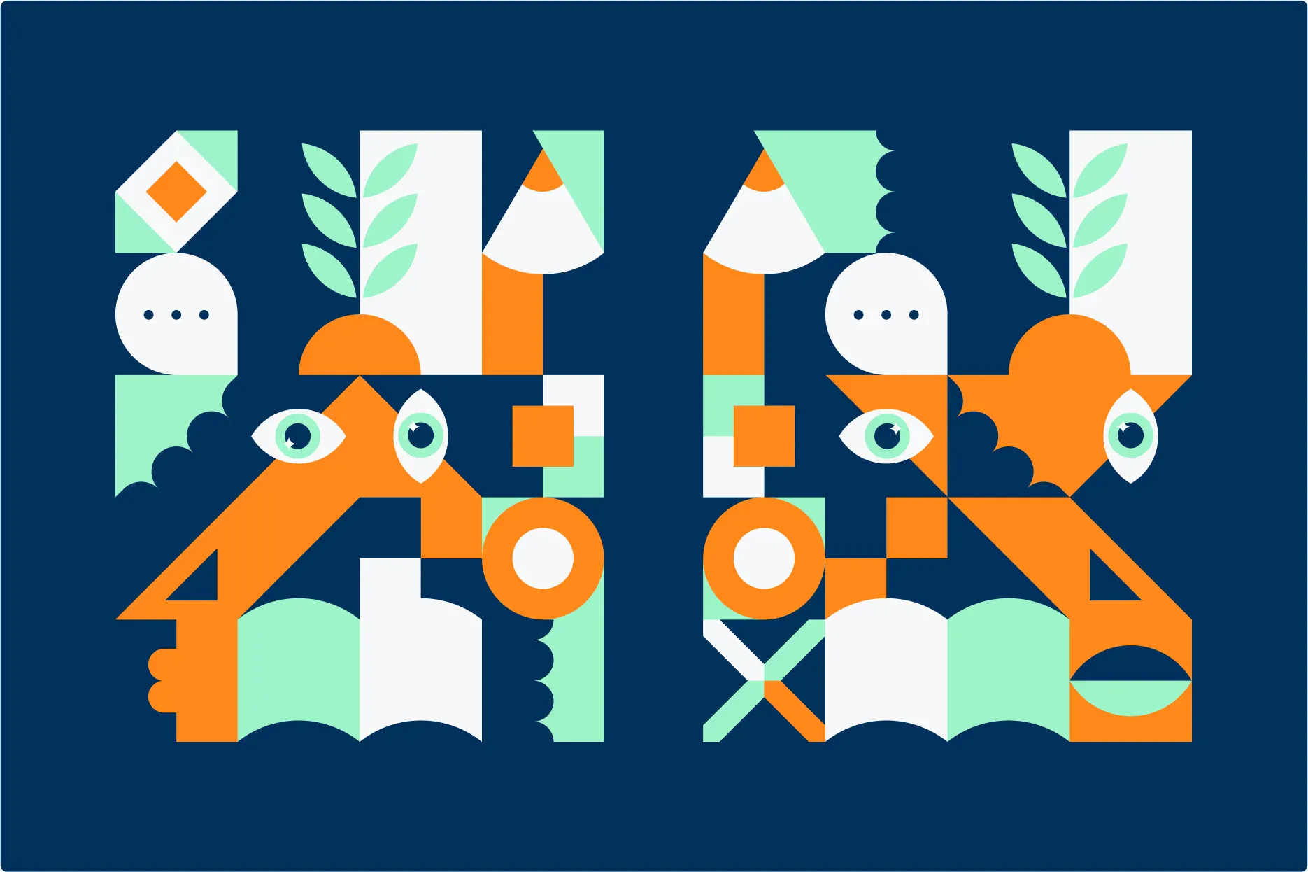
The visuals
The visuals use abstract mosaic elements that can be arranged in many ways to form larger images related to themes like education and work, such as pencils, books or characters. These hidden images invite viewers to pause and explore the details. The system allows for both large compositions and the use of individual pieces alongside text and photos. To bring the visuals to life, small animations like a shifting eye, a growing plant or gently moving shapes add subtle motion and interest.

ONLINE
The website
The website was designed to inspire and support employees and employers in retail and service sectors on their journey of lifelong learning. We aimed for a simple, welcoming design that is easy to navigate and works smoothly in both Icelandic and English. The site shares useful info about courses, grants and Icelandic language learning, all with a friendly tone that reflects the playful spirit of the brand. By linking to helpful resources and keeping things clear and approachable, the website encourages everyone to grow their skills and feel confident in their work.


.webp)
Next project
Start with branding
Visual language
Logo design
Naming
Motion design


