Accessible design for higher education
Our Roles
Web Accessibility
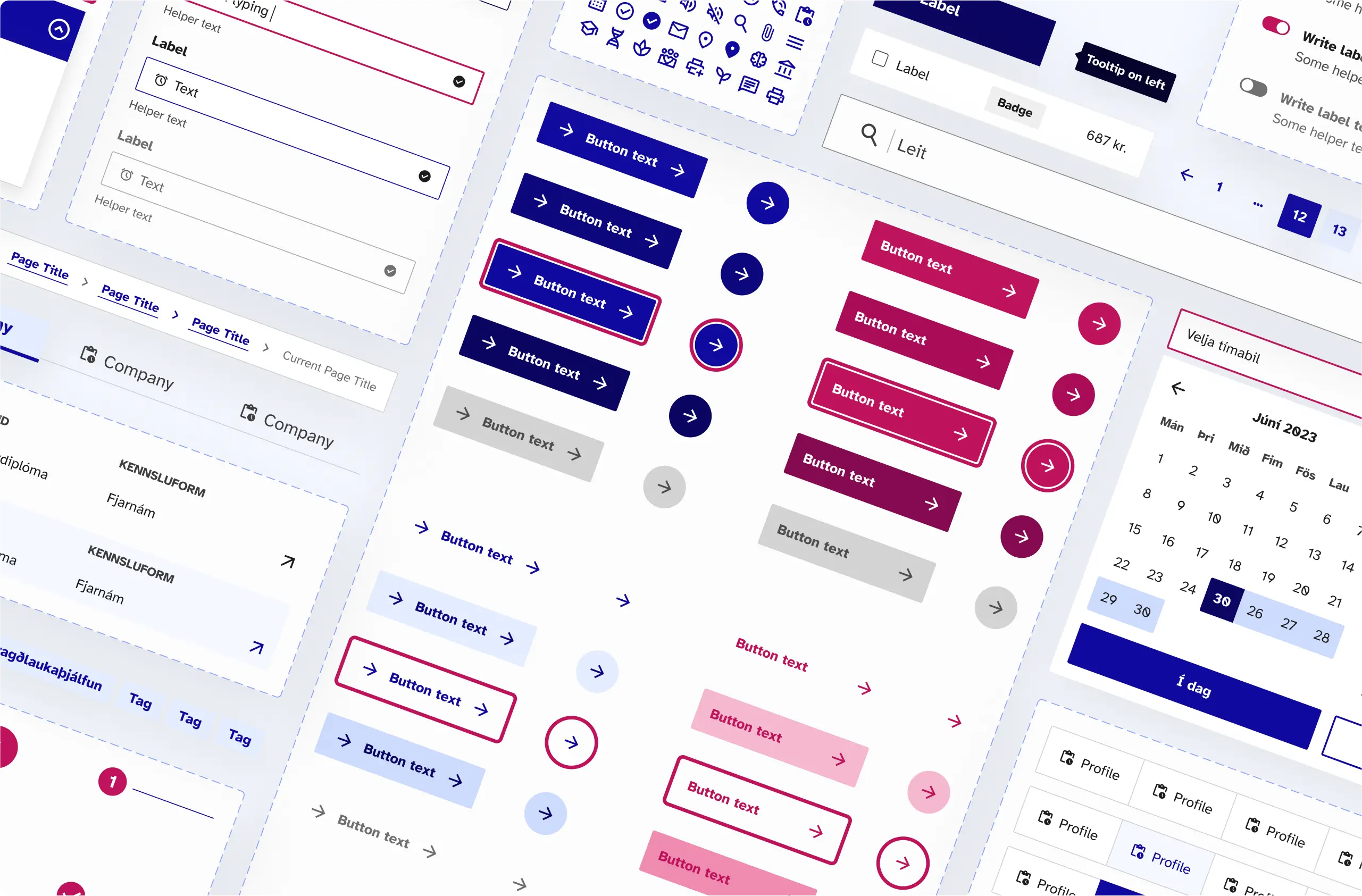
Global design system
Client
Description
The mission
UX Design
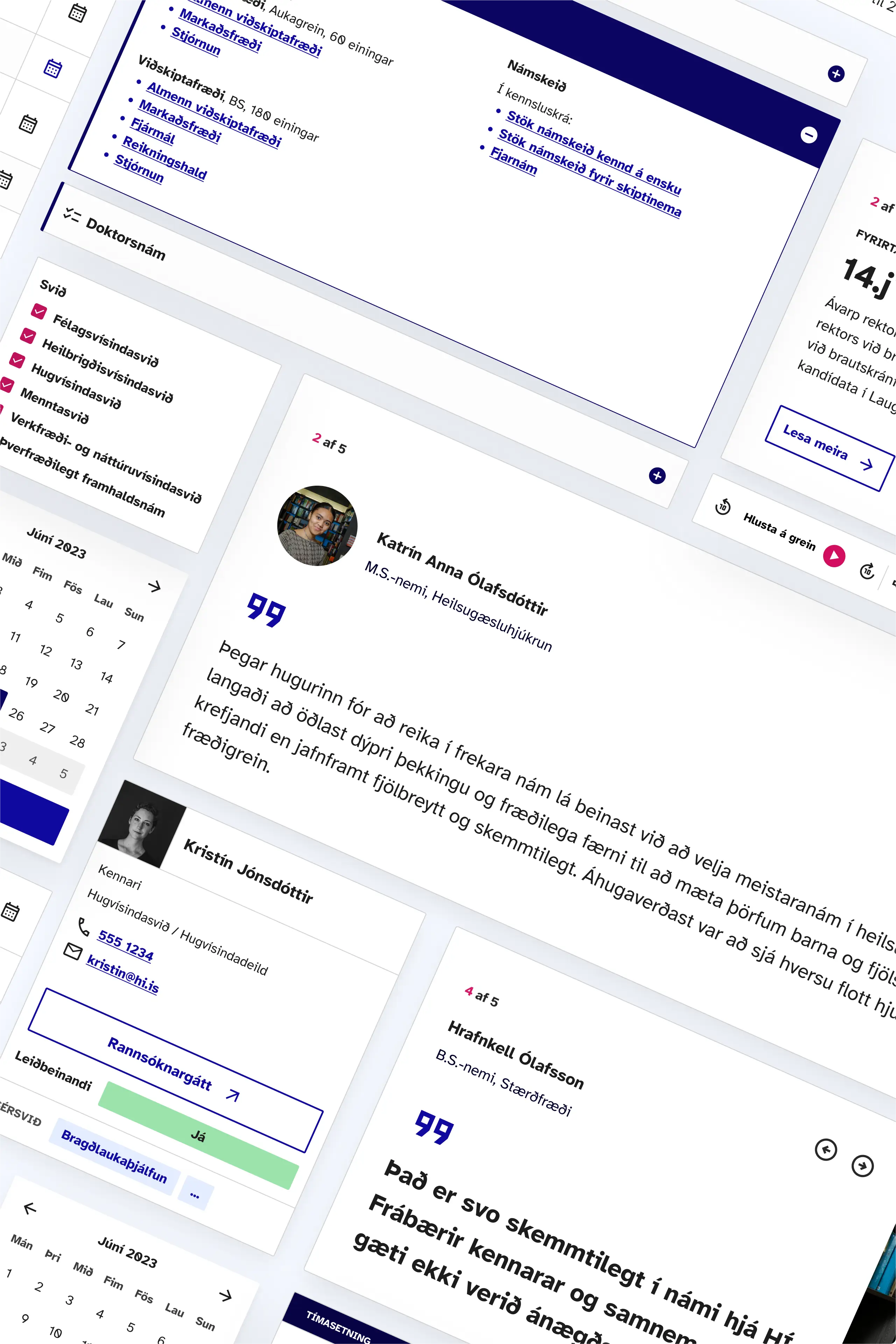
Built around users
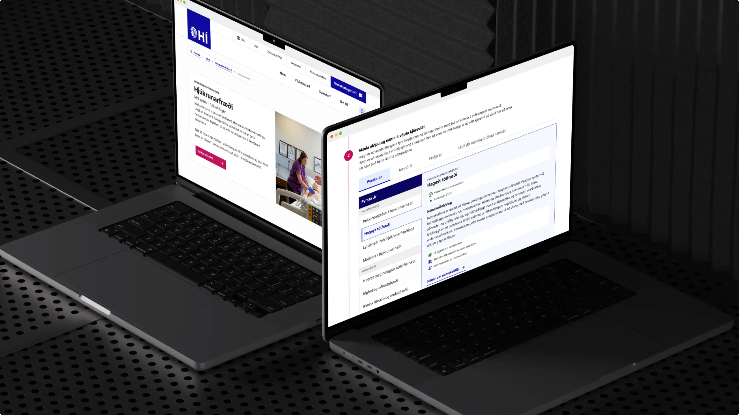
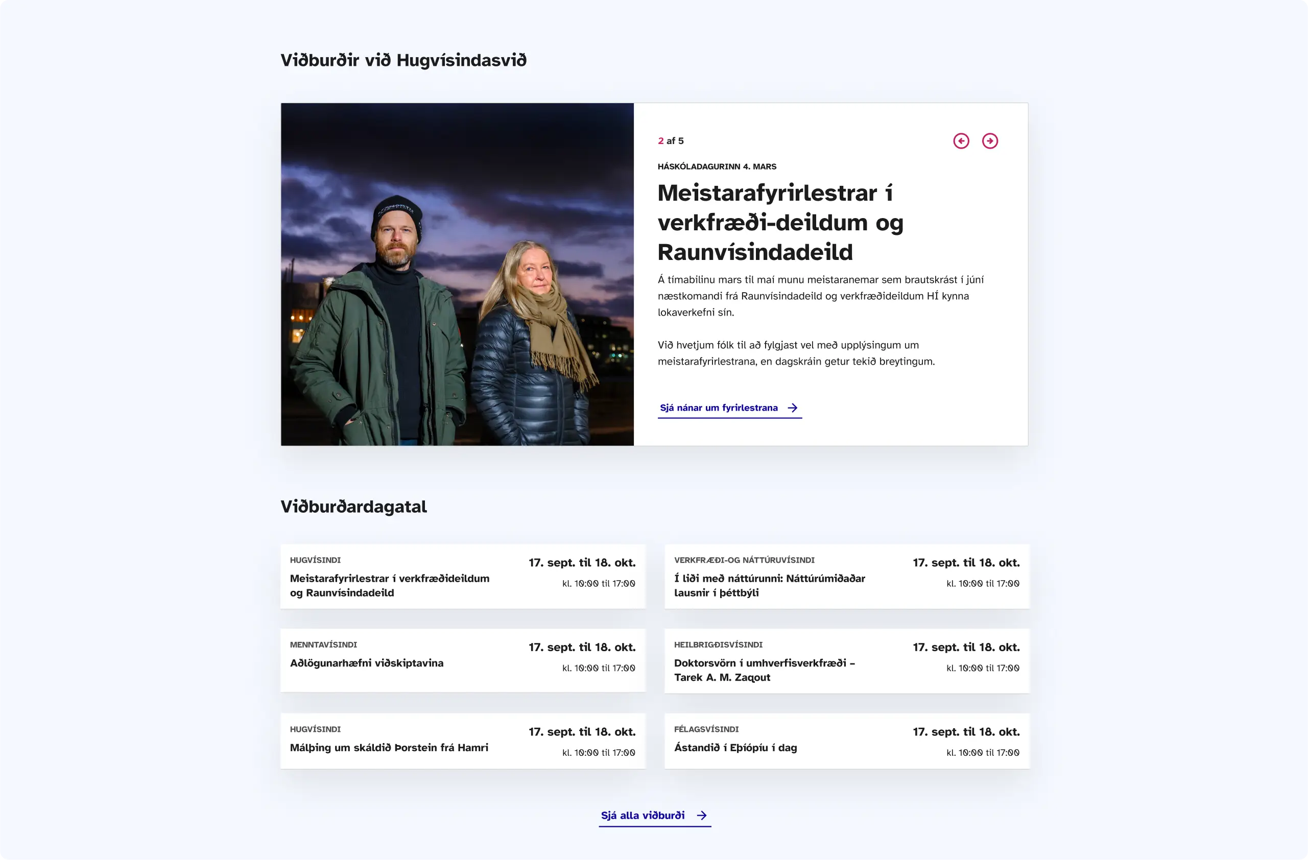
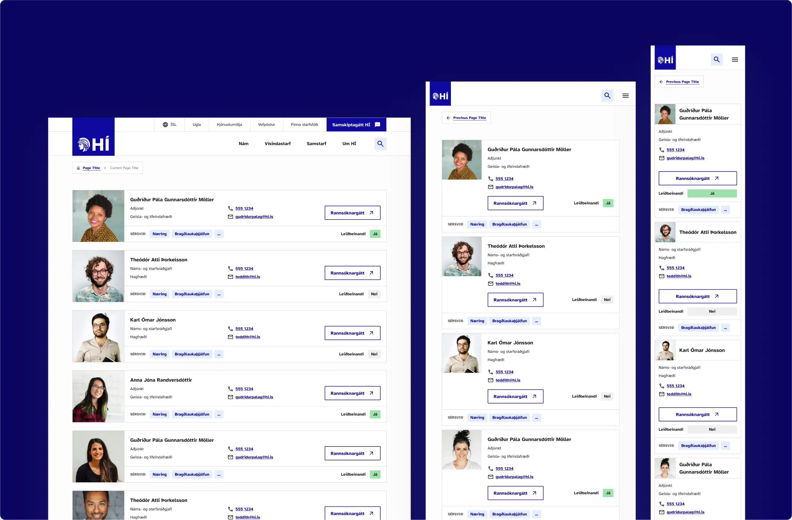
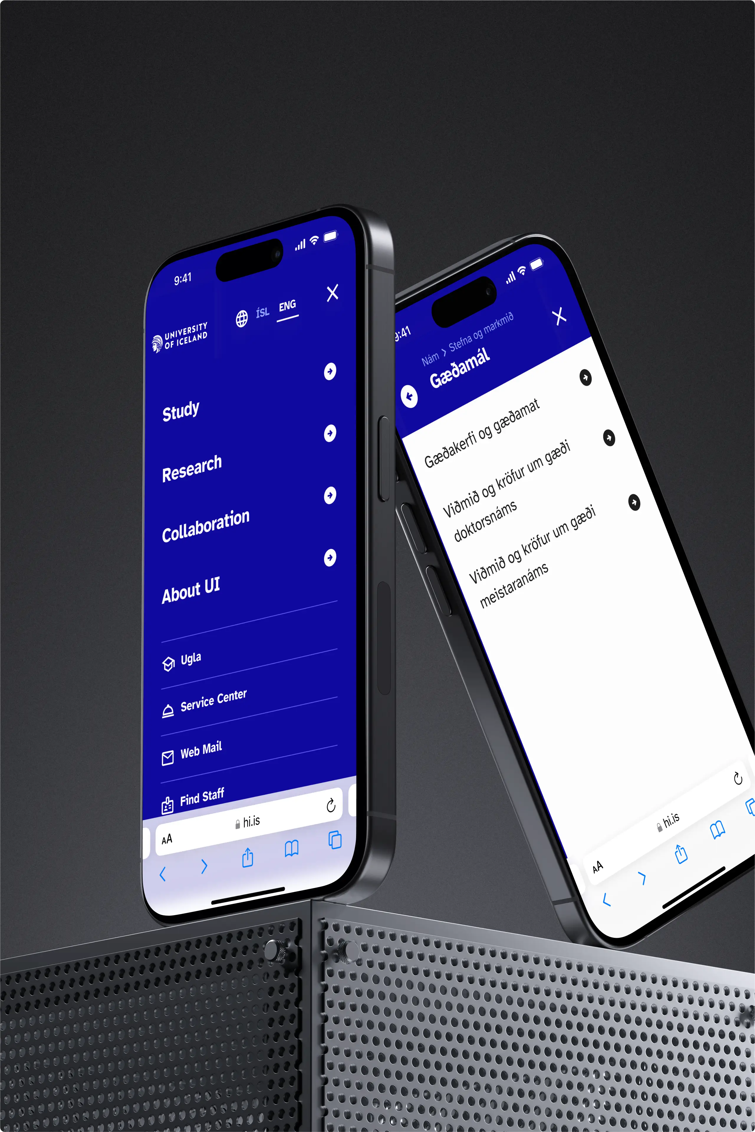
We inherited wireframes from Mennsk and built on user research to shape a clean, user-focused interface. With students, faculty, alumni, and the public all using the site, we had to balance clarity with flexibility. Modular design components let editors build pages that adapt to any content—without breaking UX.
Visual Design
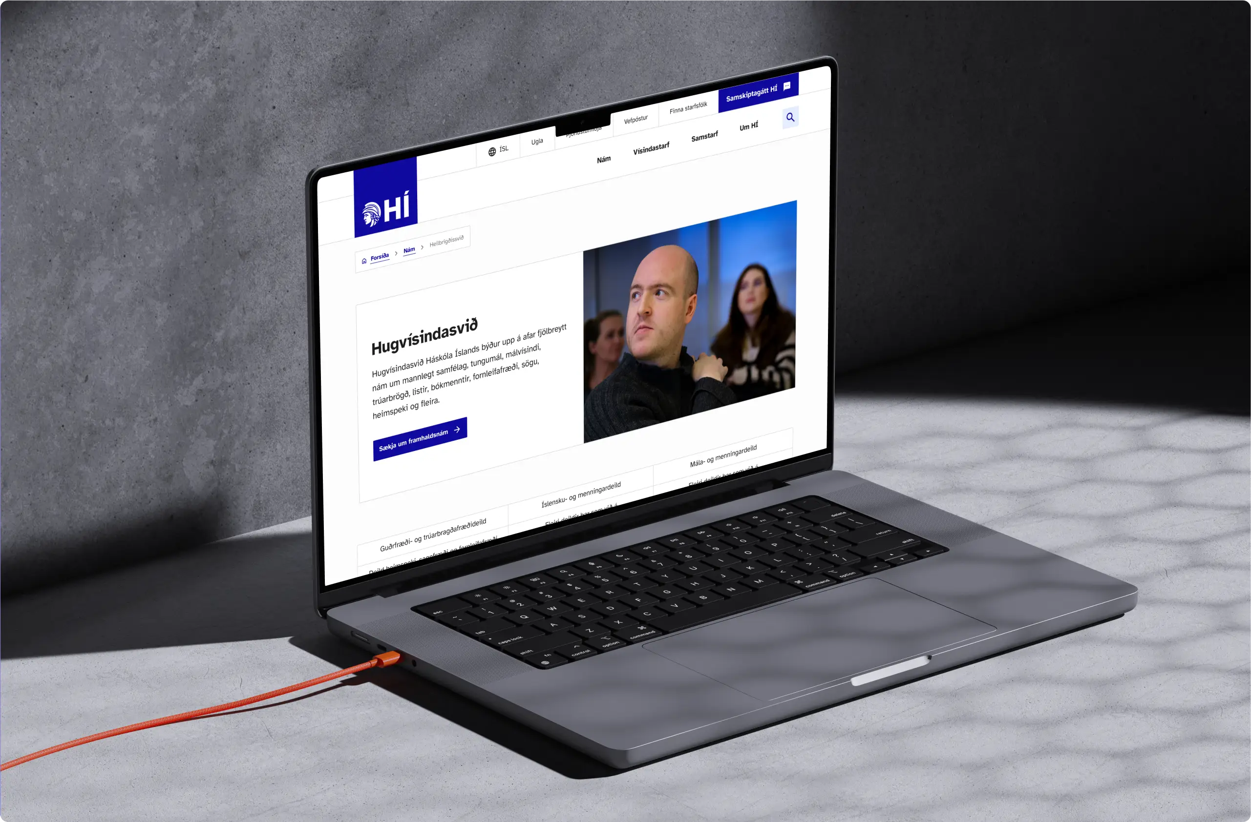
Modern, confident, unique
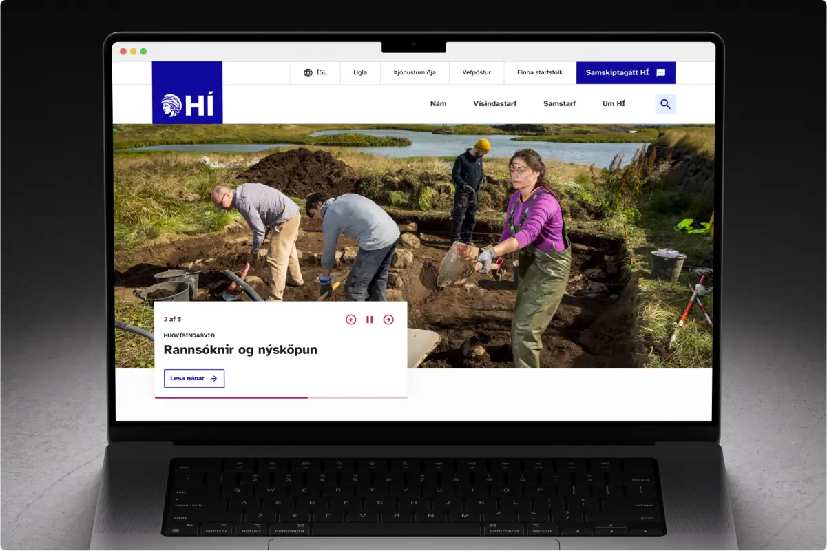
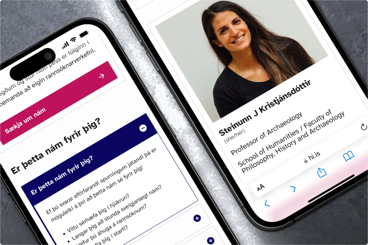
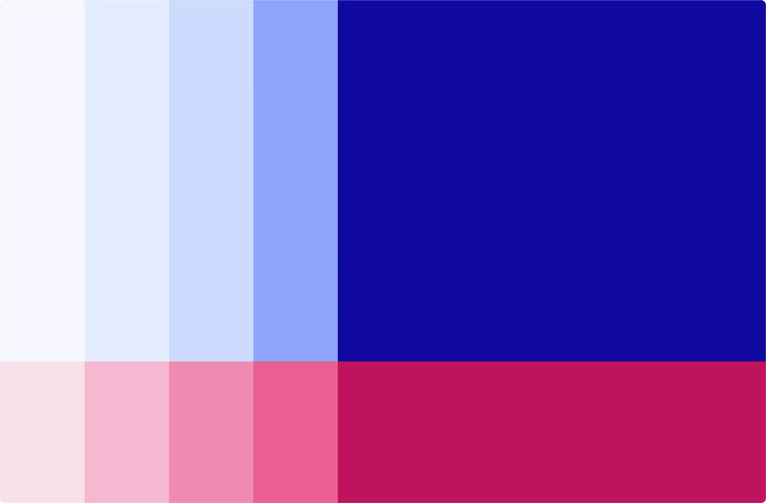
We gave the University of Iceland a fresh visual identity to stand out in a sea of lookalike institutional sites. Enter Deep Pink: a bold, friendly contrast to the traditional blue, adding warmth without sacrificing credibility. Paired with a clean, legible typeface, the result feels modern, confident, and uniquely theirs.
Development
Built to Last
We worked closely with the University of Iceland’s internal development team. Every component was documented, tested, and built to be responsive and accessible. The design system became the single source of truth—making handoff smoother and future updates far less painful.
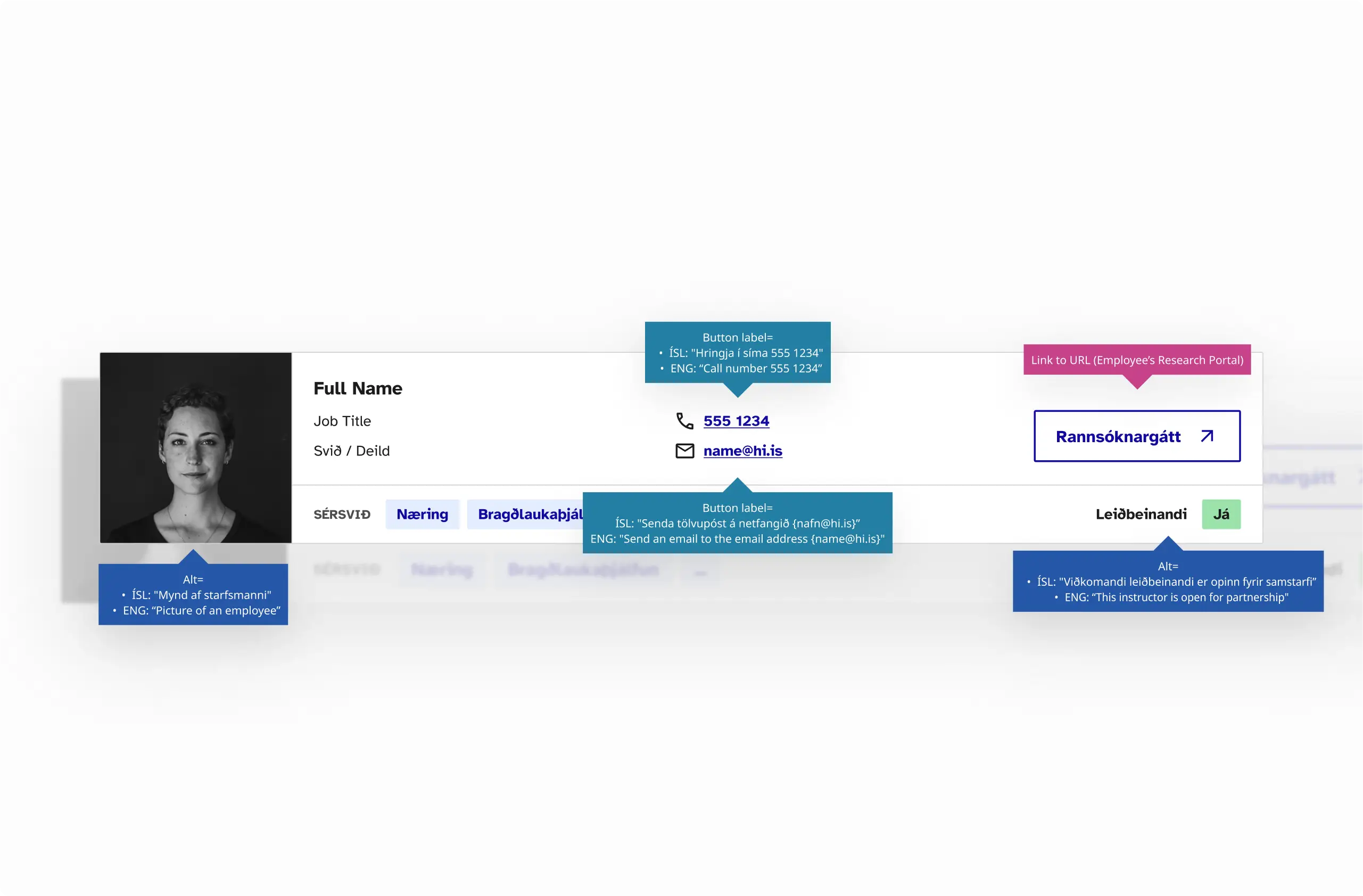
Accessibility
Inclusive by design
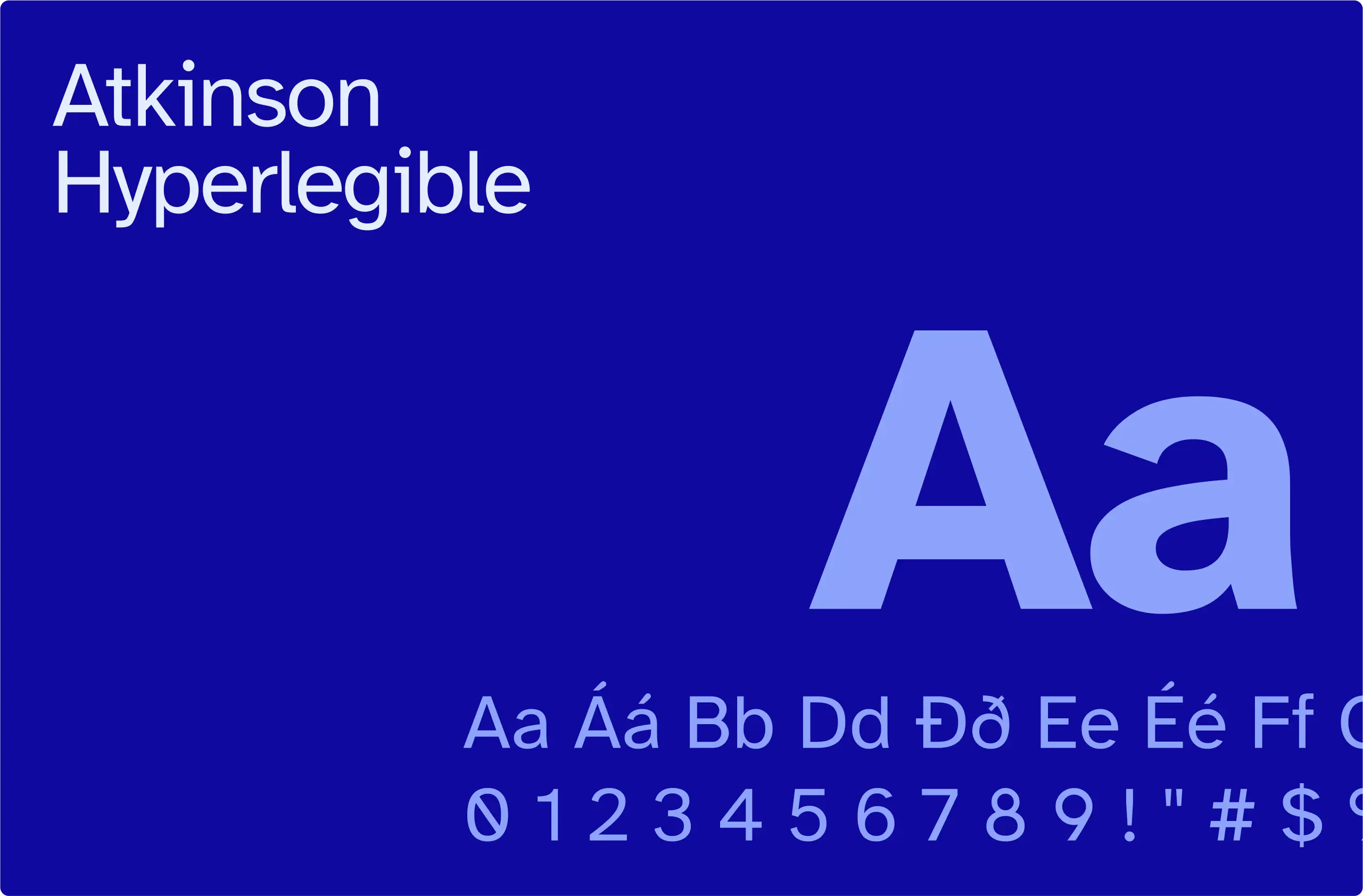
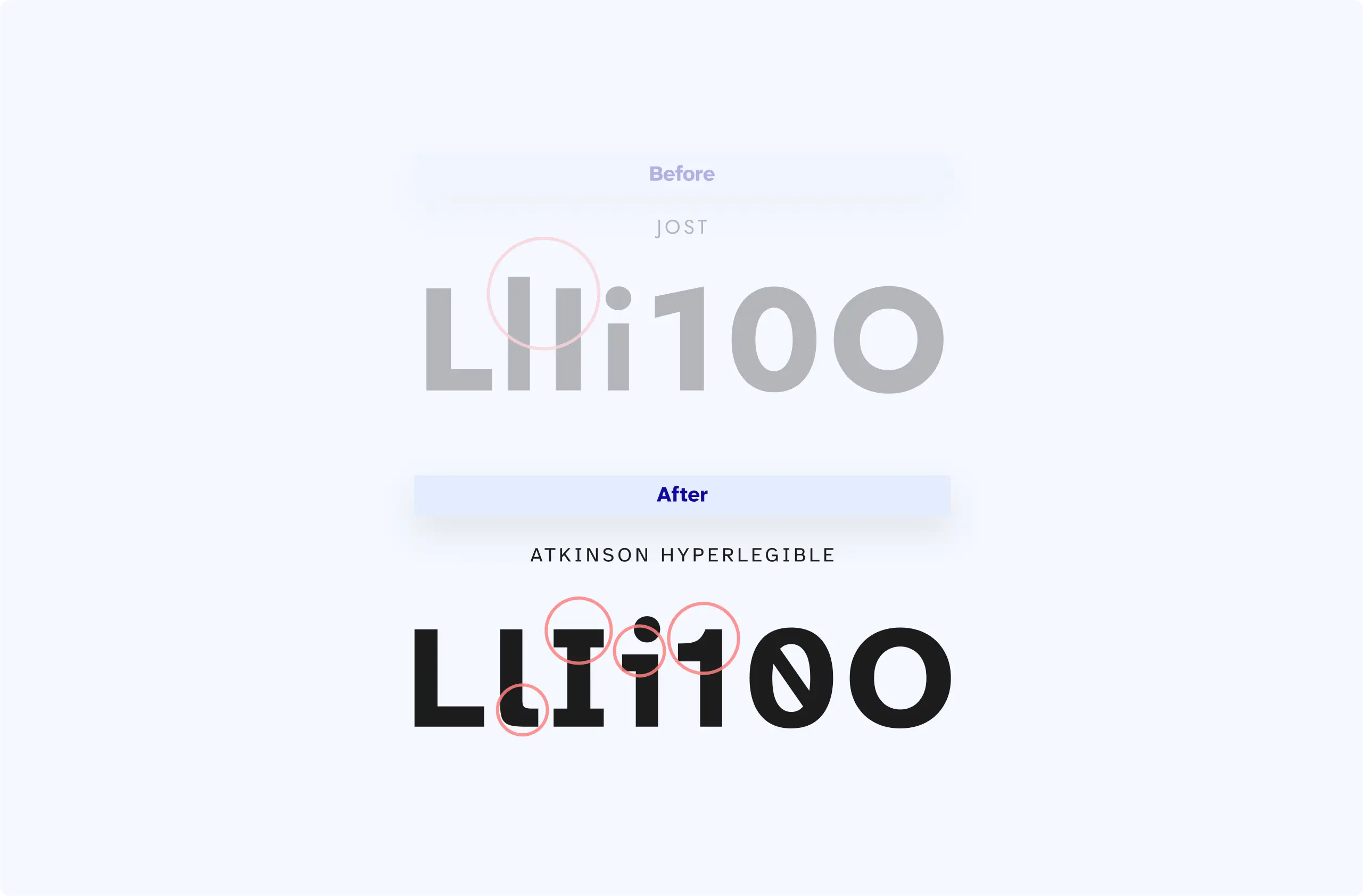
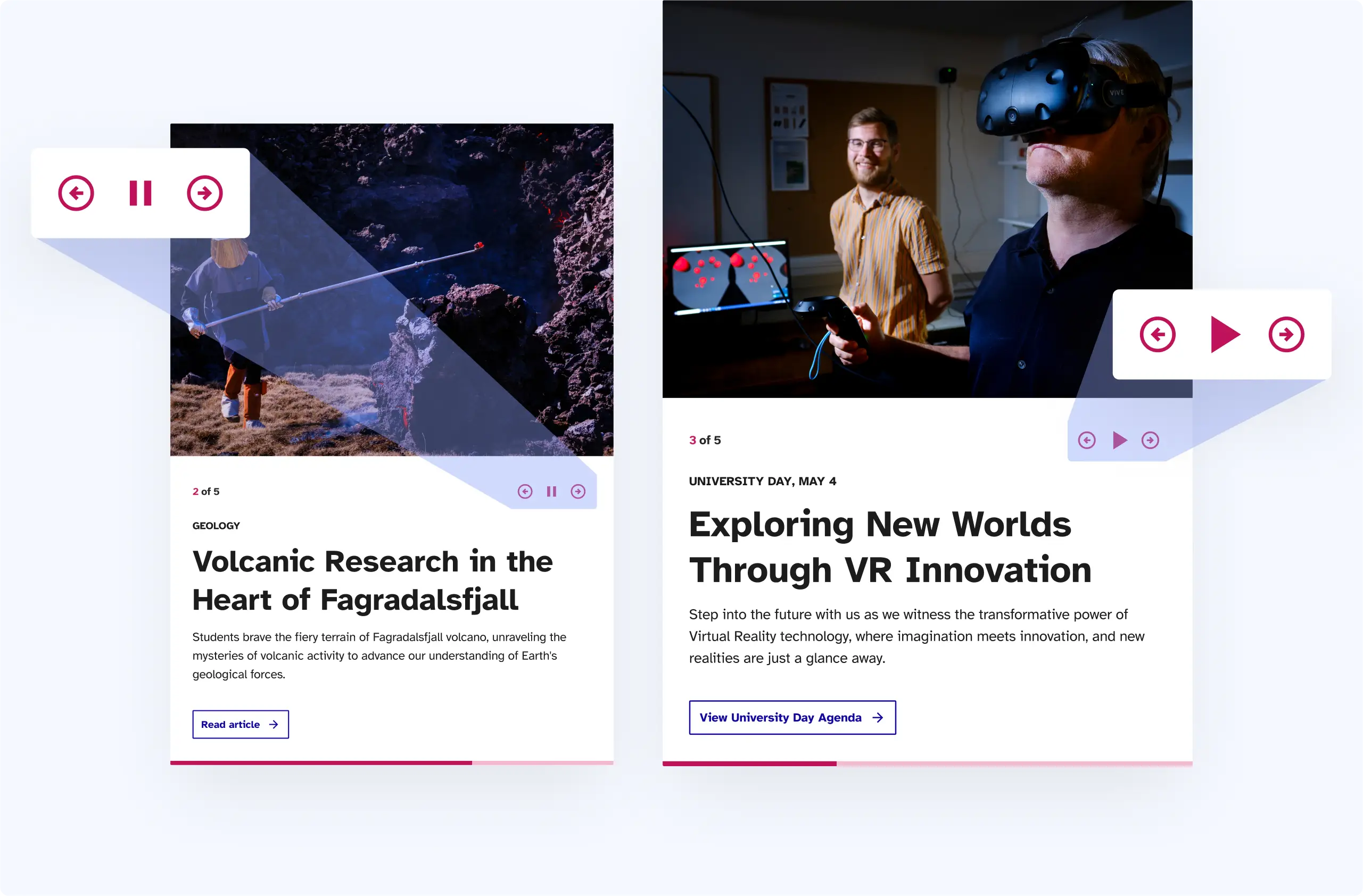
Accessibility wasn’t a checkbox—it shaped every decision. From adopting the Atkinson Hyperlegible typeface to implementing pause buttons on carousels, we made sure users of all abilities could navigate with ease. High color contrast, logical reading order, focus states—you name it, we covered it.
Conclusion
The new site is a bold, accessible platform that lives up to the University of Iceland’s reputation. It’s now easier to explore, more inclusive, and built for growth. Best part? The internal team has a system they can confidently build on.
83Figma pages created… and counting
3k Figma elements created
1041 Comments resolved
Next project
Engaging interactive learning
Design System
Game design
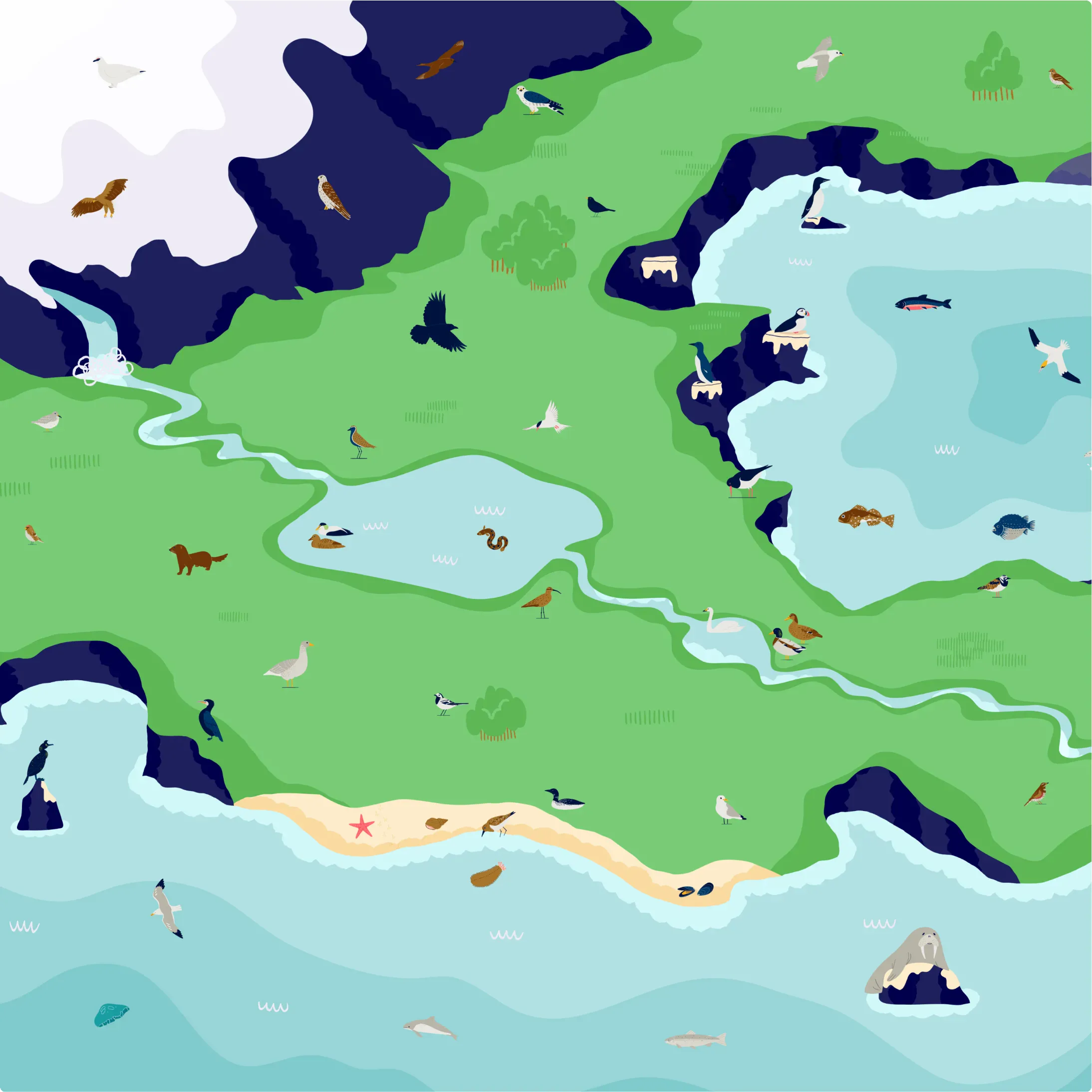
Illustration


